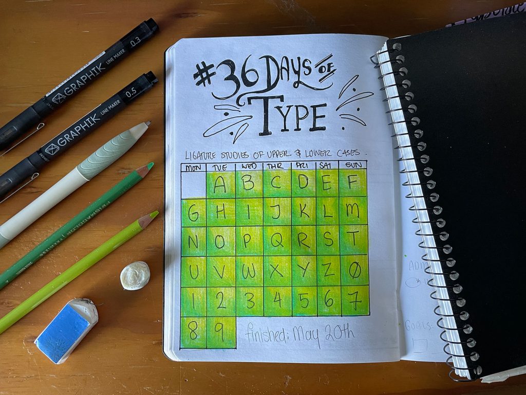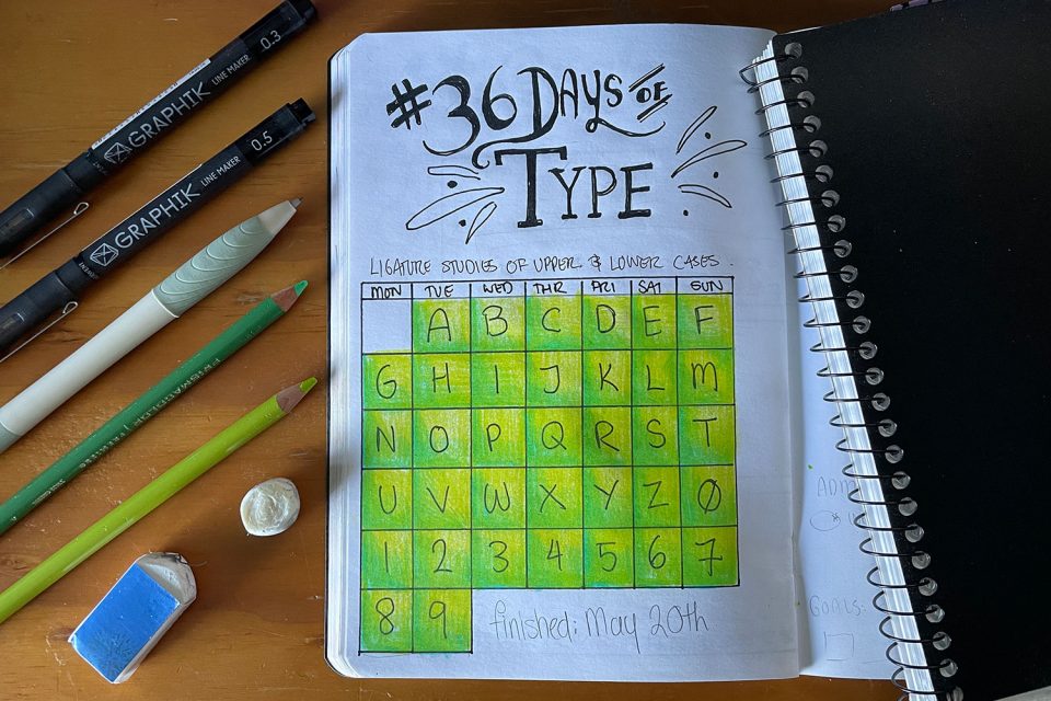
36 Days of Type
Writing this retrospectively means that remembering exactly who, or where, I found out about the 36 Days of Type. It could have been somewhere like Creative Bloq, or even lettering artists like Jessica Hische, Seb Lester, or Ian Bernard. But I can’t recall precisely where.
36 Days of Type was a challenge to draw a letter or number every day for 36 consecutive days.
It was the kind of once-a-year event that I would find out about after the event, swear to do it the next year, and then proceed to forget until it was over again.
But not in 2019.
At this point the “go hard or go home” mantra is probably pretty obvious. Why stop at a single letter, when it could be a launching pad to level up and work on my visual library of fonts and letterforms?
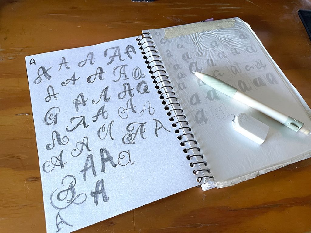
"So, you're putting these off?"
"Yeah. Apparently."
"Why?"
"Lack of variation."
"Lack of variation?"
"This was meant to be a study of ligature forms across a string of styles. All that's been looked at - even though it's a wide category - is Script fonts."
"What do you want to see more of?"
"Base font types - serifs, san serifs. Even some blackletter varients and unical."
Sketchbook notes, 2019
On with the Show
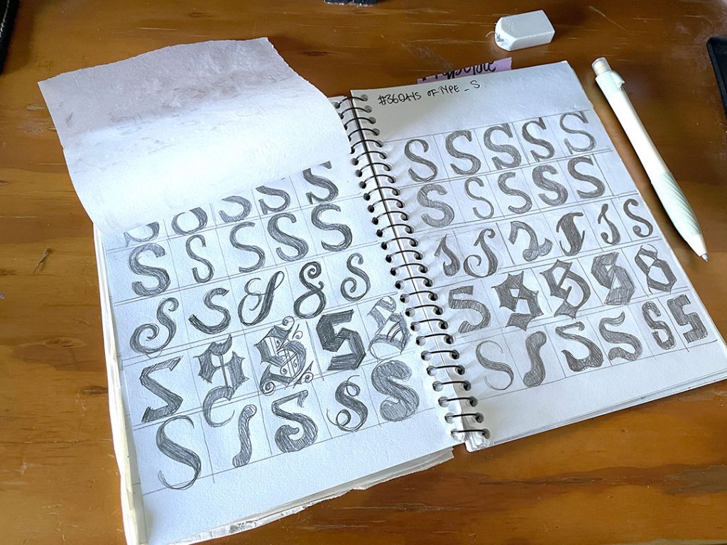
You can see just flipping through the sketchbook that it quickly tightened up from being a loose and aimless “draw as many types of <letter> as you can” to a very structured study with purpose:
- How is the capital <letter> presented across different fonts within five main font groups (Serif, Sanserif, Blackletter, Script, and Display)
- How is the lowercase <letter> presented across different fonts within the main font groups.
Each page was split into 5 rows, one for each font group. The challenge became less about just drawing a single letter and more about finding the ways in which letterforms were being drawn significantly different from each other, yet still recognizably that letter – which ironically meant paying more and more attention to the details. Unwittingly this was developing a skill that would come in handy when trying to identify or match fonts, as often has happened during my time at the printshop.
The final exercise came to 52 pages of letters (26 uppercase, 26 lowercase), with 10 pages of numbers (0-9, single-pages). And probably a little more than 36 Days.