Hello, welcome!
Did you find what you were looking for?
NEW BLOG POSTS
Colour Theory (2024)
Colour Theory (2024)
Colour theory was one of those things where I had picked up bits and pieces from books as a kid, learned through trial and error the difference of mixing warm paints with cool paints instead of like with like, but not something that any formal education properly covered. But in the middle of July 2024, I became aware of a Colour Confidence course at the local art supply store. It seemed very different from most of the other courses being run as they were usually specifically aimed at one medium or another – such as watercolours, acrylic, graphite pencil.
The course itself focused on colour theory applying it to acrylic paints – but in anticipation of the course, and with several years’ worth of Art Hoard Guilt™ I jumped the gun and started experimenting with colour ranges and trying to make use of the POSCA markers (2020) that I had accumulated, but largely had sat unused.
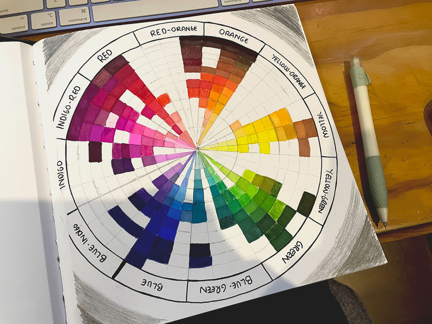
I can’t find the specific origin of the colour wheel idea – I’m sure I saw something like it in passing from another artist process video or studio photos – but the urge to just do a basic colour pallet to see what POSCA colours I had was something that my brain had been dangling as a dopamine carrot at me to do for a while. (And yes, it was right. It was very satisfying)
Of course the original colour spectrum tests proved that there were some missing colours. So after consulting the POSCA colour range and the local stationery store, with an updated collection the colour pallets were redone and revised.
The Colour Confidence workshop went on to cover mixing colours with acrylics, the differences between warm-shades and cool-shades (and how they interact – or, in some cases, don’t). Taking a 8 colour pallet – Magenta, Cadmium Red, Ultramarine Blue, Primary Blue, Light Yellow, Deep Yellow, Mars Black, and Titanium White and expanding it by mixing colours. Further exercises included:
- Achromatic Gradient (No colour, black and white)
- Monochrome (Single colour)
- Analogous Pallets (4-5 colours next to each other in the colour wheel)
- Triadic Pallets (3 colours evenly spaced across the colour wheel)
- Complimentary Pallets (Colours opposite each other on the colour wheel, such as blue and orange)
- Split Complementary Pallets (Similar to complimentary, but instead of the colour opposite it takes the two colours either side of it. So if we started with blue, the split complimentary would take red and yellow instead of orange)
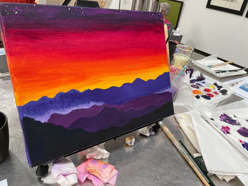
The majority of the course revolved around a 12-colour Colour Wheel model, and we briefly touched on the difference between additive colour (what your computer monitor or phone screen uses, by generating light – additive) and subtractive colour models (most traditional media, subtracting from the light being reflected off the paper/canvas/substrate). The day closed out with a painting on canvas based on photos supplied.
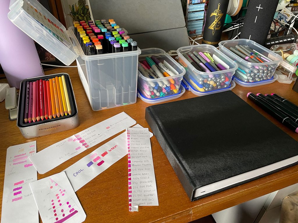
About two days prior to Colour Confidence, I started to expand on the investigation into POSCA colours and started to look at the other traditional materials in the Art Hoard™ including a set of J Burrows Graphic Markers (circa 2018), Sharpies (also circa 2018), old Copic markers (circa 2008), several ShinHan Touch Markers (circa 2012), Prismacolour pencils (circa 2017), an assortment of Faber Castel Albrect Dürer watercolour pencils (2024) and inherited sets of BIC Markers. Something had struck me as a good idea to see visually what traditional media colour spectrum I was dealing with, especially since I was so familiar working with a digital colour wheel. It also would make it easier to see where I had gaps in the spectrums, in theory.
This project was a good exercise in Colour Temperature, trying to establish whether shades were warm or cool compared to one another. Each slice of colour was split into three sections on the horizontal axis: warm-colour, core-colour, and cool-colour. Vertically the slices were also broken into light, mid-tones and shadows.

One of the things I was particularly interested in was seeing how similar colours across different mediums were – Prismacolours compared to Polycrome, different brands of alcohol markers (J Burrows vs Sharpies vs BIC), and where the POSCAs fell in the spectrum. If I was going to try and use the traditional mediums more, I wanted to try and get a better handle on how colour worked across what I had available to me.
Most of the blog posts at this point would finish with some kind of Big Bad final project but it appears I’ve let that fall to the wayside – perhaps because it spawned further investigation into techniques for Copic (and other) markers, different pencil techniques and finally playing with the Gauche from the Art Hoard™ (2020, this time).
Side Quest #1: Markers
(TBC)
Side Quest #2: Pencils
(TBC)
Side Quest #3: Gauche
(TBC)
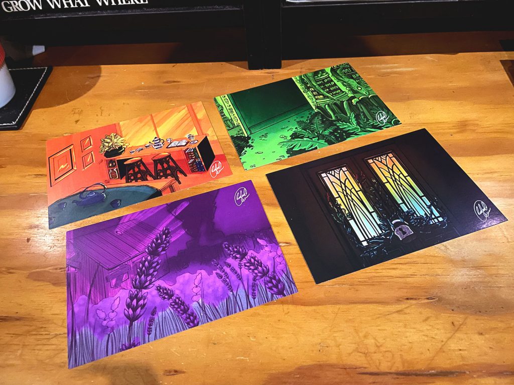
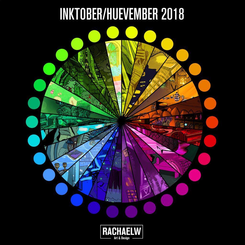
Huevember 2018
Huevember 2018
“Environments of Kydance”
When it was time for October to roll around, after spending much of the year throwing my efforts into branding and logo work (Daily Logo Challenge*) and fundamental drawing practice (Sketchy Veggies), once again I found myself wanting to utilise Inktober as a personal challenge to try something different. For years I had seen huevember turn up – a colour-based challenge, traditionally taken up in November – but always at the wrong time of year. And since I had been wanting to practice drawing backgrounds, it seemed a good an excuse as any. So with a huevember chart in one hand and a list of random-generator environments (I think from https://artprompts.org/ ) in the other, it was time to get some practice thinking about and drawing places that would fit the prompts.
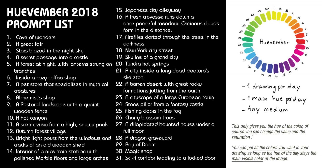
Everything was going according to plan! … Until the night of Day 3.
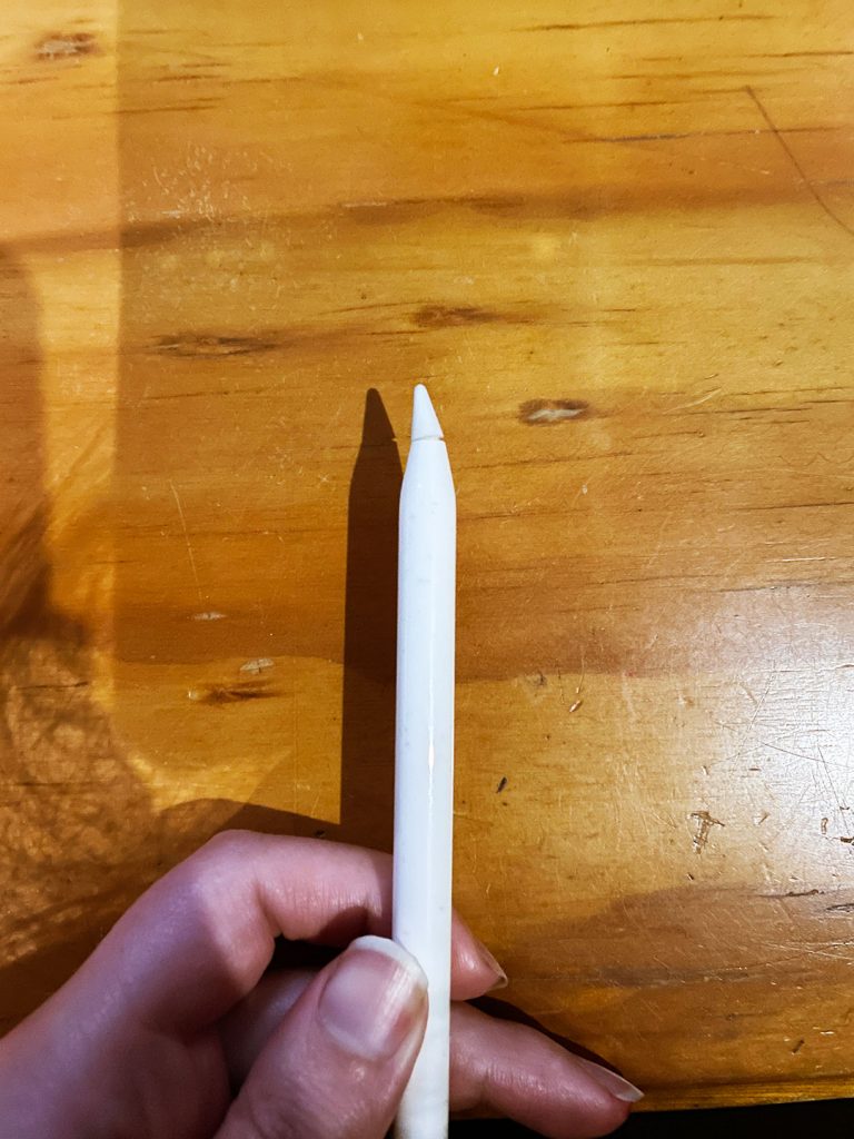
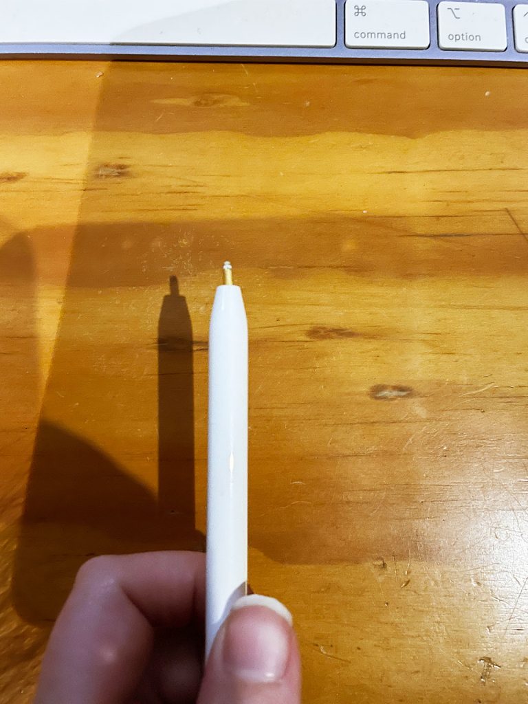
In what is, in hindsight, spectacularly typical me style, I managed to drop the apple pencil. Enough of a drop that I could try to course correct and catch the pencil, in the right timeline.
This was not that timeline.
Instead of catching the pencil I brushed it at just the right time to change it’s course from the floor, to slamming point-first into the wall. But of course, not just any part of the wall. It had to be point-first into the solid steel support beam, a mere 160mm space of wall with plasterboard either side. Very quickly it became apparent that bending the copper innards of the Apple Pencil tip, was a shortcut to an expensive paperweight. The sensitivity was gone, and despite synching to the ipad, the surface didn’t recognise it.
Comically, I was heading to Melbourne the following day to pick up pieces from the Royal Show, and was able to swing past the stationery store to get an early birthday present. Problem sorted, more or less.
(“But where’s the proof? Where’s the photos?” yeah, good question, I thought I had some too! I am very sad there’s not photos of the 90˚ bend in the copper beyond what’s been etched into my memory. All I can say is 0/10 do not recommend yeeting thine expensive electronic pen into a steel beam. I clearly do not learn from experience though and proceeded to drop the replacement pen, tip first, straight into the floorboards in 2026. But it had a much better – and longer – life than the previous pen! And this time, I got photos.)
One of the things I went into Huevember thinking about was an old Illustration project from University, where one of the restrictions was it had to be a two-colour job. It seemed so odd at the time, hilariously familiar upon reflection, but through huevember it became a good excuse to revisit and play around with those sorts of restrictions and colour groups – such as triads or complementary colours.
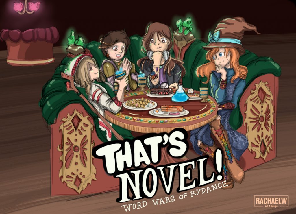
Somewhere along the way I wanted to try and tie the environment prompts together, like an expansion on the world that I’d started building with a self indulgent illustration at the end of an event for a writing group, dubbed “That’s Novel”. It had featured a group of adventurers taking a break at the tavern, inspired by the event venue (a pancake restaurant).
Shortly after the final Huevember piece was completed in January, an opportunity arose to help a friend table at the Sticky Institute’s Festival of the Photocopier. In a mad rush to make zine-fair appropriate material, I threw together an artbook of a small selection of pieces from the collection. Complete with place names and locations that reflected the global nature of the writing event that had inspired the pieces.
A small selection were also chosen as part of a short run of A6 prints for a COVID Lockdown snail mail group in 2020.

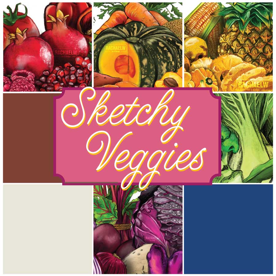
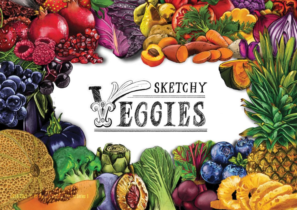
Sketchy Veggies (Ongoing, 2018-Present)
Sketchy Veggies
During 2018 I focused a lot of time on refining my skills by diving into textbooks, and applying theory to practice (as seen in the Daily Logo Challenge*). To get me out of the house, I was invited along to one of the local craft group gatherings. It presented a new environment, a set time once a week to work on something away from the all encompassing desktop and looming threat of job applications, social media and other distractions.
One week I just started playing around with Procreate – messing with different brushes, toying with textures. And finding myself missing the life drawing studio classes we’d had at uni, set about trying to recreate those sessions within my own limits and interests.
So I started drawing vegetables. Why vegetables? I don’t know. But there’s probably more than a little influence seeping through from the Harvest Moon, Story of Seasons and Stardew Valley games.
I really started playing with textures and charcoal brushes while working on the artichoke, but it always surprises me when I am reminded it was actually the sugar snap peas that were the first of the Sketchy Veggies. Both of them came together sufficiently quickly, that I set myself a goal after the meeting – doing one a day would give me seven veggies after a week. Something small, yet fun. And something that went back to basics.
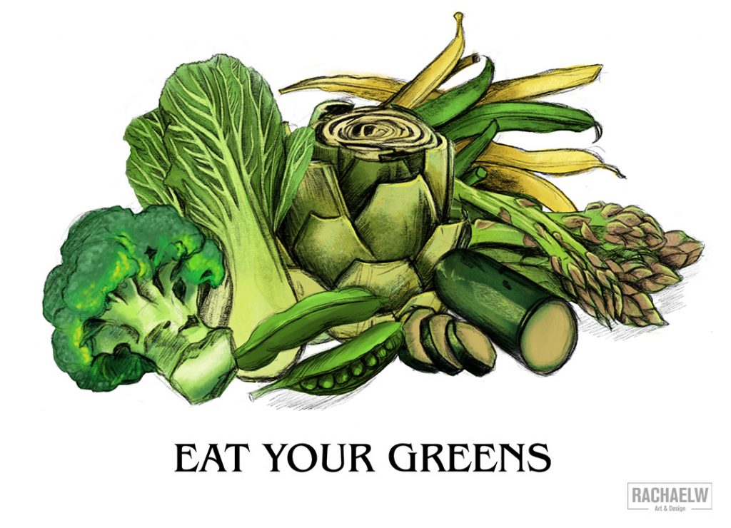
It could have ended here – beans, sugar snap peas, broccoli, zucchini, asparagus, artichoke and bok choy.
But you know it didn’t.
Showtime (2018)
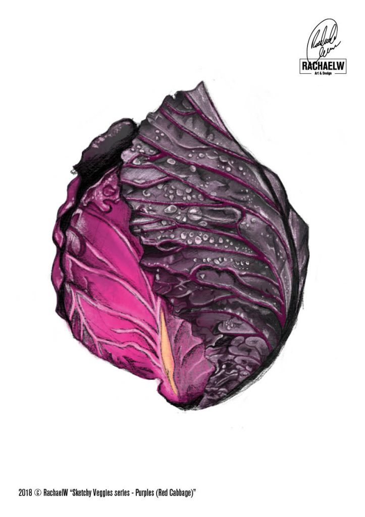
Coming off the back of the much more detailed bok choy illustration, last of the seven Greens series pieces, the purple cabbage combined challenging textures such as the leaf veins and water droplets on the reference image. In comparison to the Greens which came together within a week, the purple cabbage took that long and more, and it turned into a rush to try and get it finished in time to submit to the Melbourne Royal Show’s Art, Craft & Cookery competition, Tablet Art division.
Despite the last minute entry, “Eat your Greens” came second!
The rest of the purples were completed in the time between submission drop offs for the Melbourne show (September) and pick up of artwork (early October). The project continued into the new year, 2019 bearing groups of Orange and Red fruit and vegetables. Somewhere along the line my intention to just draw the vegetables shifted to focus on creating linework that was still identifiable as each fruit or vegetable on their own, without having to rely on colour to do the work for me.
Plan? What Plan? (2020-2021)
In 2020, I finally sat down to try and work out a plan of attack for future extensions of the project; gathering reference images for remaining colour groups, and the first overview image for the colour group sets; Yellows, Blues, Brown veggies and White veggies.
Solid colour squares waiting for Brown, White and Blue veggie groups.
Slowly throughout the rest of 2020 and 2021 I made my way through the Yellow and Blue veggies sets, bringing the total of vegetable colour groups to six and a grand total of 42 different fruit and vegetables.
Experiment, Evolve, Exhibit (2022)
With so many fruits and vegetables to play with, 2022 turned into a year of experimentation. I tried out Red Bubble’s notebooks, only to be extremely disappointed at the physical size of the books that arrived (as well as the binding). I played with a short run of 80x125mm stickers, as well as a run of A5 prints that included a full print of the veggies artwork that had been used on the notebooks.
And after a period of not exhibiting, discovering that the 2022 Melbourne Royal Show was celebrating Agricultural milestones, I was convinced to challenge myself and prepare a new submission for a different, and much bigger competition category – Still Life 2D Artwork.
There was some fear about submitting for what was, typically, a very traditional category. And the work was done digitally, but with pencil and charcoal brushes that made people question whether it was traditional or digital. The schedule information for Still Life said “Any medium, including mixed media”, and at that point the worst thing they could say is “no”. So I set about working out the dimensions, composition, and then realised a small problem.
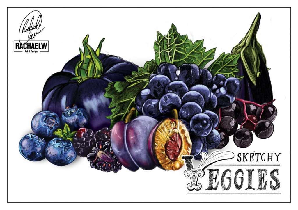
Eat Your Greens never had a fruit.
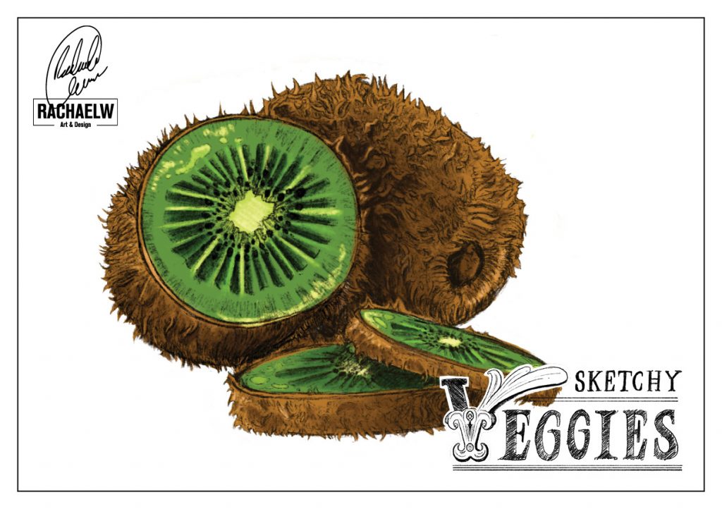
Every other set more or less had a fruit – Oranges had 4, Reds had 5, Yellows had 4, and while Purples didn’t have any explicitly, at least 2 of the 4 Blue fruits could pass for purple. So once again it was back to the drawing board; What green fruits were there? What was something I haven’t done before? Grapes were out – I’d just done a bundle for the blues. I still hadn’t done apples, but they seemed so simple and plain. But Kiwifruit. That fit the bill. In more ways than one. (At this point it was almost traditional to have at least one, stupidly complicated fruit or vegetable per set. Purple Cabbage, Cantelope/Rock Mellon, Lychee, Pineapple… and now, Kiwifruit)
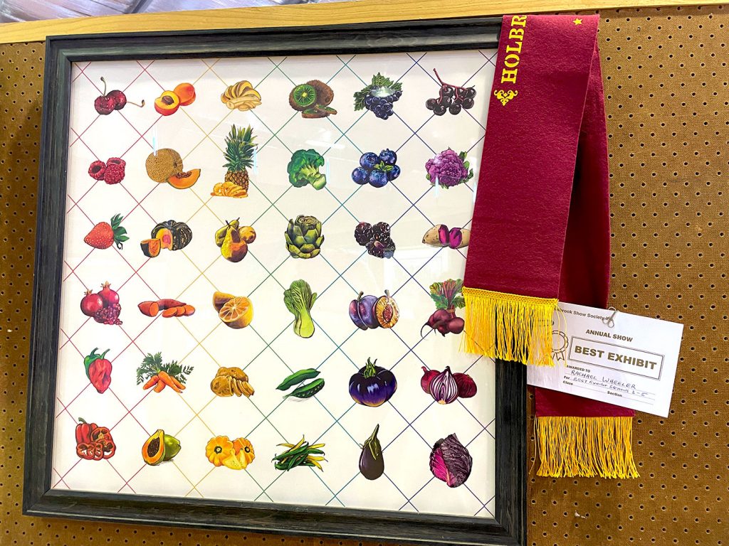
All the pieces for my metaphorical chess board assembled, now it was time to set up the final piece. Heavily inspired by accent kitchen tiles, it became a rainbow of fruit and vegetables matched beautifully with a rustic wooden frame that pulled everything together nicely.
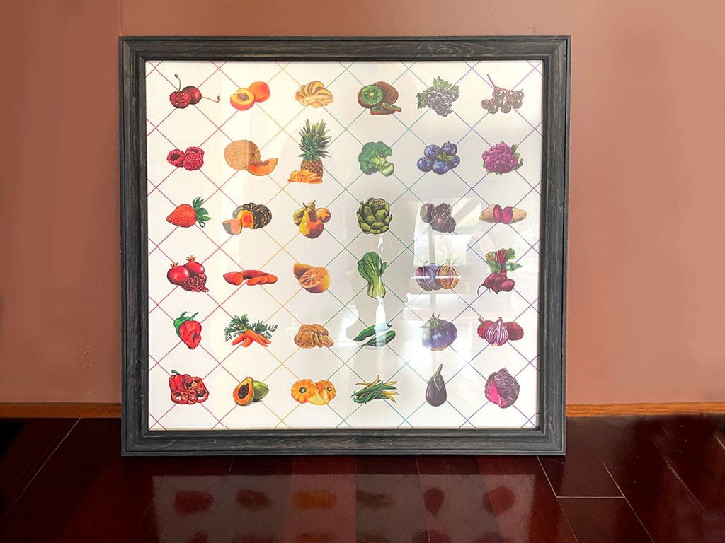
To my surprise, despite going into the show just wanting to get my work out there and seen, it came home with a Highly Commended award. Not a bad effort for dipping my toes into the larger art categories.
Long time no see (2024)
It took until 2024 for me to show Sketchy Veggies again, when I was made aware of a local regional show that was actively looking for submissions for its arts and crafts show, and encouraged to see if I had anything I wanted to submit. It was such a last minute throw together, I was shocked to walk into the exhibition and see one of the felt ribbons I had long associated with other agricultural show awards, draped over the framed Sketchy Veggies. They had done it again, this time coming away with Best In Show.
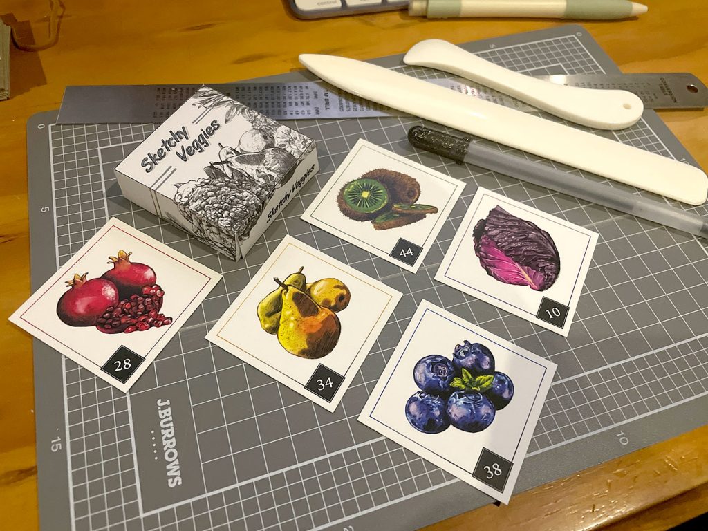
The idea of doing business cards with the Sketchy Veggies, as a kind of easter egg set had been something kicking around in the bowels of my brain for several years at this point. And finally it became a reality in the wake of the Holbrook show results and another Typism Summit focusing on marketing and business practice. One of those silly jobs that you spend forever putting off, but when you sit down to do it, it comes together quickly. Before too long, the cards were printed and I was sorting them into decks.
The cards were part one – I couldn’t properly start working on part 2 until I had a full deck on the proper paper stock to get my dimensions to build a dieline for a box to house the cards. The next stage was a combination of print house experience, and the years of building mockups of packaging. Getting the dimensions, setting up the artwork and getting it printed was the easy part. My scalpel hand did not appreciate cutting out and creasing multiple boxes.
I’m a Real Project now?! (2025)
And somehow, finally, in 2025 after 7 years of Sketchy Veggies, I finally sat down and made them a proper series logo. Something that after all this time felt right, in spite of many many past attempts to make something that clicked.

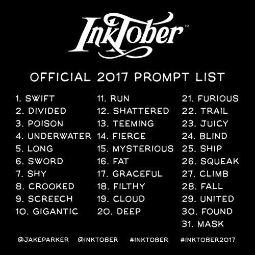
Inktober (2017)
Inktober (2017)
What is Inktober?
Started in 2009 by Jake Parker as a challenge to improve his inking skills and develop positive drawing habits, the basic rules have been to create a piece of art in ink, every day, and share it with people – online or offline. In 2016, Parker begun sharing official prompt lists for people to work with.
Challenge Accepted
When the frustration at not using my ipad as much I thought I should aligned with an increasingly bleak looking work situation, and off the back of a team-initated drawing challenge, Inktober 2017 became the perfect escape. And the perfect excuse.
Instead of going back to my traditional art roots, I wanted to use the challenge to develop something else. A problem that had been sitting gathering dust: the ipad pro and apple pencil. The 31-day challenge would be a great opportunity to push ahead one day at a time with getting more comfortable sitting down with the ipad and smashing something out.
But of course, worth doing, worth overdoing.
Go on, I dare you
I never wrote it down but I remember setting myself a few ground rules for this Inktober challenge.
- 1. Everything had to be done on the ipad with the apple pencil
- 2. You have from 00:00 to 23:59 every day to work on a piece. No more, no less.
- 3. Regardless of how finished or not it is, you have to post your final piece.
All 31 pieces were made with iOS Sketchbook Pro, and there’s a whole range of styles and pieces that came from the challenge. It’s fun to look back at these retrospectively;
- Pieces such as #5 and #13 being inspired by Stardew Valley (#5 in anticpation before the Switch version had been released, ironically incredibly prophetic given the number of time I spent hunting down hardwood in-game once it came out. And I had managed to play enough of the game that by [Inktober] Day 13, I had an idea of what Amaranth as a grain crop was like.)
- #15’s creature in the dark looking over its shoulder serves as a permanent reminder that The Rasmus’ album Dark Matters was on high rotation during this challenge (“Something in the Dark”, Track 2)
- The teeny tiny Foreign Shrapnel Dragon as he appears in #7 after being spotted by the human owner of his spare coin hoard (mortified, truely), and #21 defending his stash of coinage.
- Several pieces that serve as a reminder of circumstances and current events at the time too (#12, #27 and #29).
Some of these were revisited later, and some were polished into finished pieces:
In Conclusion:
All in all I achieved what I set out to do with this challenge – 31 days in a row, sit down with the ipad and the apple pencil and make something. Some days were easier than others, it got easier the more I did it, some prompts were easier than others. I might have a great idea one day, and barely execute the prompt the next. And that’s okay! If nothing else, it gave me the starting blocks for several illustrations that I could come back to – and in several cases, did.
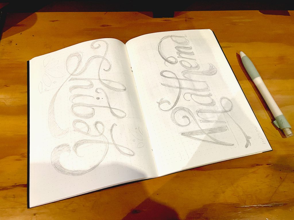
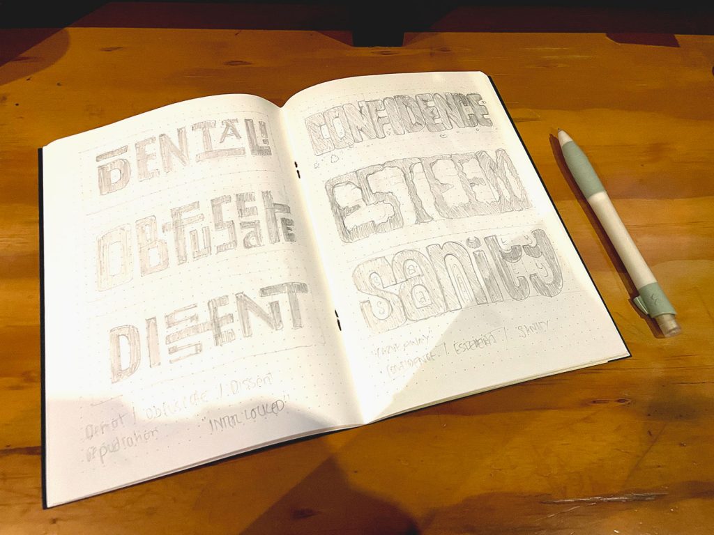
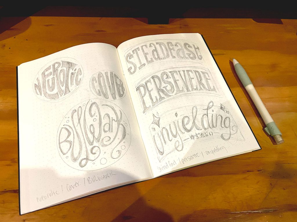
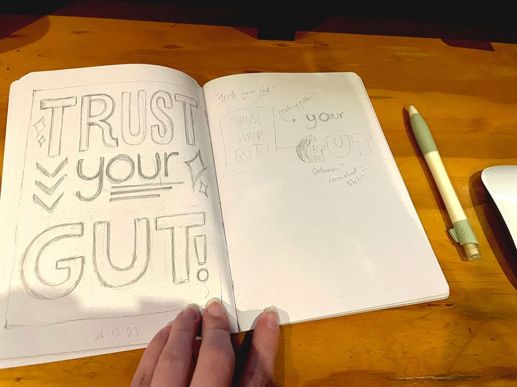
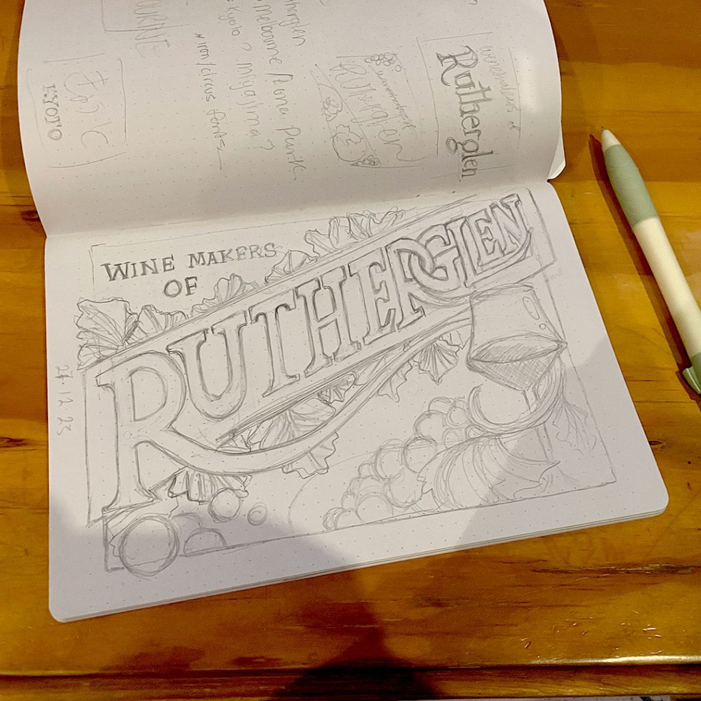
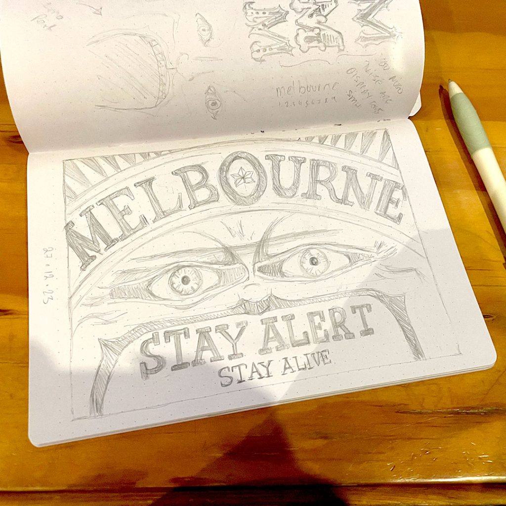
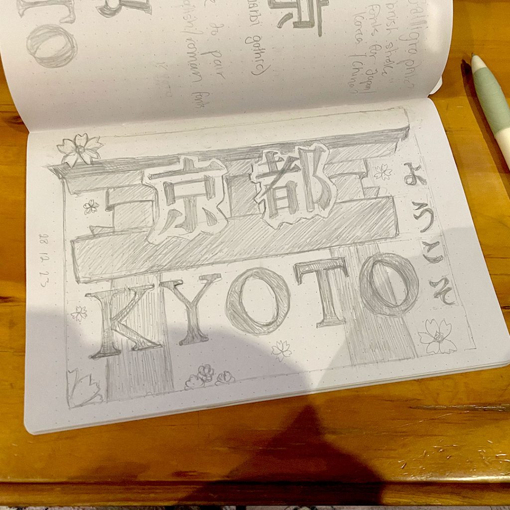
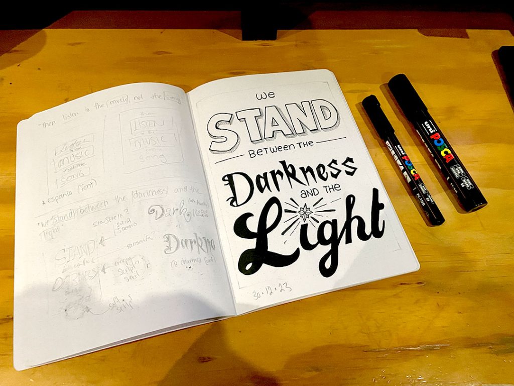
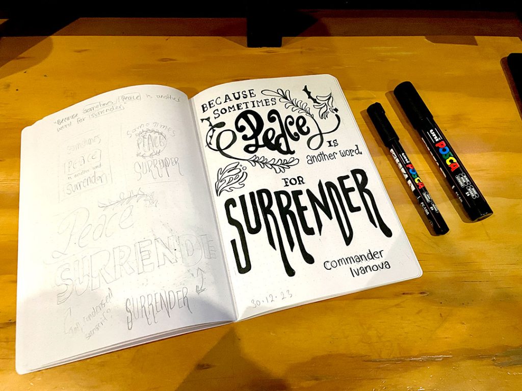
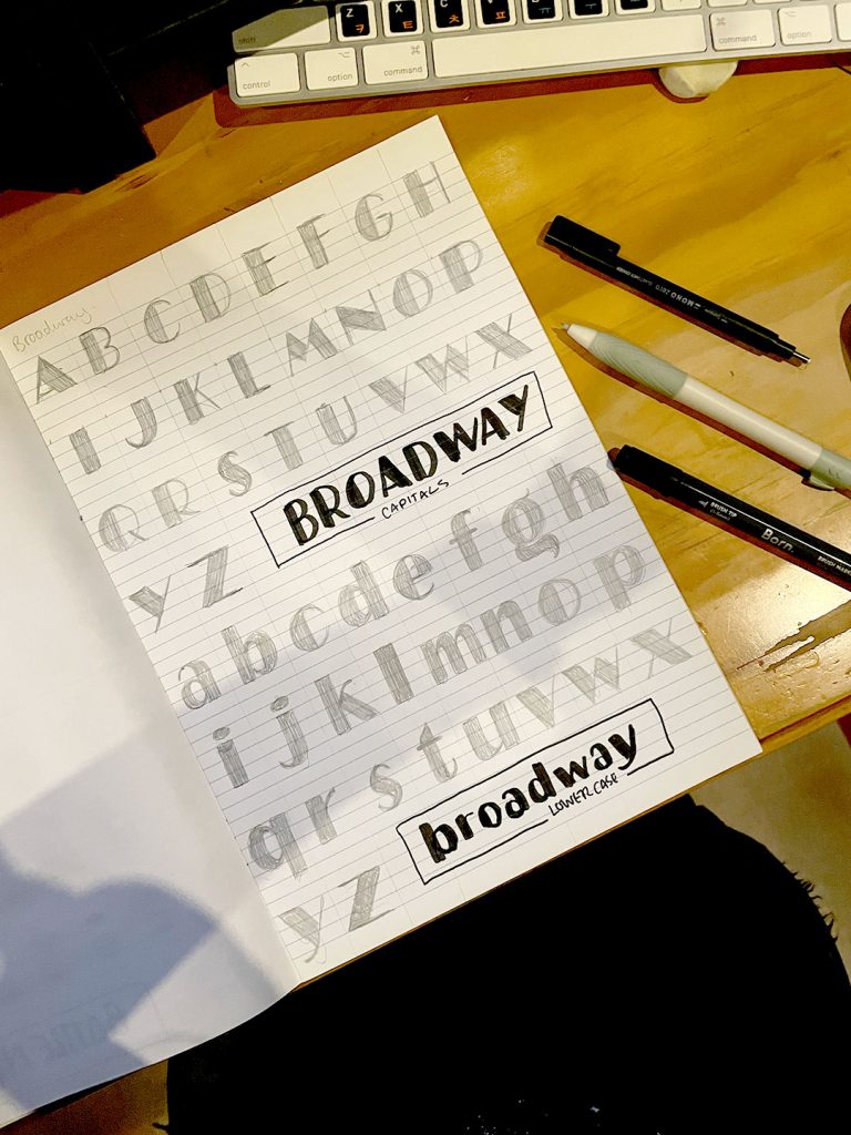
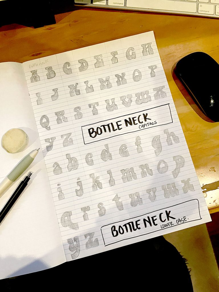
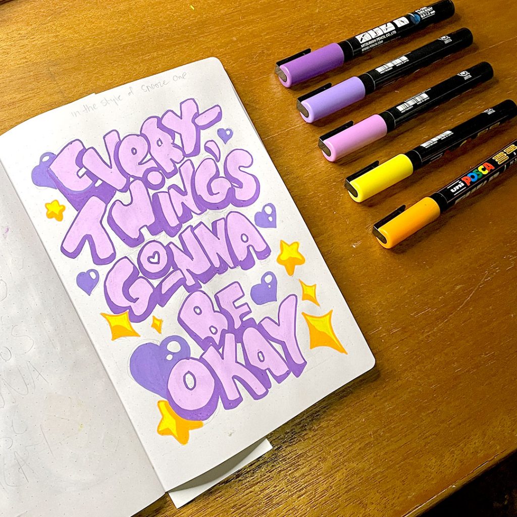
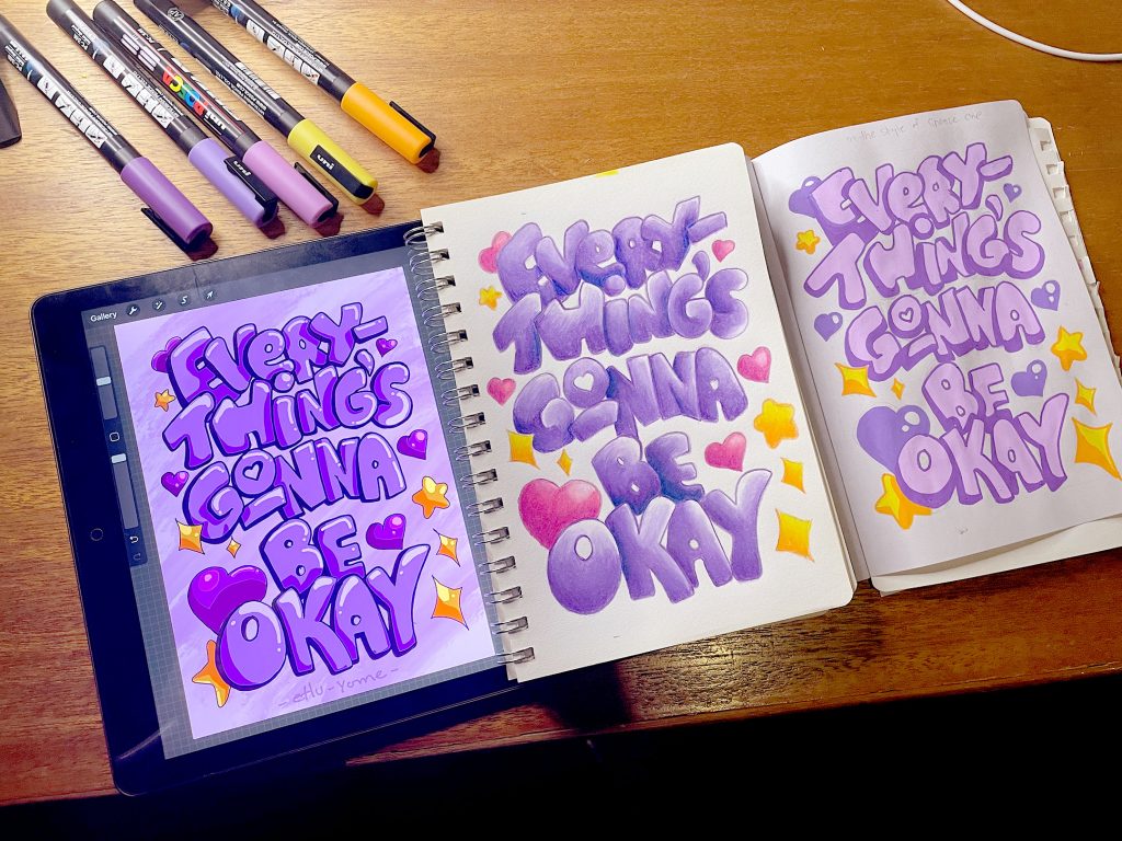
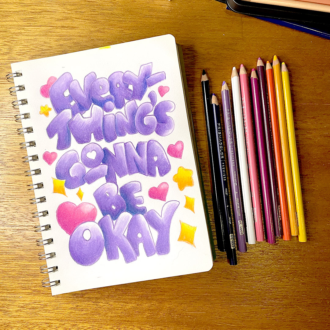
Lettering Sketchbook (2023)
Lettering sketchbook 2023
In the middle of 2022, I was gifted a Domestika Course – “Typography Sketchbook: Drawing Letters with Style” by Joanna Muñoz”. Of course I signed up, logged in, and then things happened and it fell to the wayside for a while. Quite a while. Eventually in September 2023, I dug up my log in details, grabbed an old dot-grid notebook, and started to make my way through the first few introductory videos.
An Introduction to Lettering

Going through the motions of following the course was a personally bizarre experience; I’d been dabbling in and out of lettering for decades, done at least one university-level introduction class to Typography and heard far too many coursemates telling tales of woe during their time taking the later electives. I had been able to see several prominent lettering artists present at Semi-Permanent in 2014 (such as Jessica Hische and Seb Lester), and had the chance to add some of their own books to my reference library in the years that followed. I knew all too well what things like descenders and ascenders were, I’d spent weeks studying the differences between different types of serifs and san-serif fonts for 36 Days of Type. It felt, in some ways, like I was rehashing things I already knew. That I already should be fine with.
But at the same time that frustration became a strange kind of super power. I could identify more easily what I didn’t know from what I did, things that I agreed with vs things that I didn’t (Even in the “old days” of 2023 I was still skeptical about leaning on pintrest for reference material, after personal experiences that showed it could be extremely difficult to track down original sources).
Of course, if you’ve been around the blog this should come as no surprise, as once again “worth doing, worth overdoing” kicked in; Tasks within the course, each done in triplicate.
- Same Words, Three Ways (san-serif with a 3D effect, high contrast bracketed serif, and monoline script)
- Flourishes and Swashes (script styles)
- Interlocking Forms (blockwork styles)
- Carved Out (more blockwork forms)
- Circles (letttering in a form)
- Arches (using guidelines)
- Arcs (guidelines and rotation)
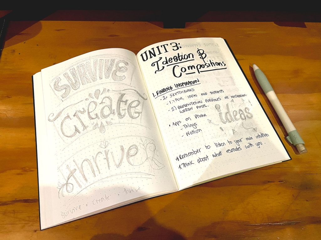
Moving from reinforcing new and old fundamentals, we started to get into the meat of the course. The stuff I was truly in it for.
Creating Compositions
The next task called for students to pair a single phrase with one of the references gathered during the ideas phase – where we looked at where we get our ideas and inspiration from, and whom. And yet in spite of following the assigned task to the letter, something felt missing.
Worth doing, worth overdoing.
I set about making my own twist on the task – picking 5 specific artists whose styles I liked and/or wanted to emulate, looking at examples of their work and identifying what made it feel like their work (to me, at least). Choosing artists with a range of styles and looking at how and what still made each piece feel very obviously “them” was something that appealed in the wake of the annual “style” discourse that flooded the internet so often and the push for creatives to be their own “brand”.
Putting It All Together
The course followed this with a set of exercises – a serif piece, a san-serif piece, a script piece, and a mixed lettering piece. (4 pieces total)
You know the drill by now, don’t you? Worth doing, worth overdoing.
And of course now that we’ve got a basic grasp of composition in pencil and black/white, the next task was to start adding colour to pieces and documenting them for social media.
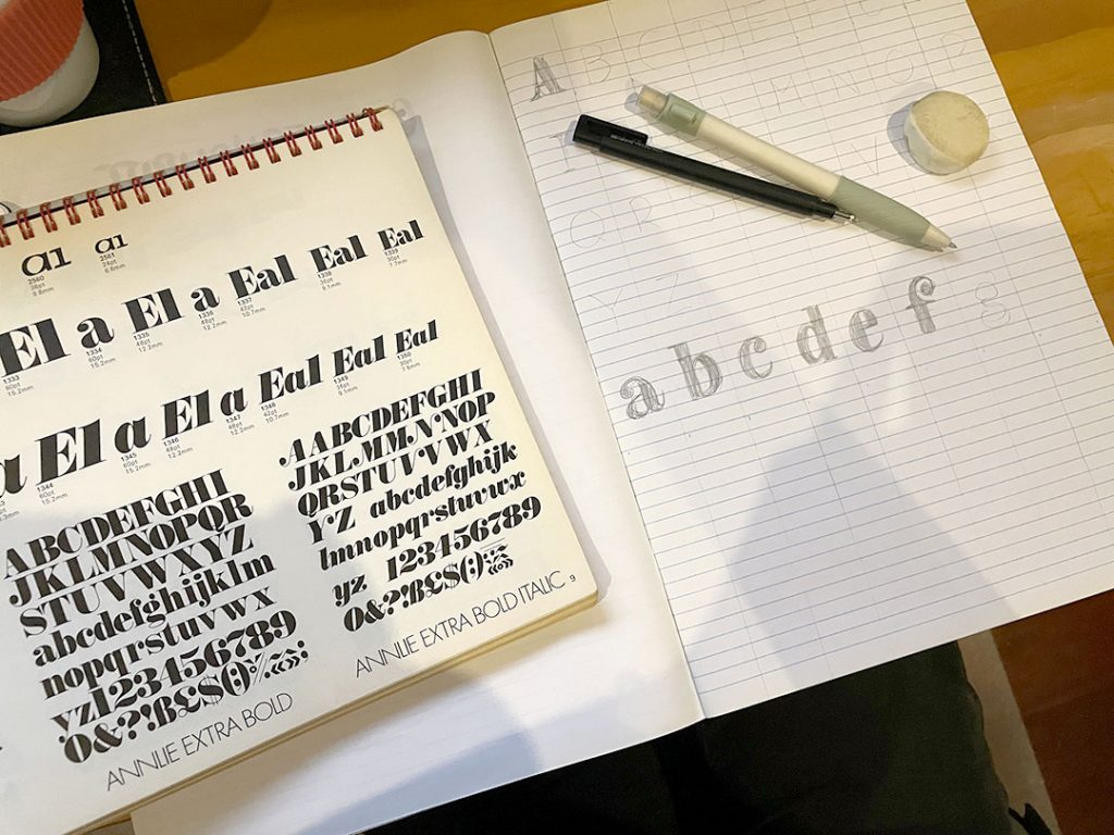
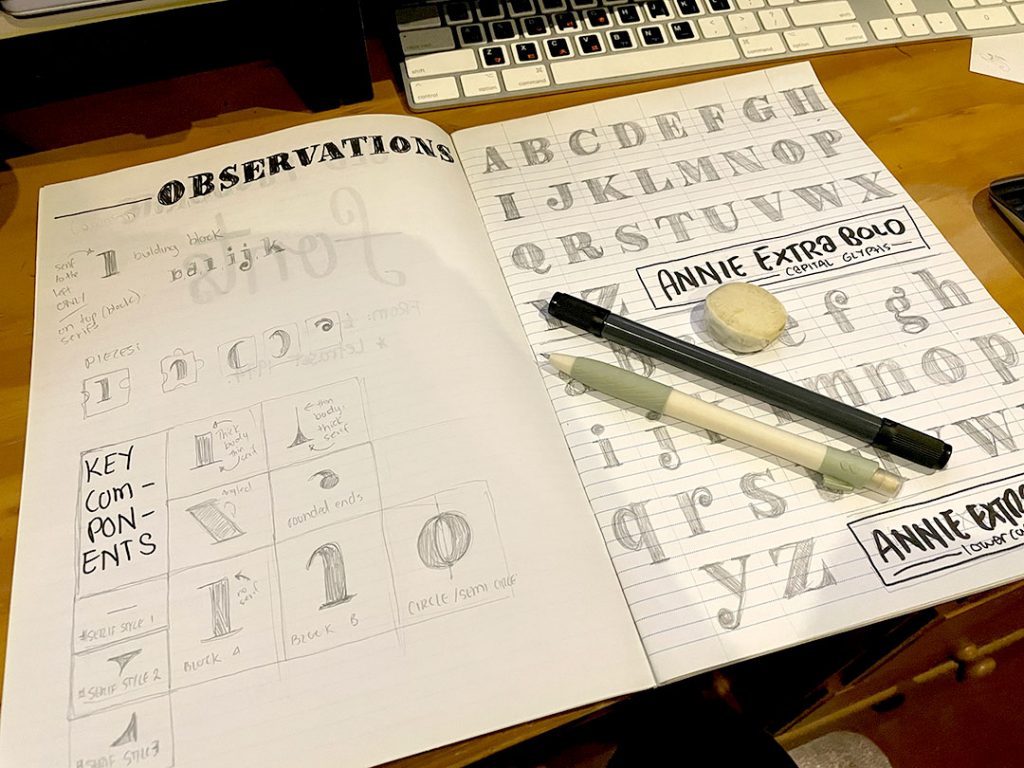
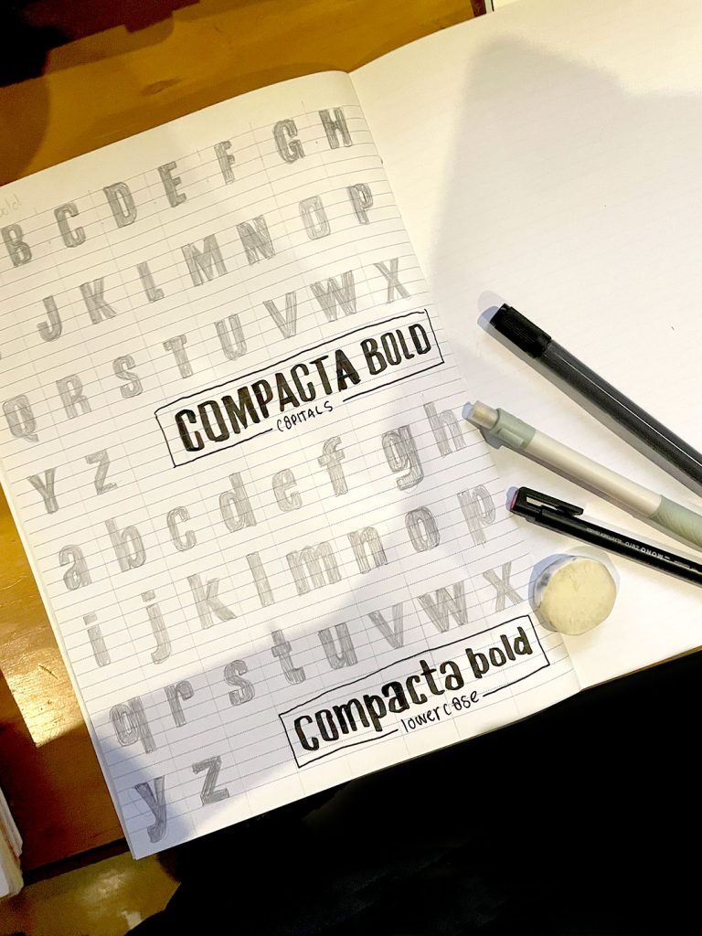
SIDEQUEST: Font Studies in Letraset
Somewhere along the line I also paused the colour project to do an abrupt crash course in different font families from ye old trustworthy font friend, Letraset.
Final Project(s)
At this point you know I couldn’t just do one final project, of course I did three – and added an extra layer of complexity! In unit 4 we started with sketching compositions and adding black ink to them. Unit 5 saw us adding colour to our compositions. So it only felt fitting for Unit 6’s grand finale, to finally translate the skills across to the digital front and complete them on the iPad with Procreate. The final missing piece in this lettering journey.

from the exercises in Creating Compositions for my final submission.
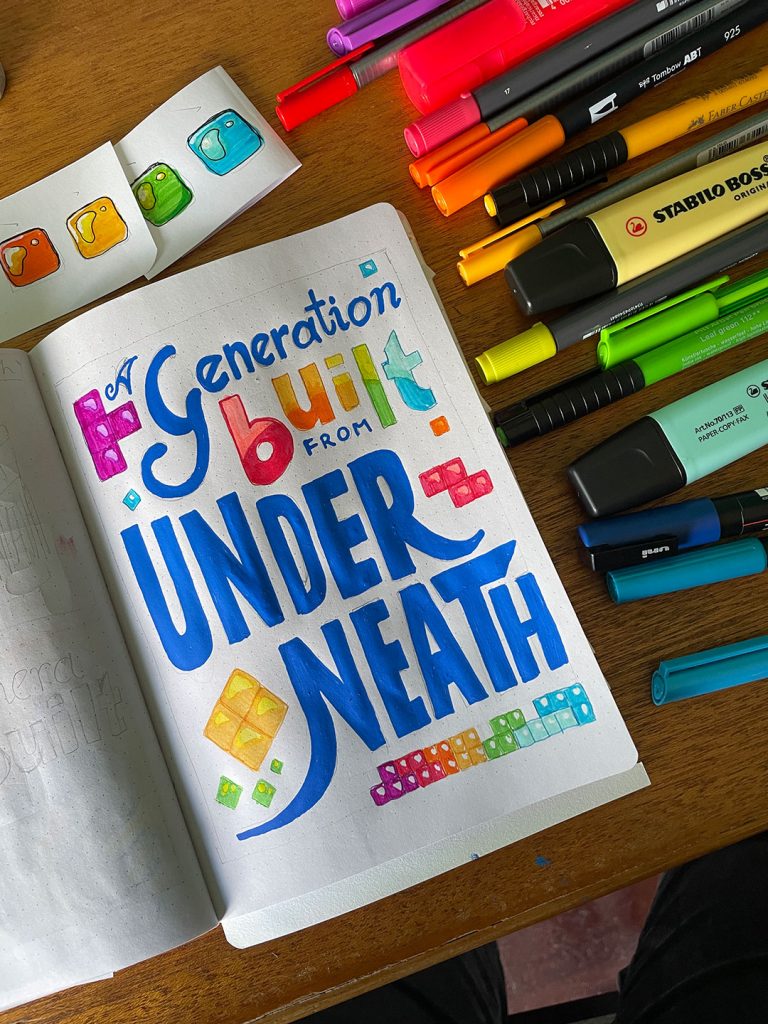
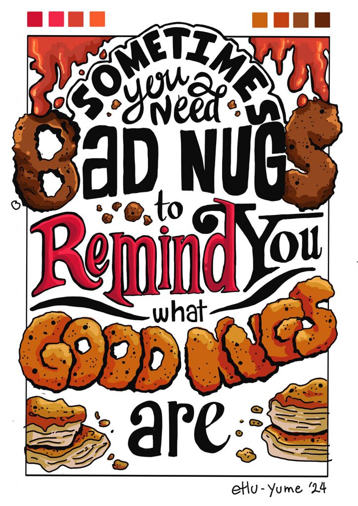
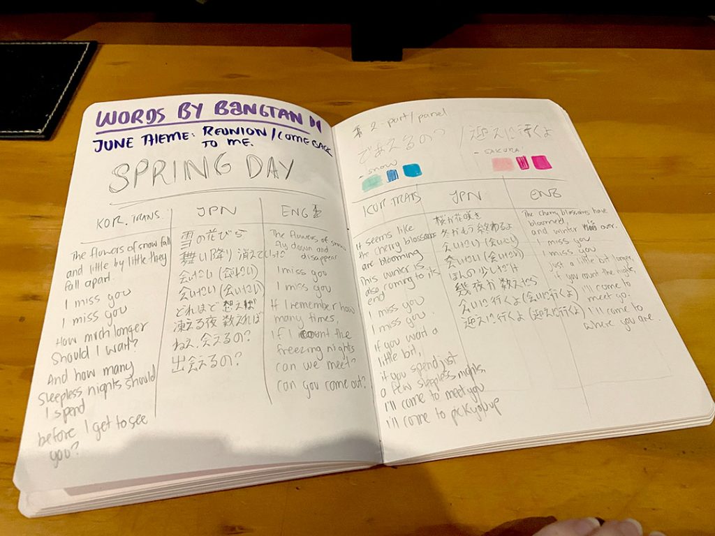
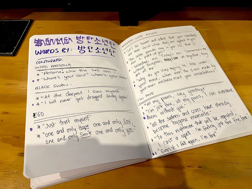
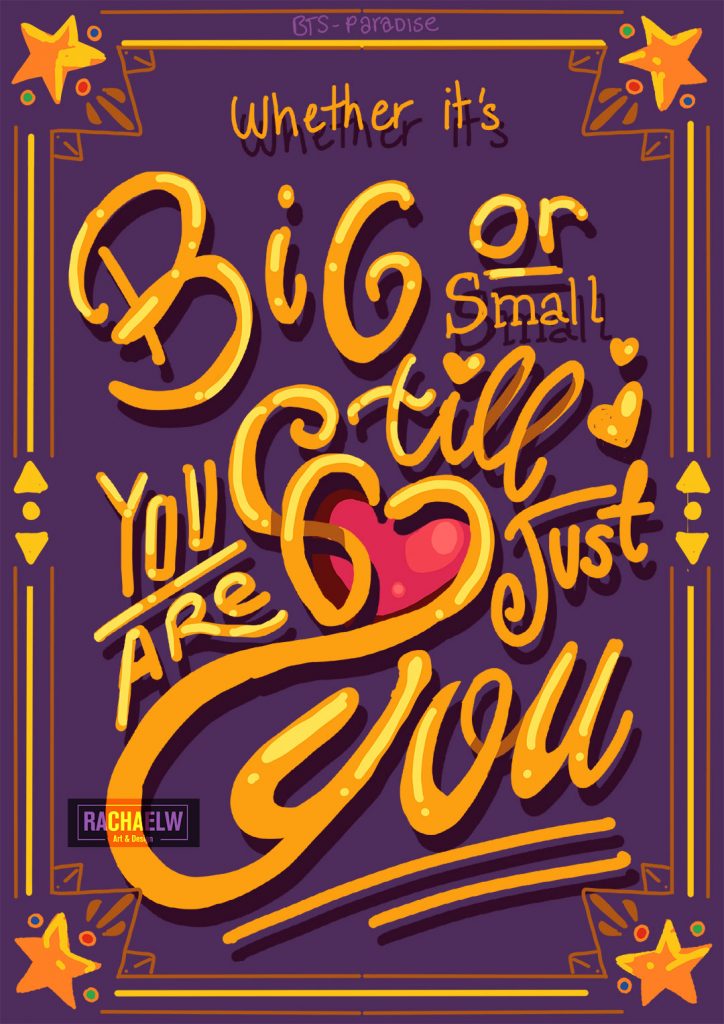
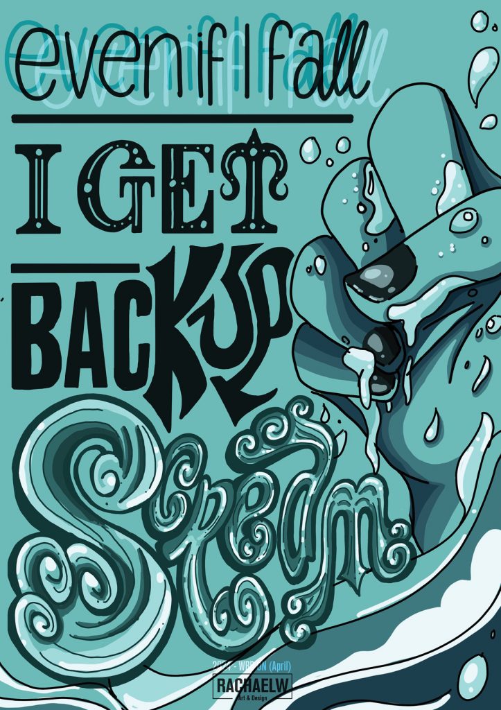
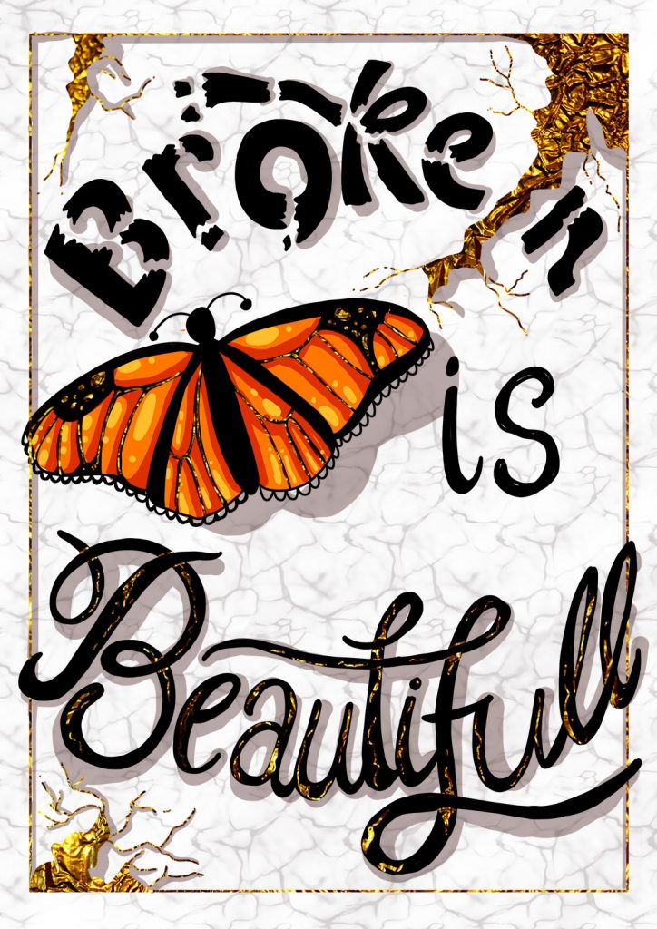
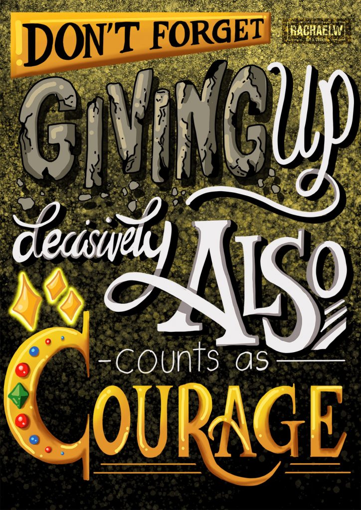
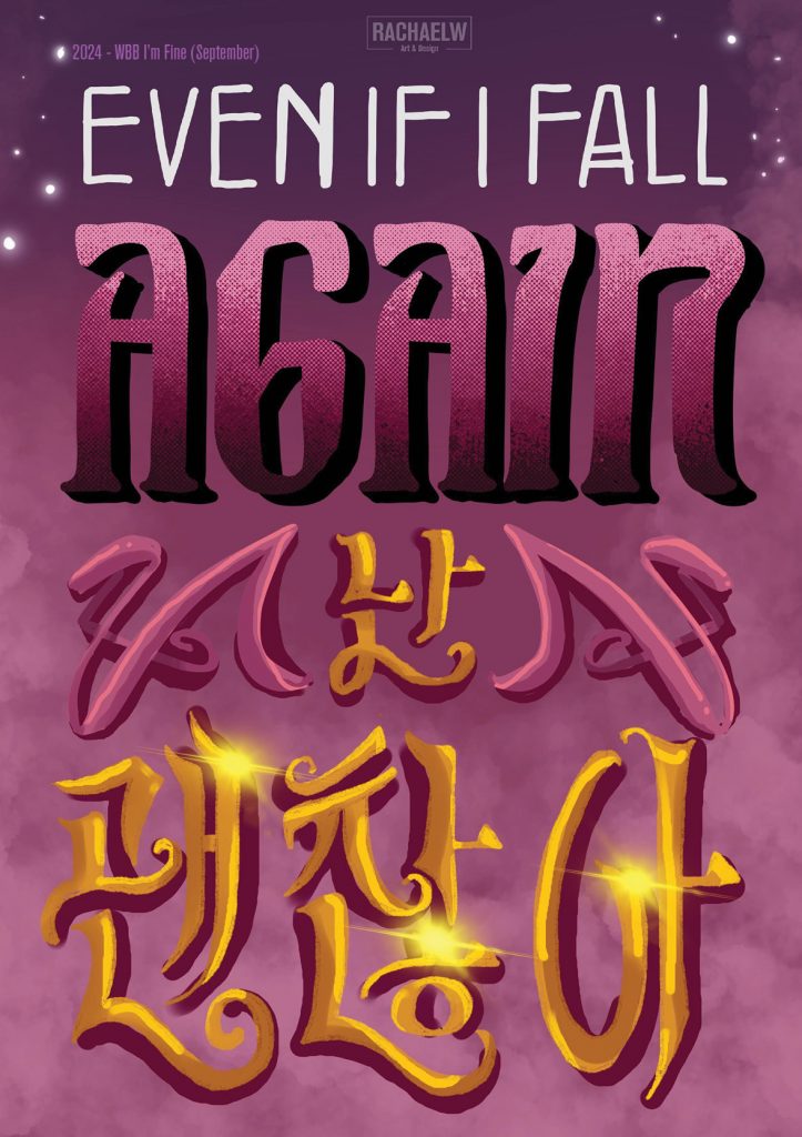
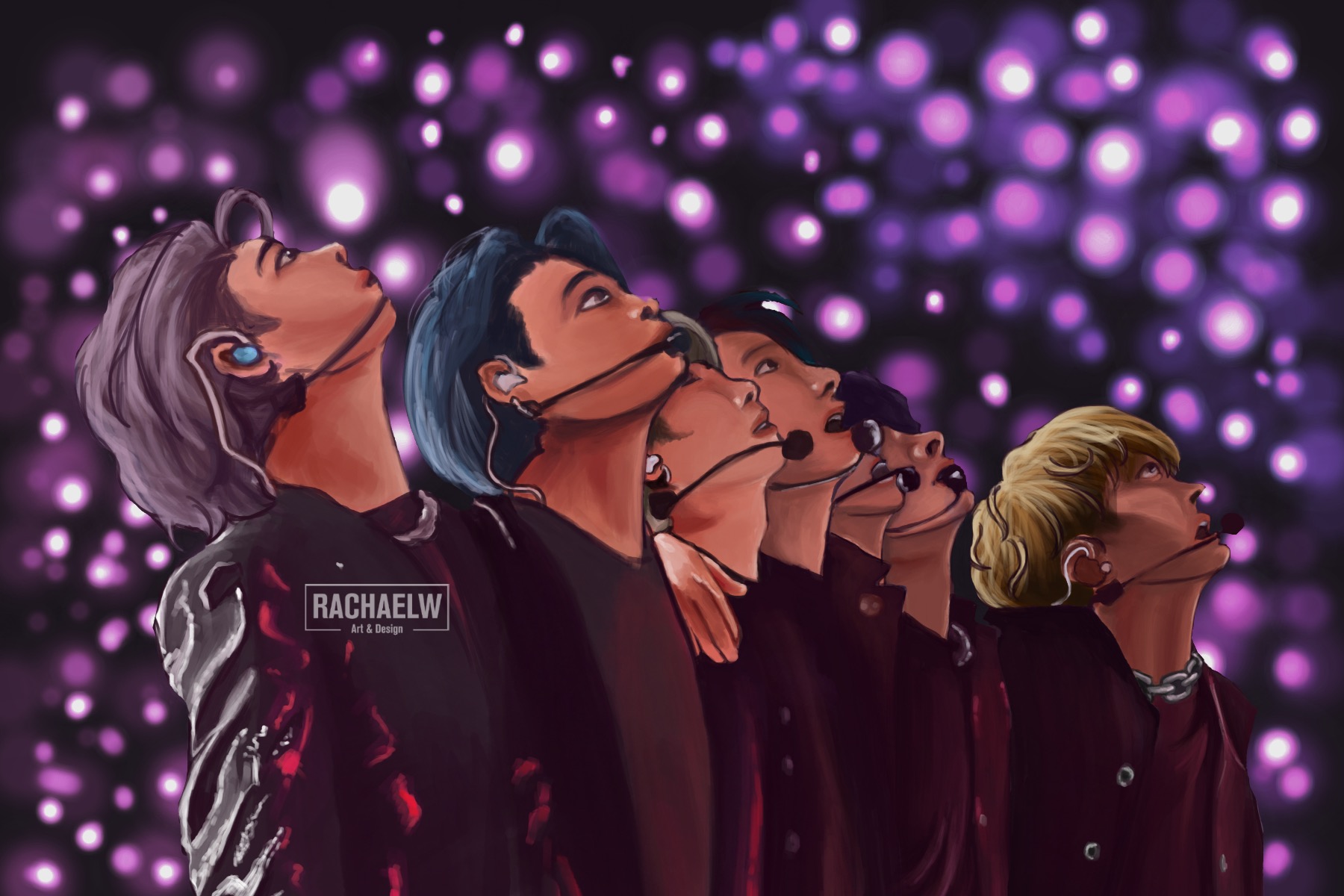
Words By Bangtan (2024)
Words By Bangtan (2024)
Somewhere between 2021-2022 I ran across a monthly challenge within the fandom for Korean group, BTS. As with so many challenges, I would see the posts for the month’s event when it was finished, and forget to keep an eye out for the following month’s theme. “Oh, I should try and do something for that!” Famous last words.
What is Words By Bangtan?
According to the fan account’s carrd from 2021;
Launching a new monthly ARMY event to celebrate the lyricism and words of BTS called #WordsByBangtan! This commences on the 25th of each month, starting February 2021, 12 pm KST. BTS' lyrics have been an instrumental part of their artistry and propensity to build a connection with the fans.

This is an opportunity to showcase our personal connections to their words through a variety of different mediums - lyric analysis threads, sharing our favourite words by them, edits, visualizations, collages, blogs, dance choreographies, films and many many more - if their words ever inspired you to create something or moved you, this is an event for you.

We will also have monthly themes to make it more engaging. It is up to you whether you want to stick to these themes, as they're only created to provide guidance. The only instructions are to credit translations you utilize, use the hashtag, and most importantly - have fun!
words by bangtan, introduction carrd
At the start of 2024, as I was finishing up the final projects for Lettering Sketchbook* and working through Typism’s Lettering Summit, I set out to make a concerted effort to keep a close eye on the Words By Bangtan challenge. When the themes dropped, when the submissions were due. Because without the lettering course to keep me on my toes, how was I going to put these skills to practice? The challenge gave me an opportunity to pursue an interest in the music and lyrical content, while also putting skills gleamed from both the Lettering Sketchbook course and Typism Summit lectures to practical use.
Challenge Accepted (Method)
As is probably expected by this point in the blog posts – project worth doing, project worth overdoing.
- Research: From the get-go in January sketchbooks were filled with notes, pages of lyrics that could apply to the monthly theme (From memory, the majority of Korean-language translations came from doolset, where I could I would translate the Japanese lyrics to the best of my abilities). After all, it’s easier to narrow down options from a short list.
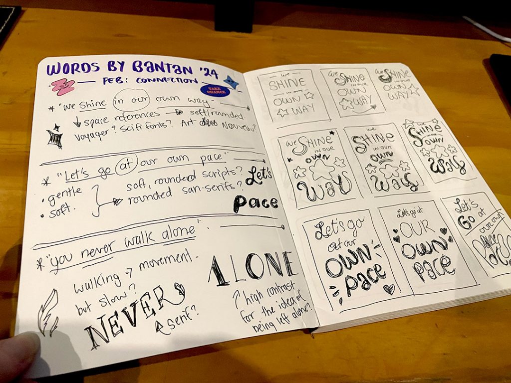
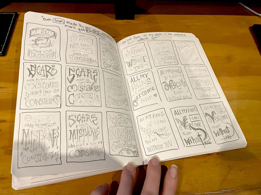
2. Sketches: After narrowing it down to a top 3 or 4 and using it as an exercise to try and do several sketches for each, I would move onto a final composition in another A5 midori dot-grid notebook.
3.Digitally Finishing: Once the final sketch/es were completed, a photo was taken with the ipad, dropping it into a fresh procreate file to finalise composition, colours and add embelishments.
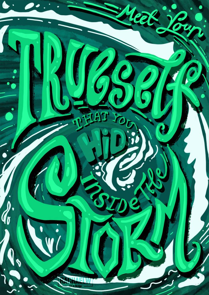
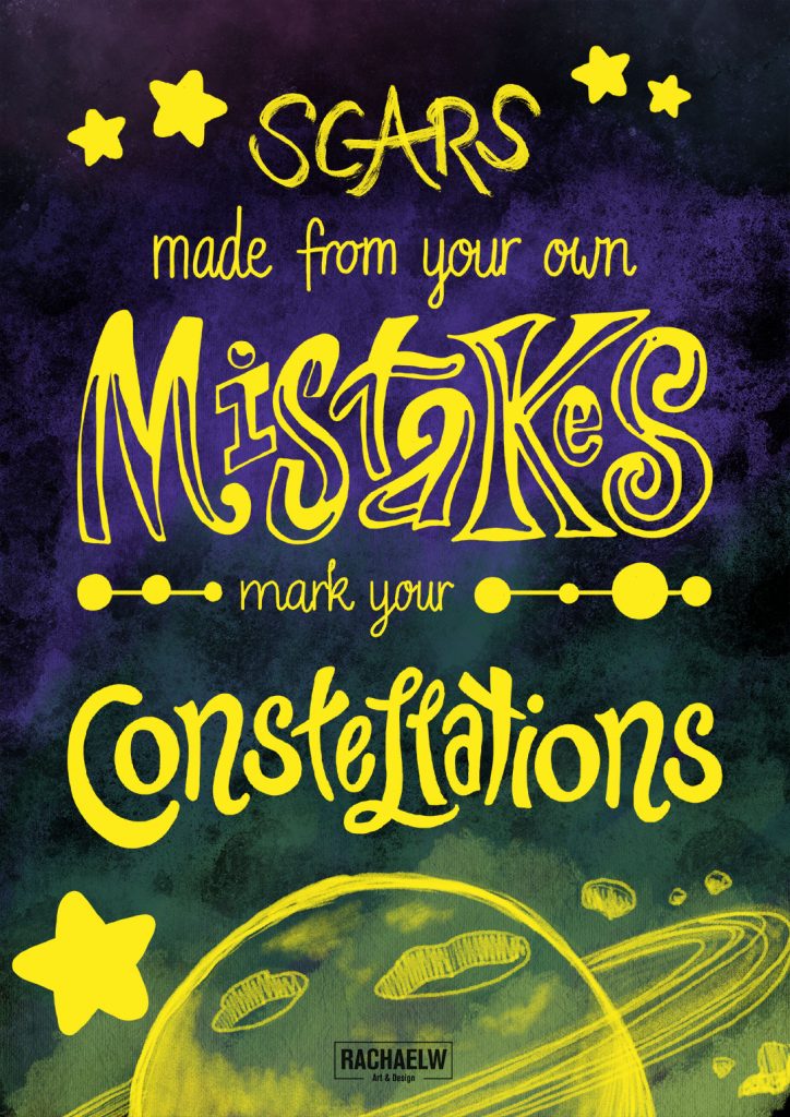
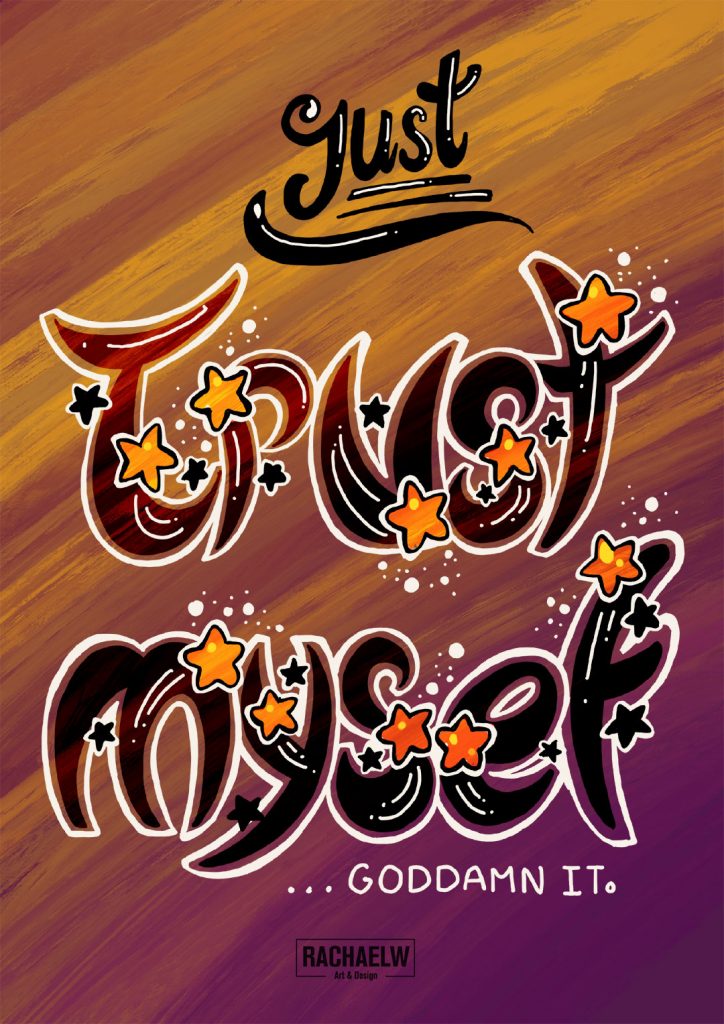
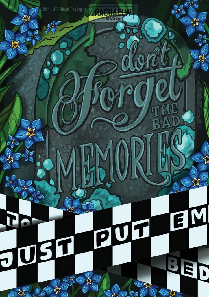
The themes that I participated in from first to last included:
- January: Revolution
- February: Connection
- March: Objection (missed)
- April: Passion
- May: Deconstruct
- June: Reunion
- July: Restoration
- August: Inception
- September: Protection
Overall this was a fun way to launch from Lettering Sketchbook and Typism Summit into continuing to give my lettering work a cause and a reason for practice, as well as diving deeper into the lyrical content of Bangtan Sonyeondan’s rather vast discography.
Links
- Words by Bangtan carrd
- Words by Bangtan instagram | twitter/X
- Doolset lyric translation
- Where to find BTS songs/albums: Spotify, Apple Music, Deezer, Amazon Music, Youtube Music, etc. I’m sure you’ll be able to find it somewhere if you haven’t already.
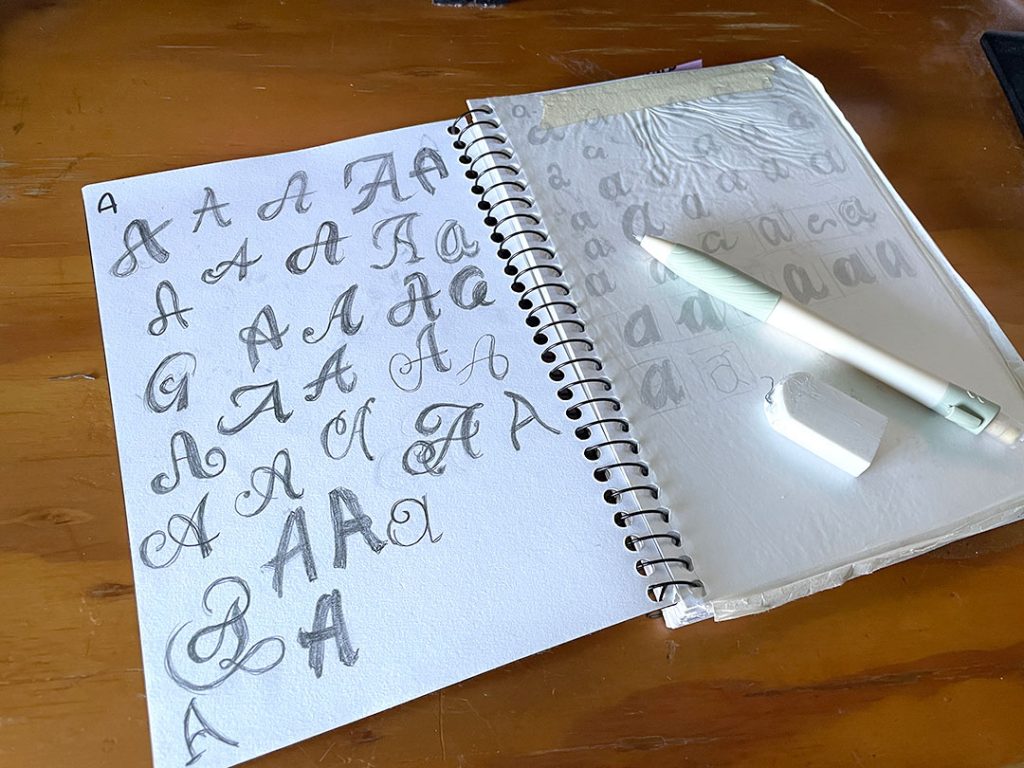
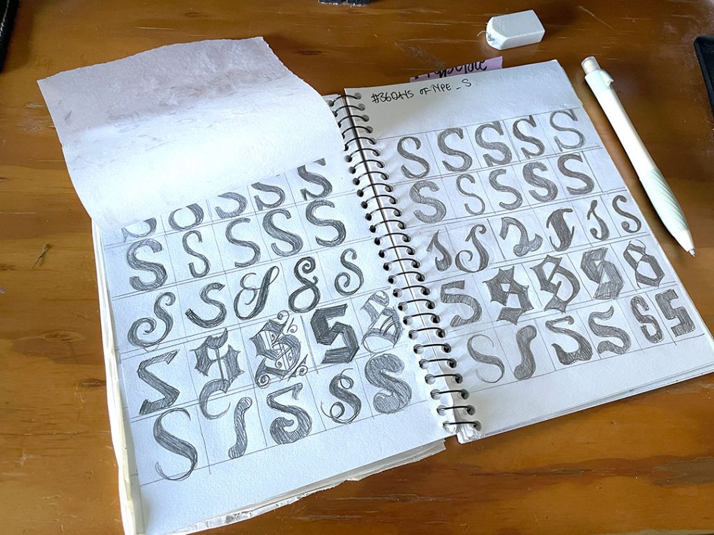
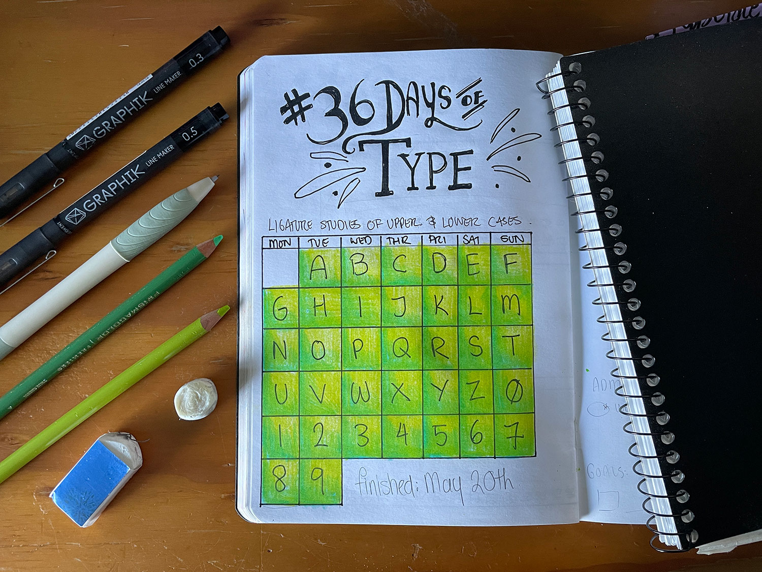
36 Days of Type (2019)
36 Days of Type
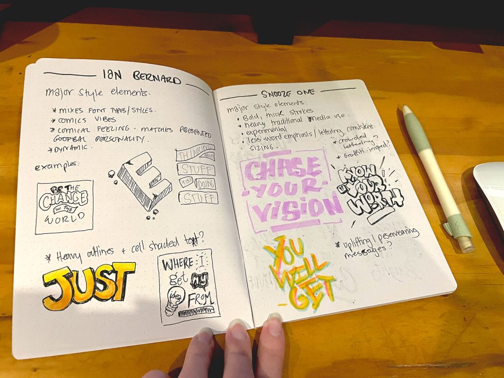
Writing this retrospectively means that remembering exactly who, or where, I found out about the 36 Days of Type. It could have been somewhere like Creative Bloq, or even lettering artists like Jessica Hische, Seb Lester, or Ian Bernard. But I can’t recall precisely where.
36 Days of Type was a challenge to draw a letter or number every day for 36 consecutive days.
It was the kind of once-a-year event that I would find out about after the event, swear to do it the next year, and then proceed to forget until it was over again.
But not in 2019.
At this point the “go hard or go home” mantra is probably pretty obvious. Why stop at a single letter, when it could be a launching pad to level up and work on my visual library of fonts and letterforms?
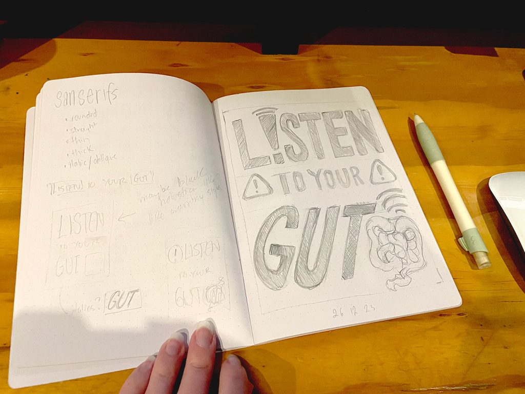
"So, you're putting these off?"
"Yeah. Apparently."
"Why?"
"Lack of variation."
"Lack of variation?"
"This was meant to be a study of ligature forms across a string of styles. All that's been looked at - even though it's a wide category - is Script fonts."
"What do you want to see more of?"
"Base font types - serifs, san serifs. Even some blackletter varients and unical."
Sketchbook notes, 2019
On with the Show
You can see just flipping through the sketchbook that it quickly tightened up from being a loose and aimless “draw as many types of <letter> as you can” to a very structured study with purpose:
- How is the capital <letter> presented across different fonts within five main font groups (Serif, Sanserif, Blackletter, Script, and Display)
- How is the lowercase <letter> presented across different fonts within the main font groups.
Each page was split into 5 rows, one for each font group. The challenge became less about just drawing a single letter and more about finding the ways in which letterforms were being drawn significantly different from each other, yet still recognizably that letter – which ironically meant paying more and more attention to the details. Unwittingly this was developing a skill that would come in handy when trying to identify or match fonts, as often has happened during my time at the printshop.
The final exercise came to 52 pages of letters (26 uppercase, 26 lowercase), with 10 pages of numbers (0-9, single-pages). And probably a little more than 36 Days.

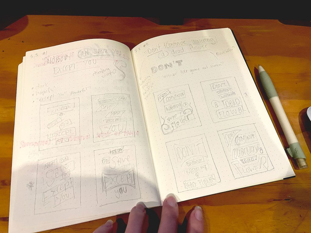
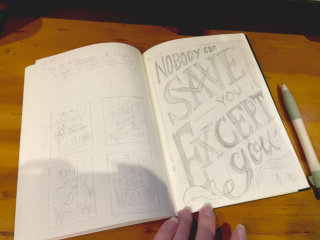
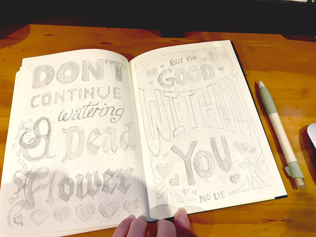
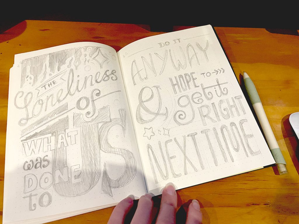
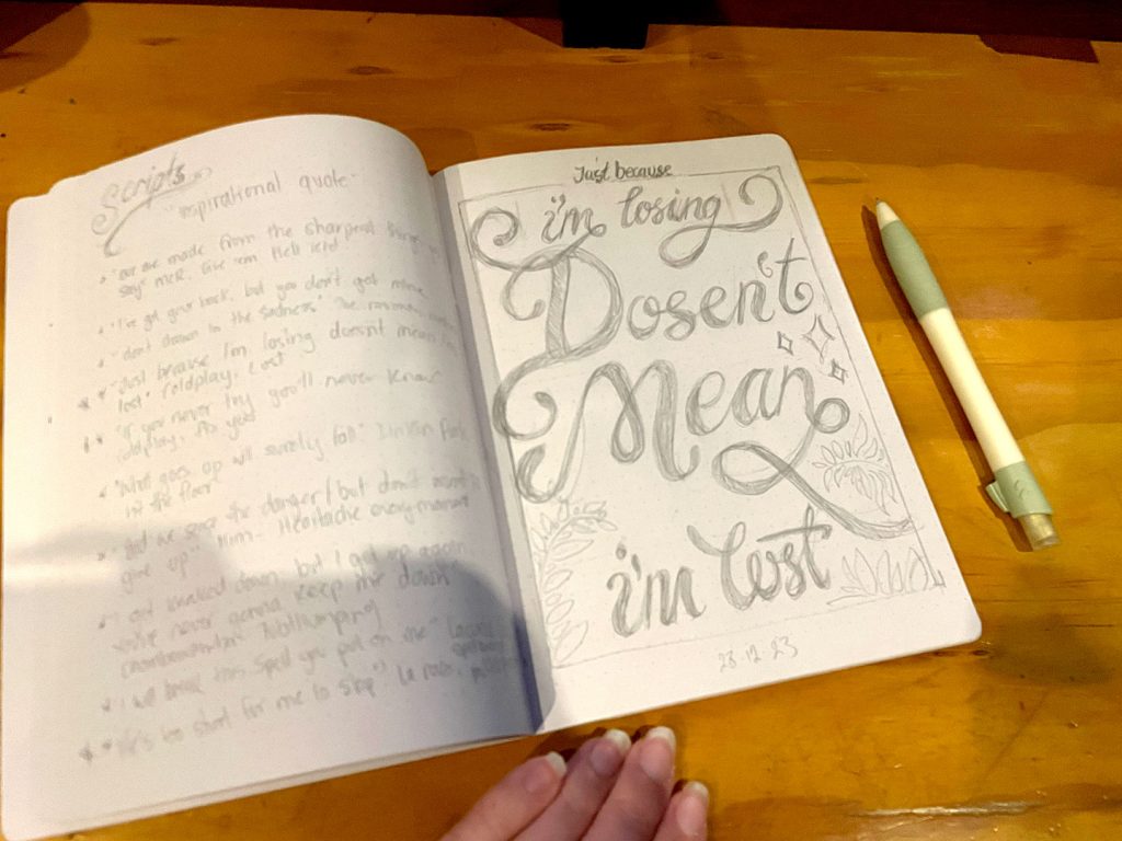
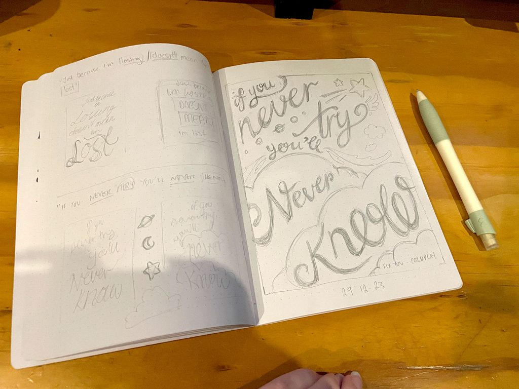
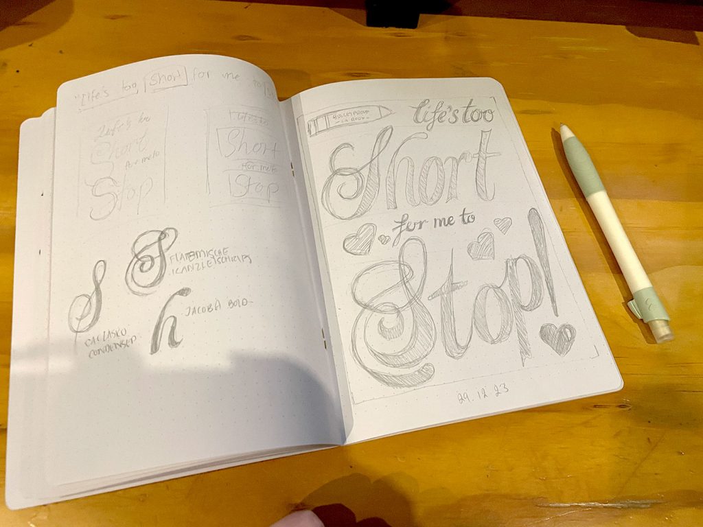
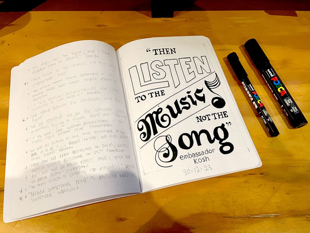
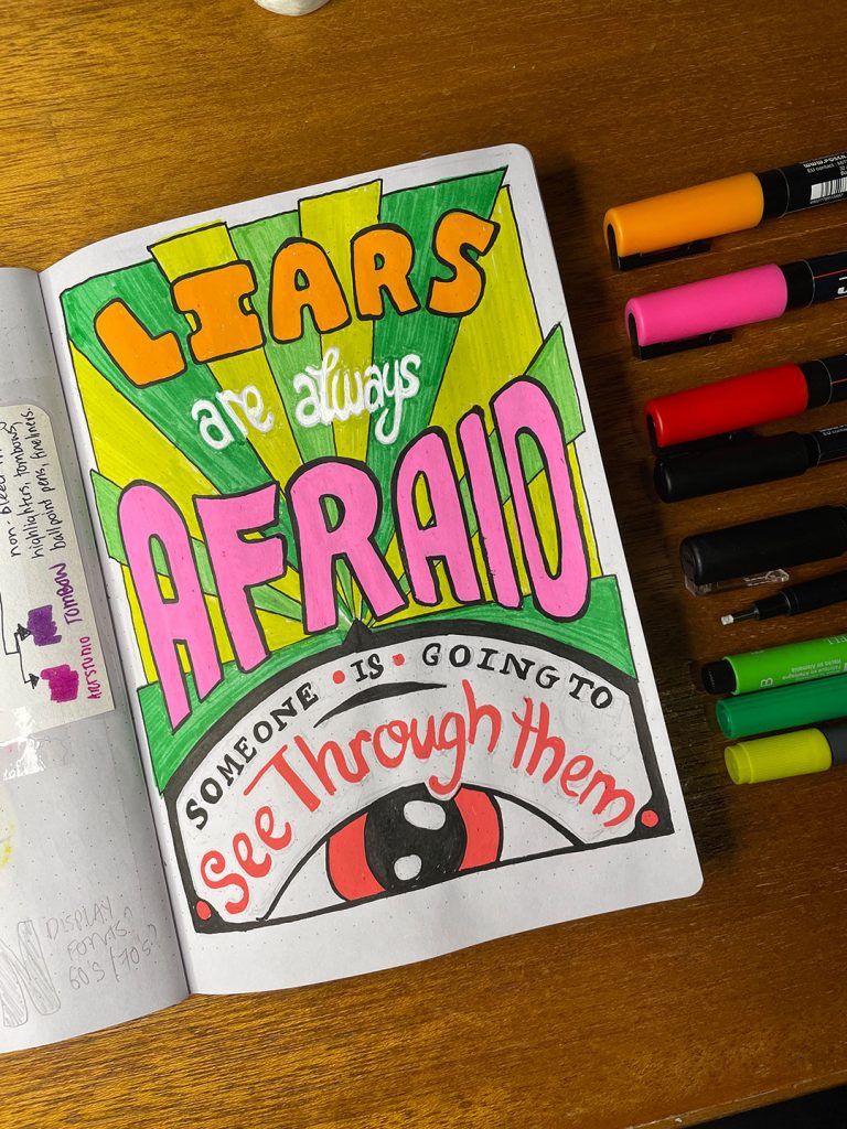
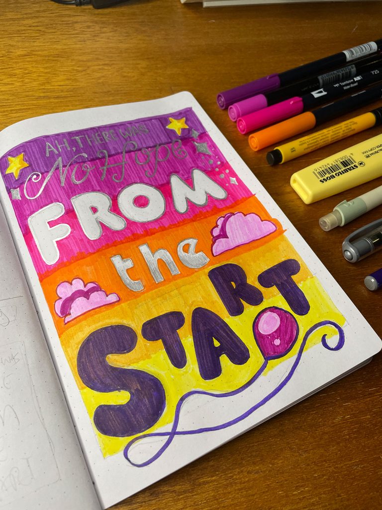
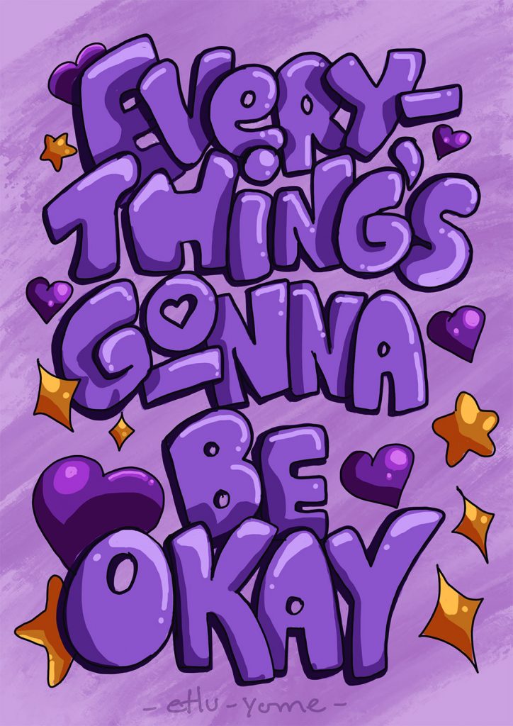
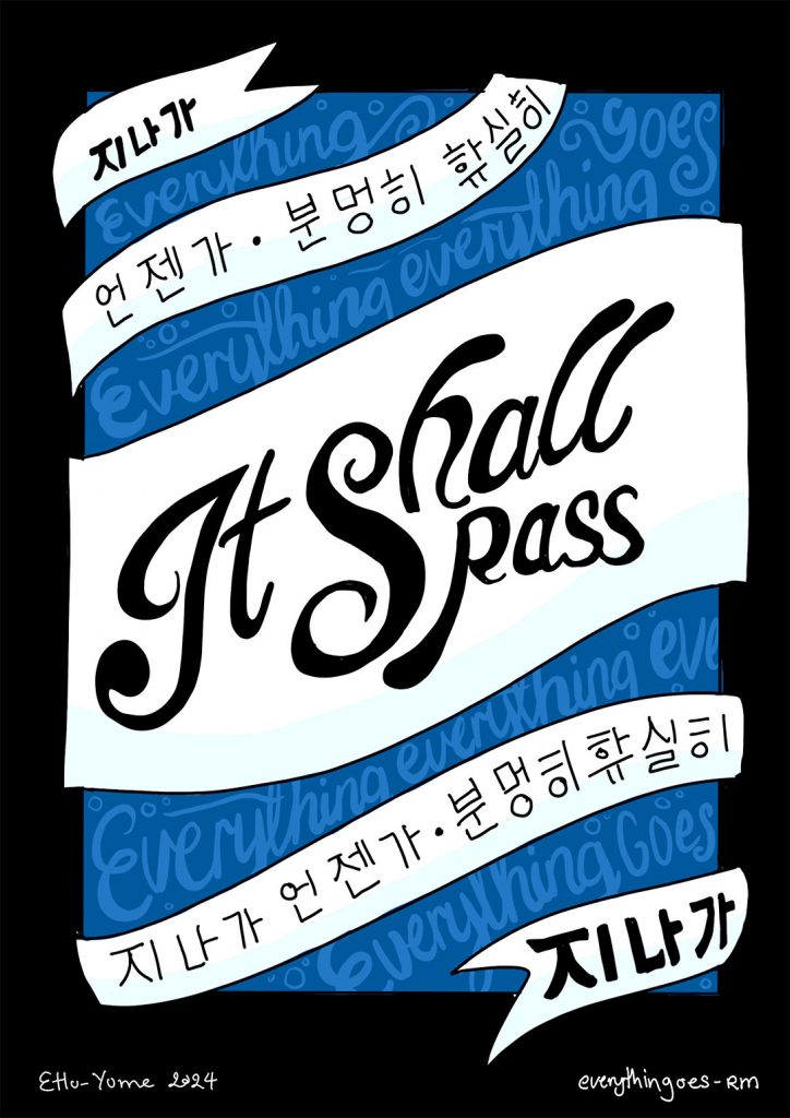
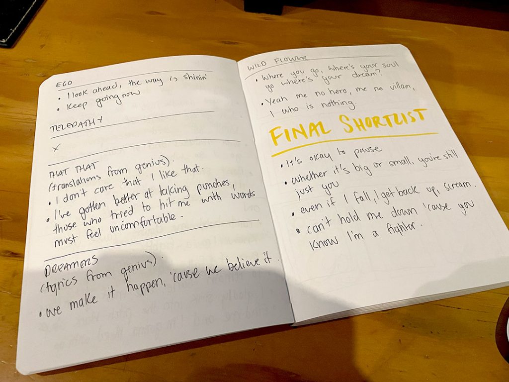
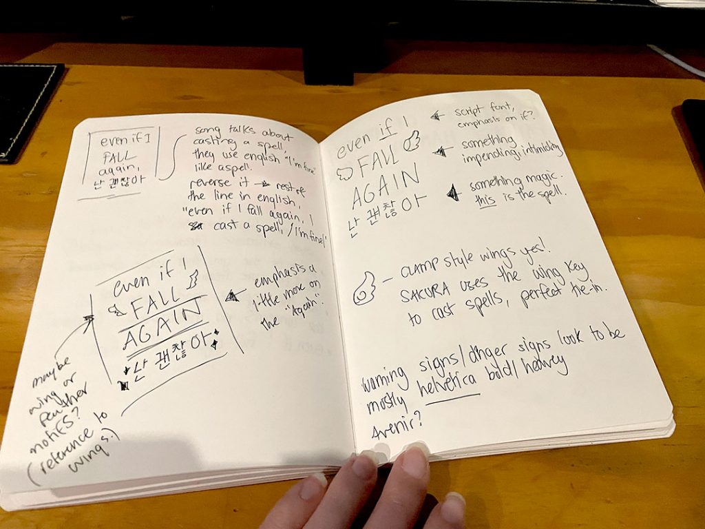
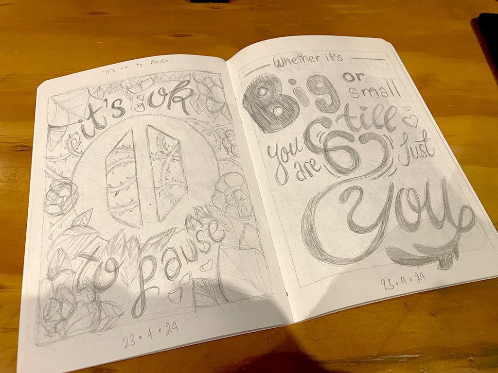
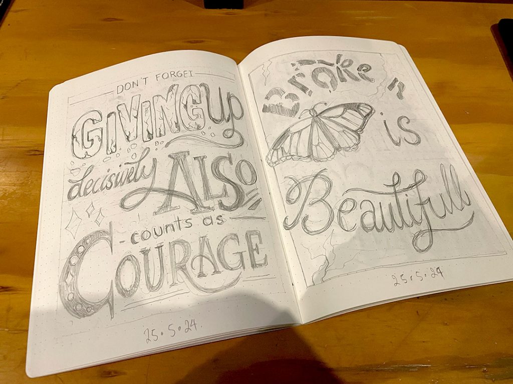
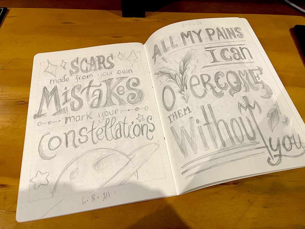
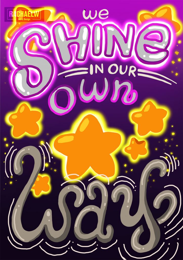
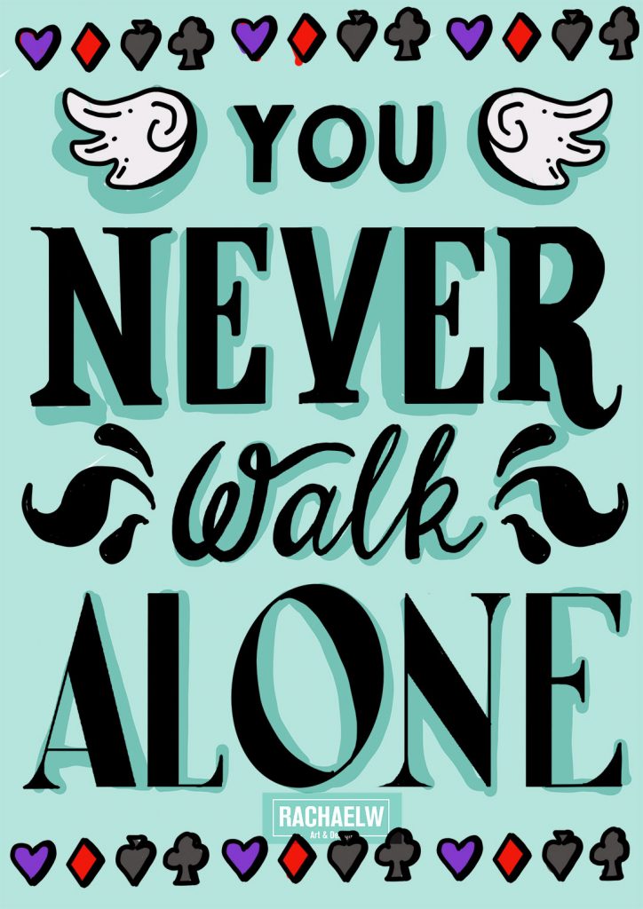
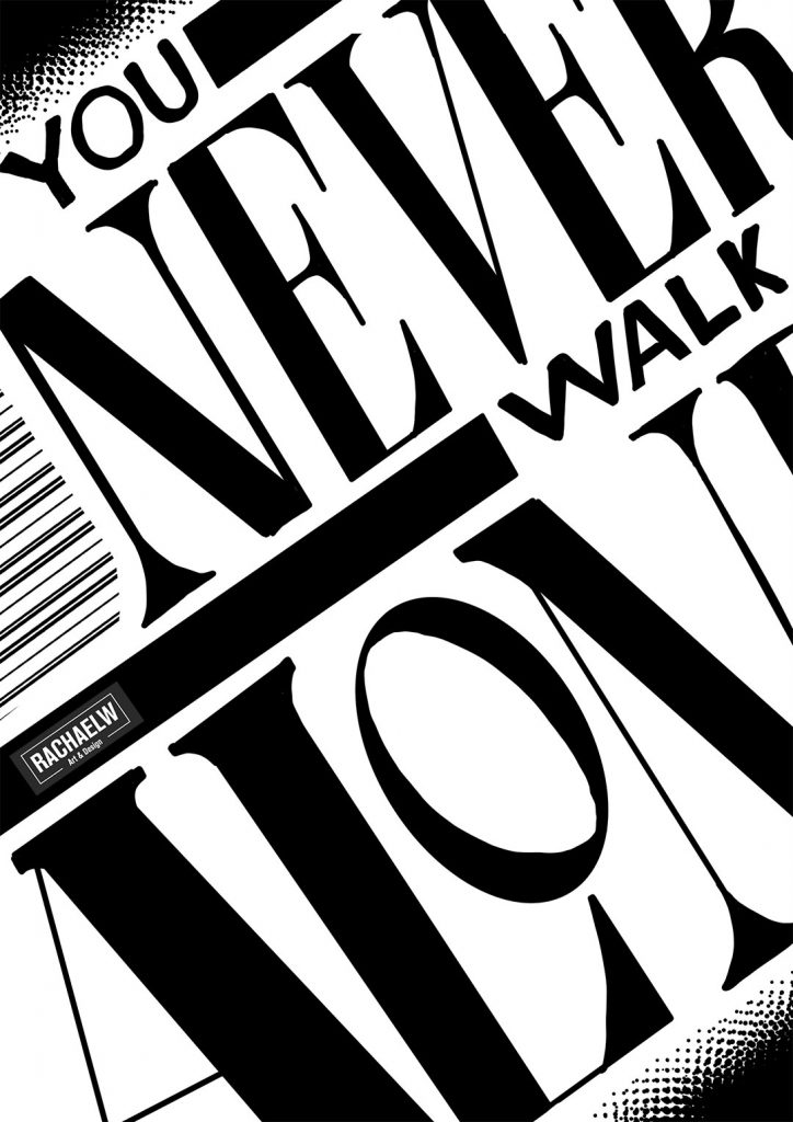
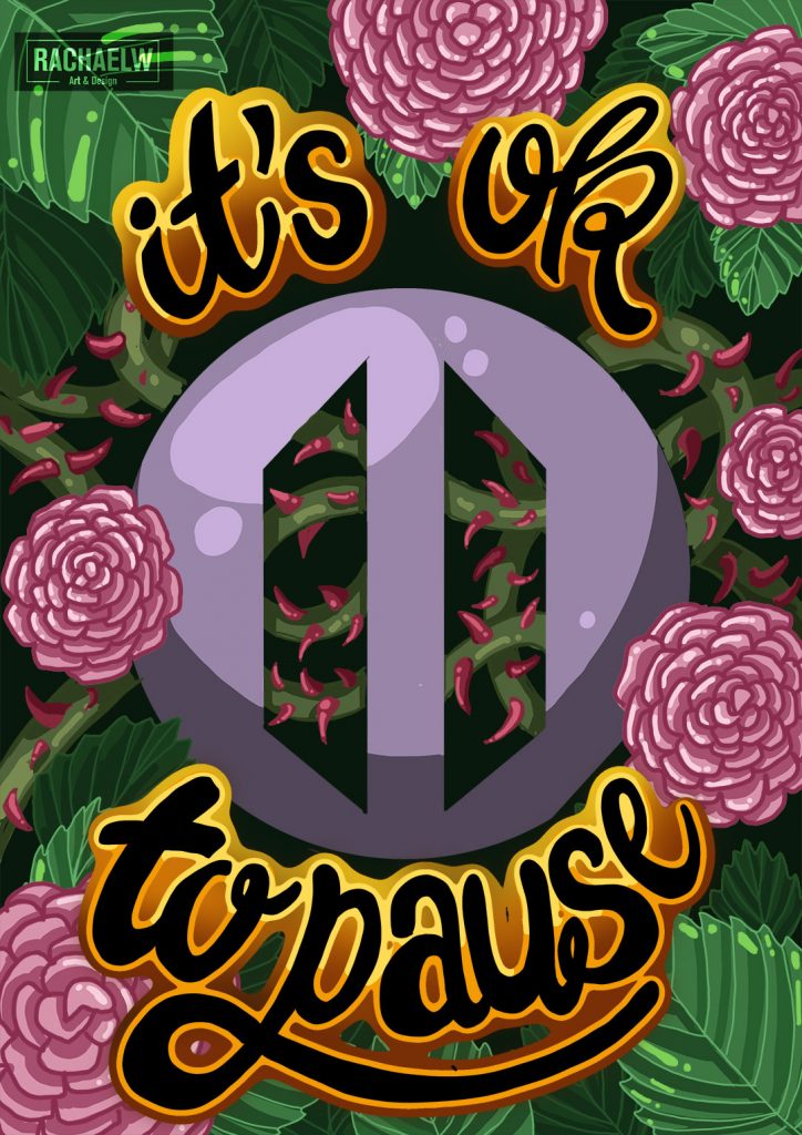
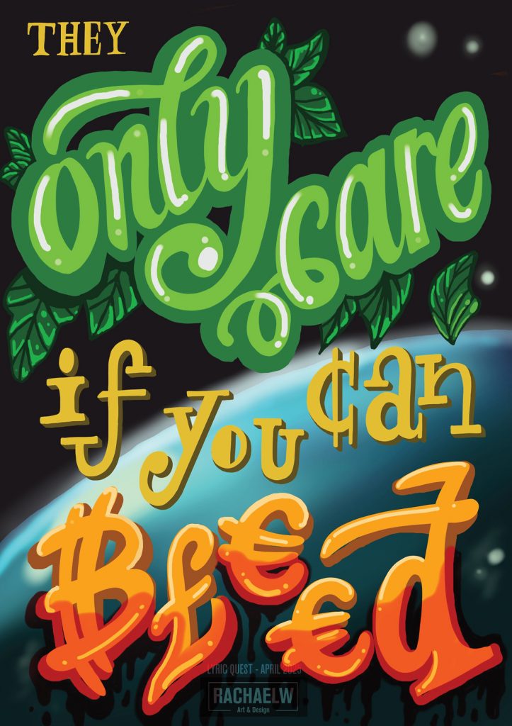
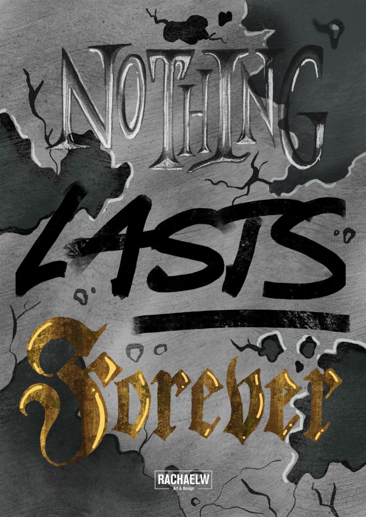
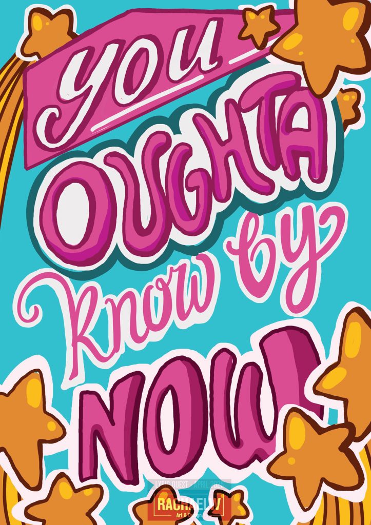
Lyric Quest
Lyric Quest
A prelude of scrap paper sketches, digital noodlings on the ipad by hand, illustrator attempts with premade fonts, and one chunky notebook from Typo that had been filled with lyrics from a high school music collection all easily date back to 2015-2016. To say this was a new skillset and a new interest, would be foolish.
So in the wake of Lettering Sketchbook*, the Typism Creative Summit, and particularly the hiatus of Words By Bangtan* in September 2024, everything came together to embark on this project. Properly. Once and for all.
Lyric Quest.
The objective was, essentially, simple.
- Find lyrics that appealed
- Applying lettering to the phrase.
- Sketch, finalise, polish.
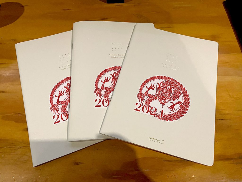
With the best of intentions I started 2024 buying 4 Midori dot-grid notebooks, having completed the Lettering Sketchbook course, intending to continue working on my lettering by gradually filling one book per quarter. Nice idea, terrible execution. December rolled around to my horror to realise I had barely finished one of the notebooks, let alone all four.
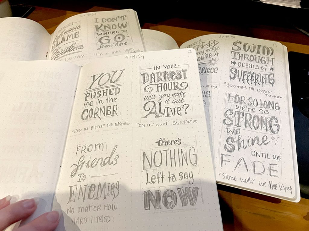
SKETCHBOOK SIDEQUEST
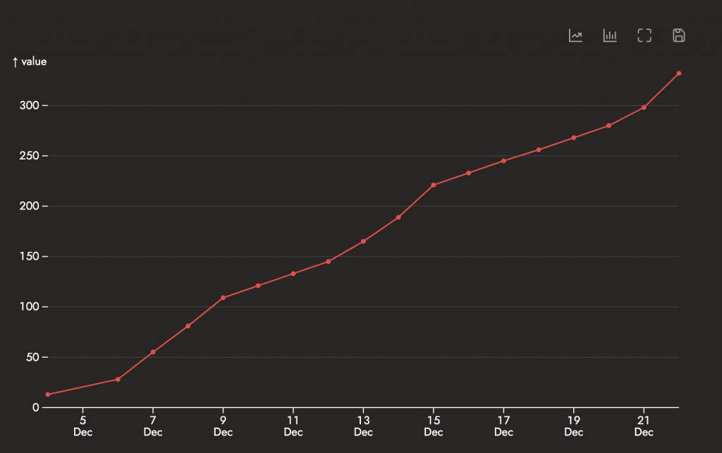
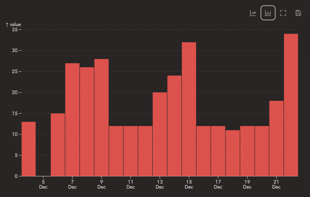
Three books, and 25 days (or so) to the end of the year. Each book had 28 pages, counting both sides of a paper sheet, for a total of 84 pages / 48 leaves. Eventually I split each page into quarters, queued up my library of liked songs, clicked shuffle, and hit play.
Some days were slow, some days were fast. Flipping through the books later is an experience of its own; between the subject matter that stuck out and the evolution of confidence in setting up pieces. In the end I was managing somewhere in the realms of 4 to 12 sketches a day (1 to 4 full pages), managing to finish 332 sketches by the 22nd of December.
Yeah, I’m still not sure how I did it either.
LYRIC QUEST – IT BEGINS
Sketchbook Sidequest fulfilled its purpose in establishing quite the future backlog of pieces to work through.
The project is ongoing – there are no guarantees that all 332 will be completed.
Typism Skills Summit 2024
Typism Skills Summit 2024
A 2022 post by lettering artist Ian Barnard put me onto the Typism books and by extension, the Typism Community. Based out of the Gold Coast, Australia, Typism is not only a community hub full of inspiration, but resources and skill summits. Subsequently I signed up for their newsletter, and pre-ordered a physical copy of Typism Book 8.
Two years later, as I was finishing up final projects for Lettering Sketchbook*, the 2024 Typism Skills Summit rolled around. It was perfect; I had built up some basic skills during the sketchbook course, and the summit was taking place over a long weekend. At some point between signing up for a free ticket and day 1, I decided to splurge the extra $60USD or so to upgrade to the VIP ticket and get all the extra bonus freebies, brushes, worksheets, and newsletter sign ups.
I sat down on January 26th for Day 2 with a hot cup of tea and some old sketchbooks with blank pages to fill:
It was time to level up.
1. SKILL UP: COMPOSITION
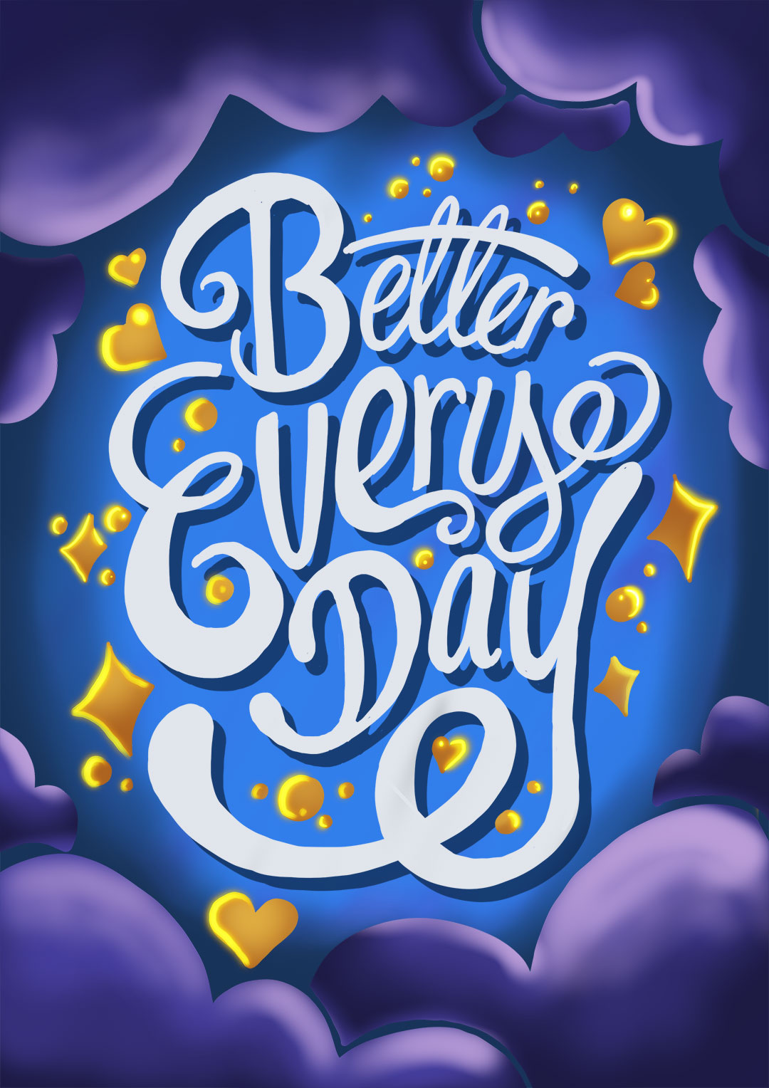
Vinithra Mammen’s talk about ways to create balanced lettering compositions got me started on taking the theory I was picking up throughout the days’ lectures and applying it in practice. She was the last speaker for Day 2 – so afterwards I could mess around with the prompt she gave viewers (“Better Every Day”). It was a good excuse to work outside of my comfort zone, at the time I had done very few lettering pieces digitaly. It turned out well – and to my surprise, even recieved a featured shout out in the Typism blog post (“Celebrating artwork from the Typism Skill Summit“).
Bonus EXP: Digital Lettering (+1)
2. SKILL UP: BOXY LETTERS
Day 3 featured Liz Volpi Impastatio’s creative workshop around Boxy Letters, creating fun and quirky cards for Valentine’s Day. The chunky, big lettering style reminded me of the “carve it out” exercise in Joanna Muñoz’s Lettering Sketchbook course. The examples were bright and fun, and I aimed to carry that across into my practice piece.
Bonus EXP: Digital Lettering (+1)
Because I started a day late, I caught up on Day 1’s lectures after the summit officially ‘ended’. And at the end of the last talk, I made a list of things I wanted to practice from the summit. Practice projects, to reinforce what I’d heard and made notes about.
3. SKILL UP: 3D LETTERING
Nico Ng’s talk touched on ways to simplify 3D Lettering, narrowing it down to three key types – Oblique, Isometric, and Perspective. Of course, that meant to put what he spoke about into practice, I had to do three pieces. One for each type he covered. Though I might have to revisit this again…
EXP: 3D Lettering (+3)
Status ailment: ??? Perspective ???? Math ????
4. SKILL UP: SCRIPT LETTERING
While there were several script lettering speakers at the summit, Thomas Hoyer and Maria Montes’ talks particularly resonated. Hoyer’s talk focused around flourishes, the lines and loops and angles, which paired nicely with the “Principles of Script Lettering” introduction from Montes. I got to pull out a few different pen types and play around in these notebooks, before throwing down pencils for another practice piece to call this skill check-in complete.
Bonus EXP: Loop-y Loop (+1)
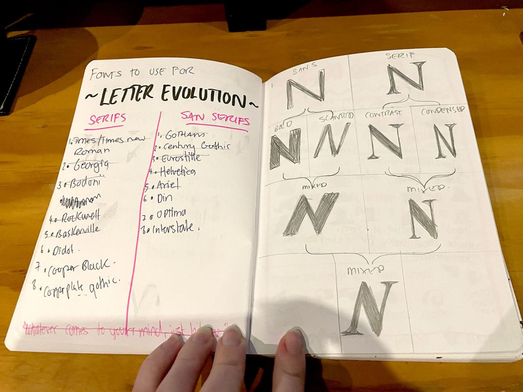
5. SKILL UP: TYPE EVOLUTION
Technically Jimbo Bernaus’s workshop exercise only asked for a single evolution stream; a san-serif split into bold and slanted, a serif split into contrasted and condensed. And then the results recombined. But if you read Skill Up 3, you can see where this is going, right? Yeah. The talk was called “Letter evolution: Build letters with confidence“, and this was me. Building confidence. Because if I learnt anything from the 36 Days of Lettering** project, it’s that not all letters (or fonts) are the same.
EXP: Letterform Structure (+1)
7. SKILL UP: BLACKLETTER CALLIGRAPHY
Blackletter calligraphy was another topic that stuck out to me from the three day summit, especially talks from Tamer Goniem demonstrating techniques with colour inks, and Jacqueen Ortiz-Nunog’s dive into Blackletter. Using the supplemental worksheets from Jacq’s bundle goodies, I dived into playing around with the calligraphy brushes I had on hand to go over the drills supplied for stroke control and muscle memory (because, as seen in exhibit 3 and 5, we have form. Worth doing once, worth doing thrice).
With the strokes reinforced, I pulled out my copy of Medieval Calligraphy to reference stroke orders for font samples pulled from the 13th to 15th centuries (“Gothic Textura Quadrata”). These styles were closer in line with Tamer and Jacq’s works than the earlier Unical styles also covered in the book. Following stroke order for the blackletter fonts was oddly familiar, and it took me a while before realising it’s because drawing Kanji characters follows a similar pattern where being drawn (and catalogued) relies heavily on specific strokes.
I still am yet to pull out the nibs and nib holders to mess around with ink for ink’s sake – but playing around with Artline Calligraphy Pens and making other markers confirm to blackletter strokes has proven therapeutic enough as a starting point.
EXP: Traditional Penmanship (+1)
Note: Pages of columns of Blackletter calligraphy are from 2025, recreated in the same style as original exercises from 2024.
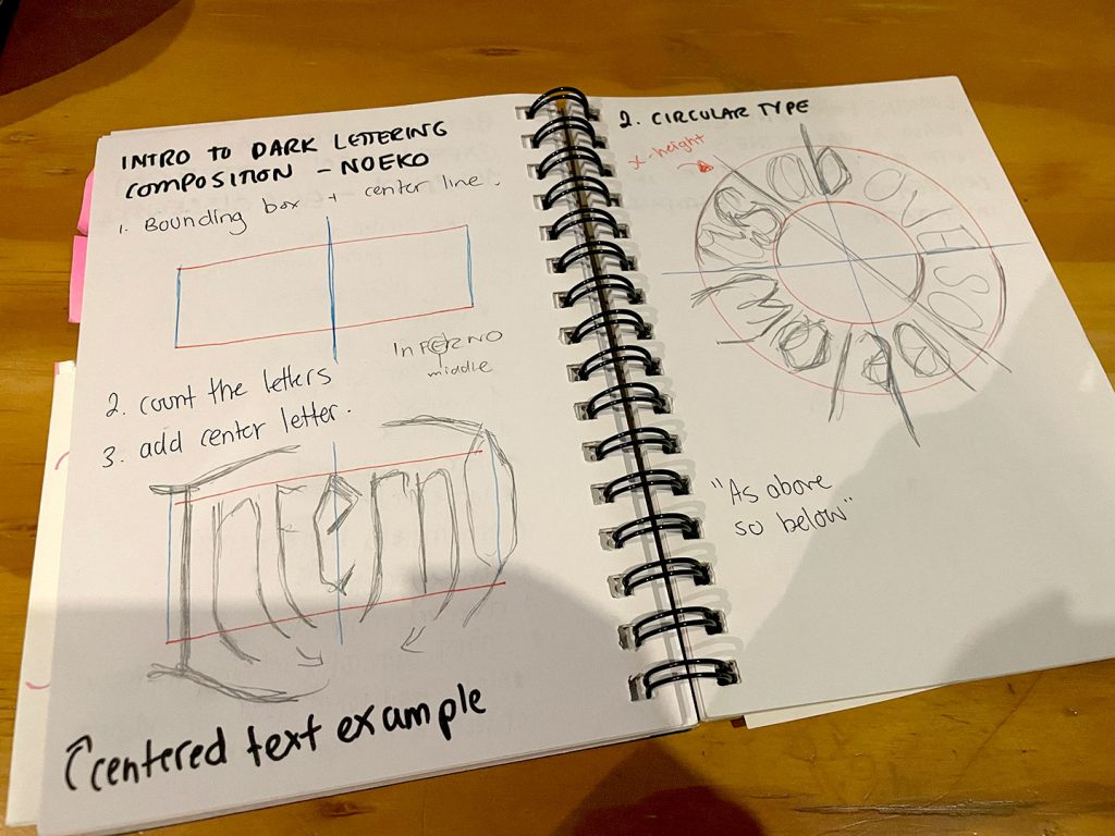
8. SKILL UP: DARK LETTERING
Initially just based on the talk’s title I was expecting Noeko’s Dark Lettering to be another variation on blackletter calligraphy, like Tamer and Jacq’s talks. I was quickly proven wrong, and the influence of heavy music in the work she presented piqued my interest even more. How to give letters those darker, sharper shapes and where (or what) to emphasise when it came to specific parts of letterforms.
(I need to visit this again – I may have flown a little too close to the sun here and gone from “dark lettering fun” to “needs to refer to notes to understand what it means”)
Bonus EXP: Circle Math (+1)
9. SKILL UP: VICTORIAN LETTERING
And of course I saved my favourite style for last – Sushimoon’s Victorian Lettering workshop. I was looking forward to this one, having played with more decorative fonts out of old Letraset books and gems like the Vintage Type Graphics book I picked up from the university store many moons ago.
Needless to say I had some fun with these.
EXP: Nostalgia Lettering +1
IN CONCLUSION:
While it took me much longer to get through all the talks than just the three days it ran for, needless to say I got a lot out of the Typism Skills Summit. It pushed me to try new things, or approach skills I already had in a different way. There are definitely pieces that came out of this that I’m still proud of two years later, and no doubt it has gone on to inform my lettering practice since.
Summit Results:
+11 EXP Digital Lettering
+46 EXP Traditional Lettering (Pencil, Pens)

Skill Level Up!
- Composition
- Boxy Letters
- 3D Lettering (Isometric, Oblique, Perspective)
- Script Lettering (Flourishes)
- Font Fusion/Evolution
- Blackletter Calligraphy (Calligraphy Pen, Key Strokes, Font Styles)
- Victorian Lettering (Ascenders, Descenders)

New Skills Acquired!
- Dark Lettering (Horizontal, Round)
TO FIND OUT MORE…
– Typsim Community: https://www.typismcommunity.com/
– Typism Summit: https://www.typismsummit.com/
– Ian Barnard: Instagram / Linktree / Youtube / Resources
– Vinithra Mam: Instagram / Linktree / Website
– Liz Volpi Impastatio: Instagram / Links / Website
– Nico Ng: Instagram / Website
– Thomas Hoyer: Instagram / Website
– Maria Montes: Instagram / Linktree / Website / Educational Resources
– Jimbo Bernaus: Instagram / Educational Resources
– Tamer Goniem: Instagram / Website / Educational Resources
– Jacqueen Ortiz-Nunog: Instagram / Links / Website
– Noeko: Instagram / Links / Website
– Sushimoon: Instagram / Links / Website
*Lettering Sketchbook – Blog post to come, a Domestika course by Joanna Muñoz. Completed during 2023/24.
**36 Days of Type – Blog post to come. Inspired by the 36 Days of Type a study looking at different lettershapes and forms across capitals and lowercase characters, across a range of typefaces. Completed May-June 2019.
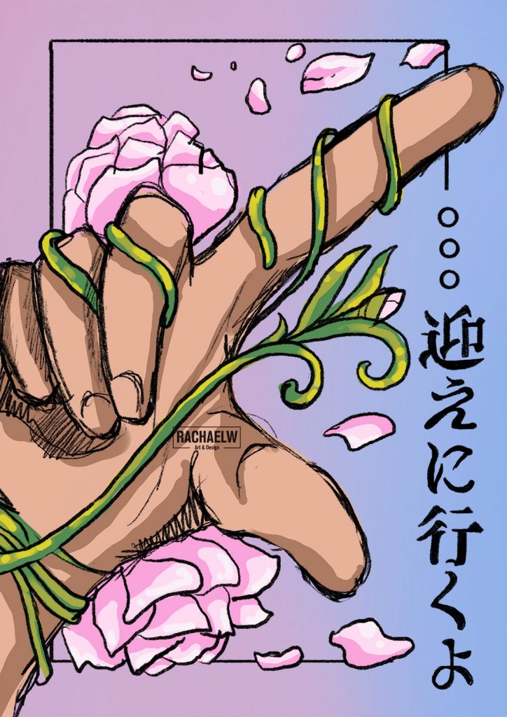
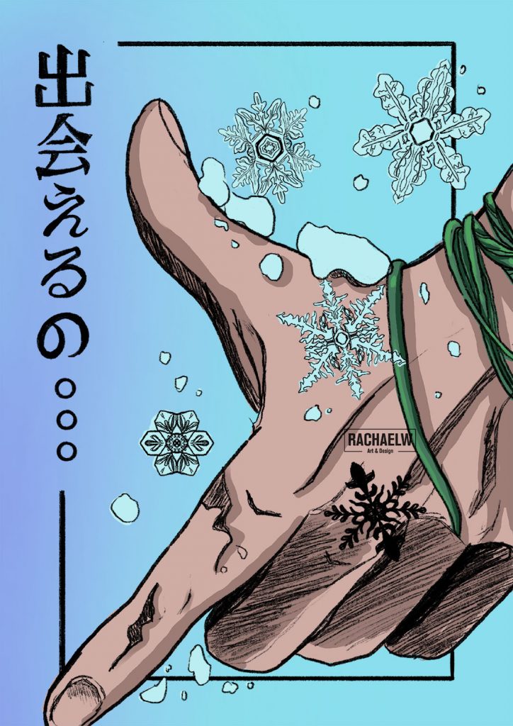
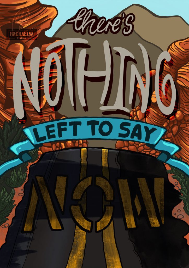
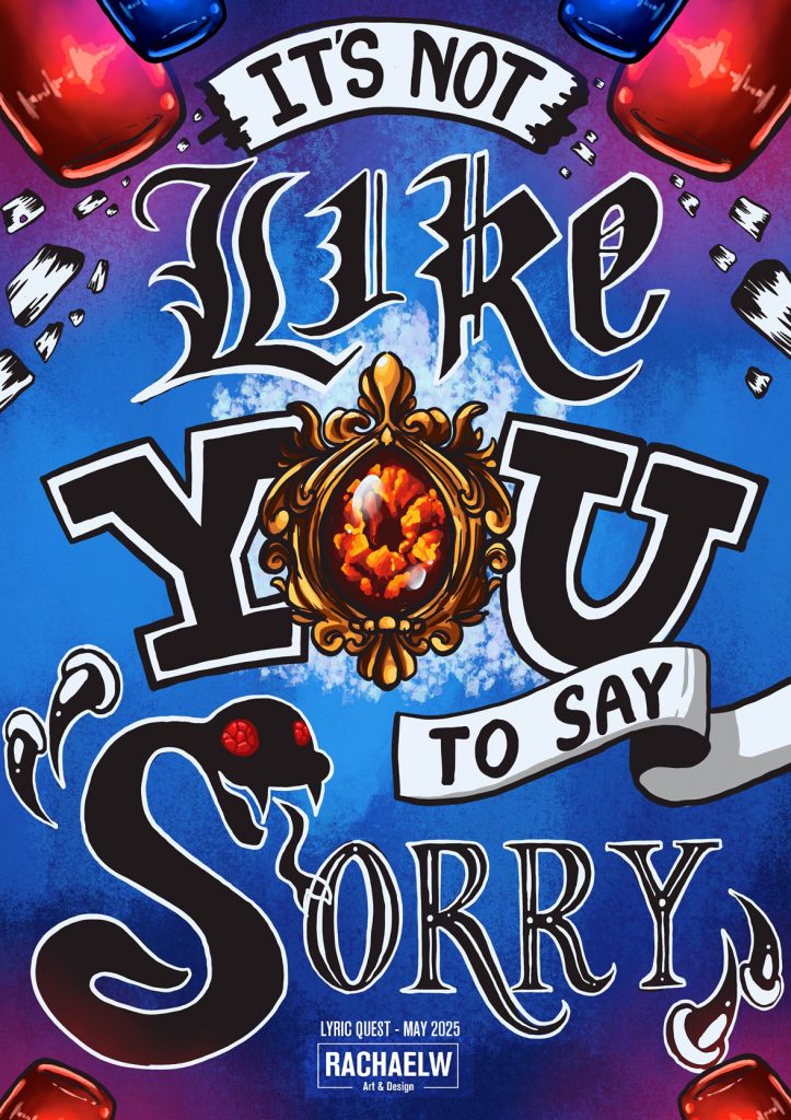
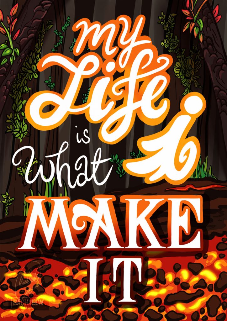
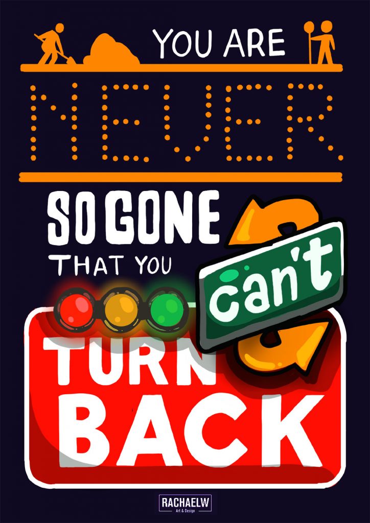
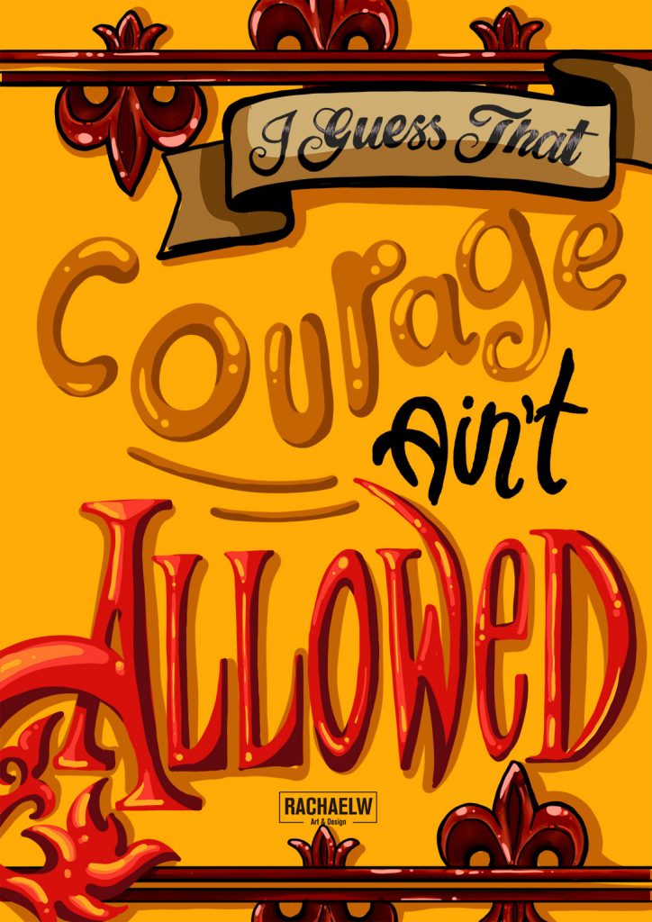
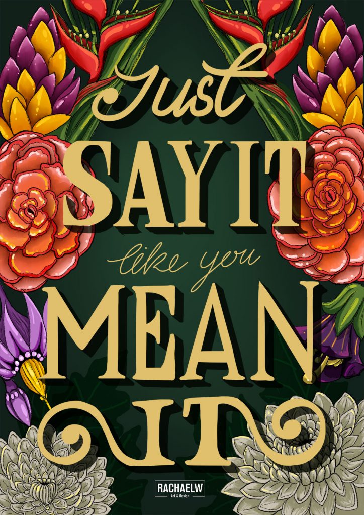
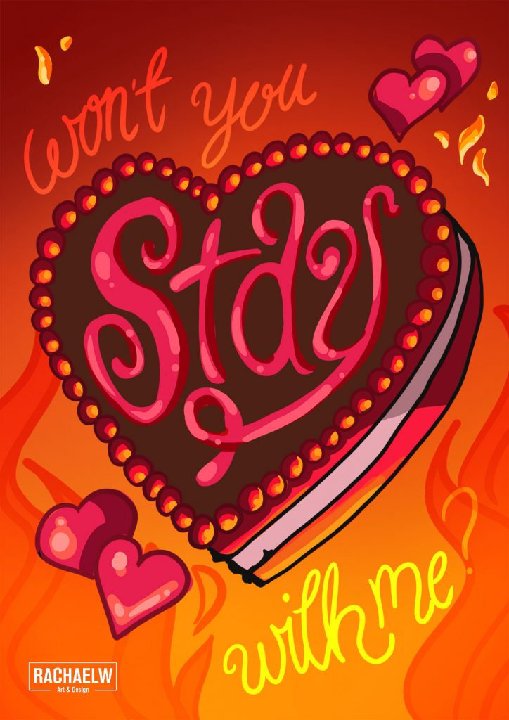
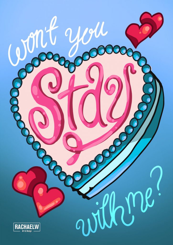
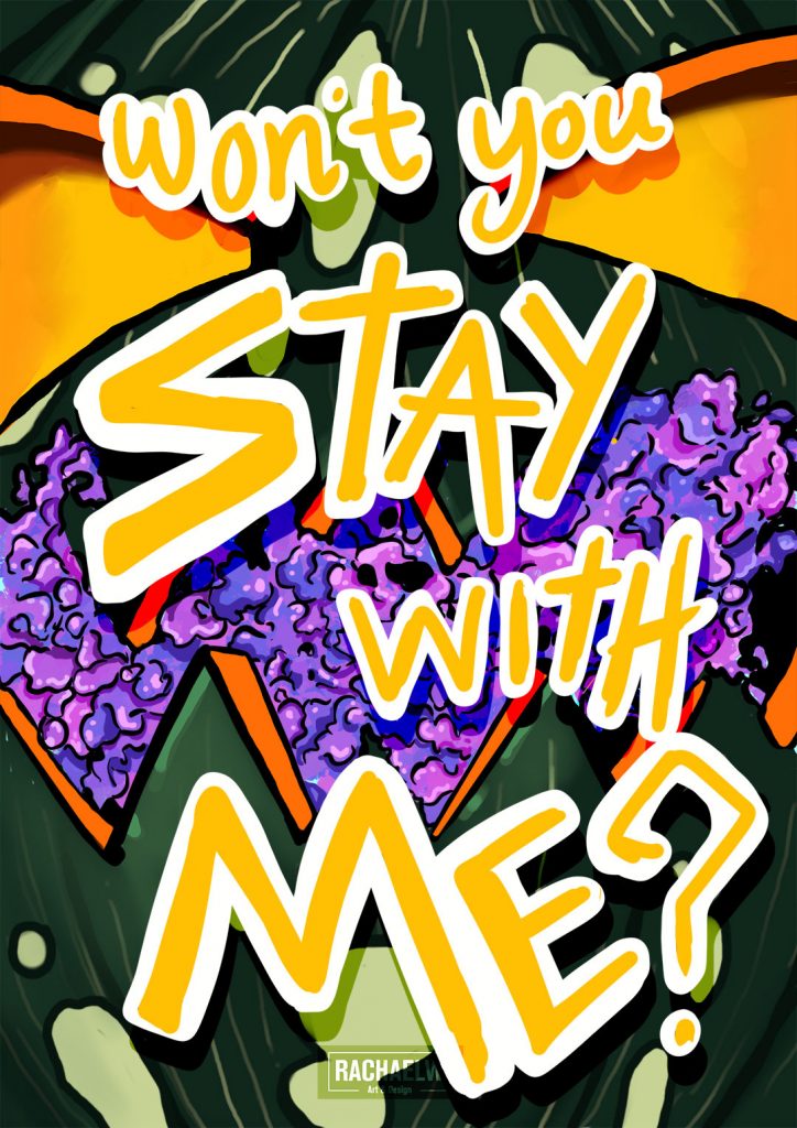
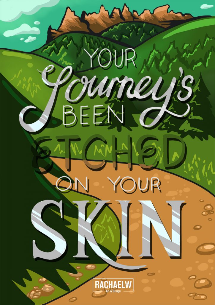
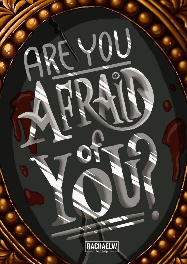
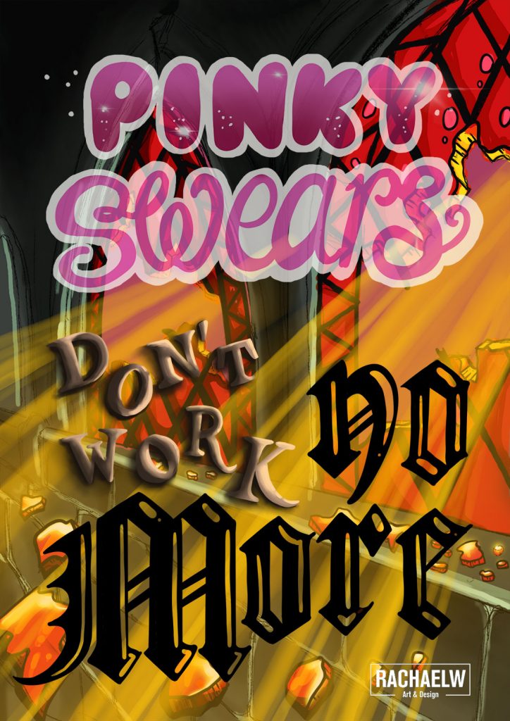
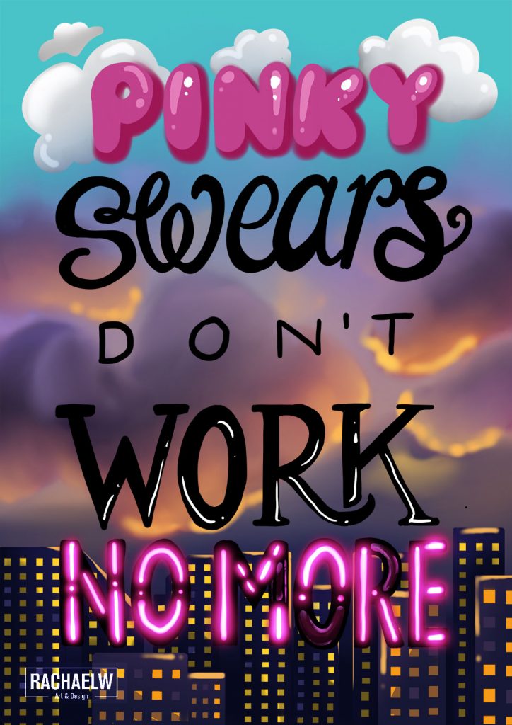
Song lyric references in the above pieces include:
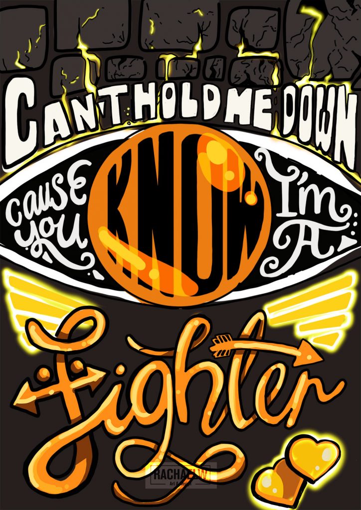
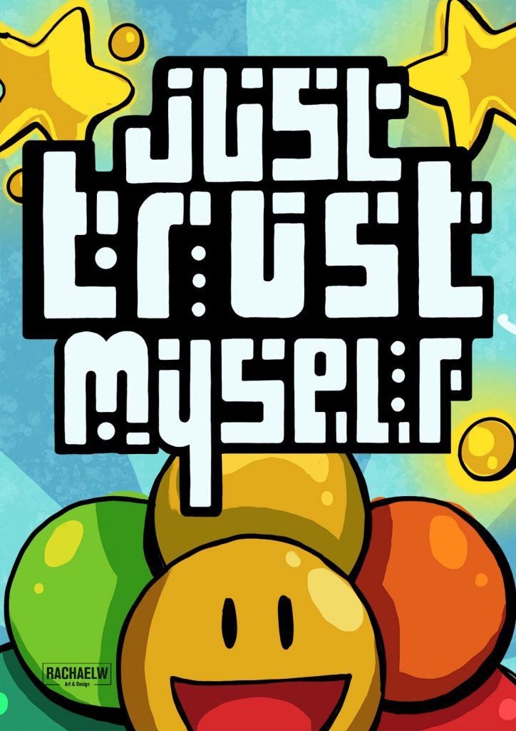
The Freak Show by YUNGBLUD, Deep End by I Prevail, Read Between The Lines by Tom Cardy, Never Gonna Give You Up by Rick Astley, Caramelldansen by Caramell, What Does the Fox Say by Ylvis, Deja Vu by Tomorrow x Together, and Merry Go Round by Yui
RECENT ADDITIONS
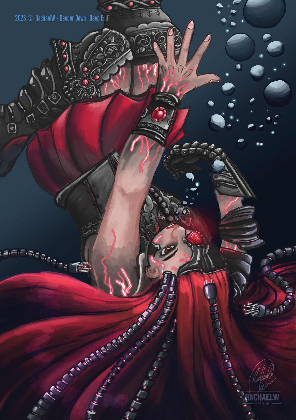
Deep End (2023)
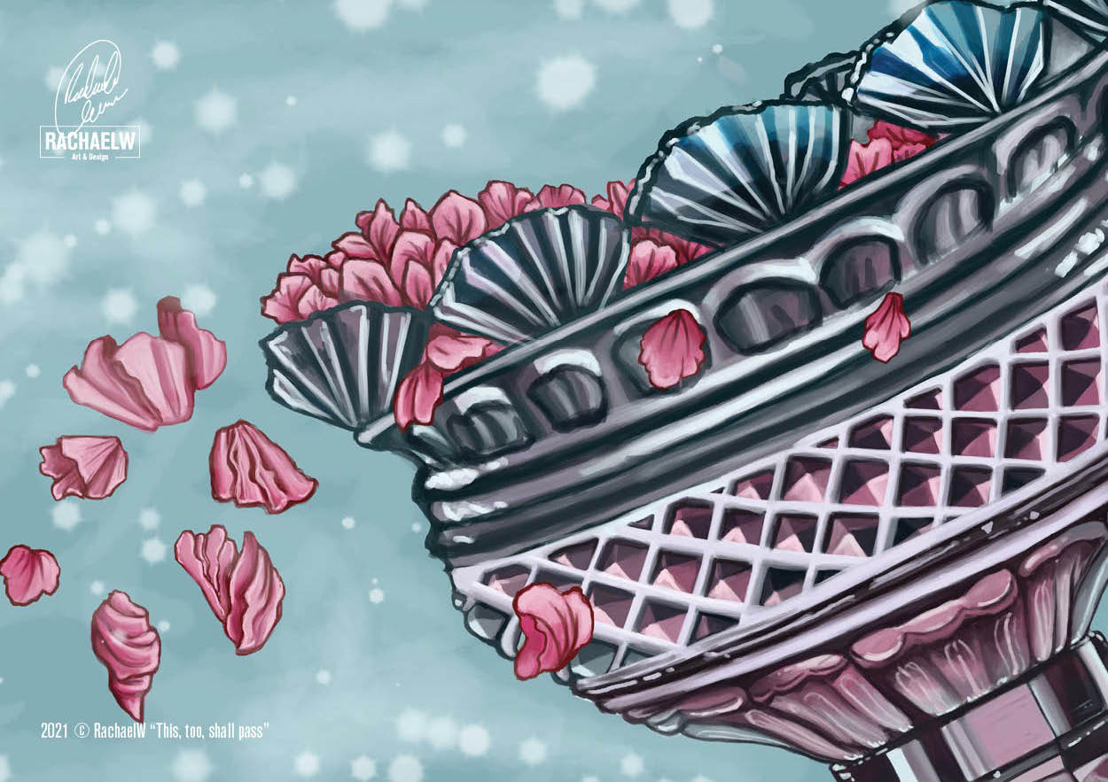
This Too Shall Pass (2021)
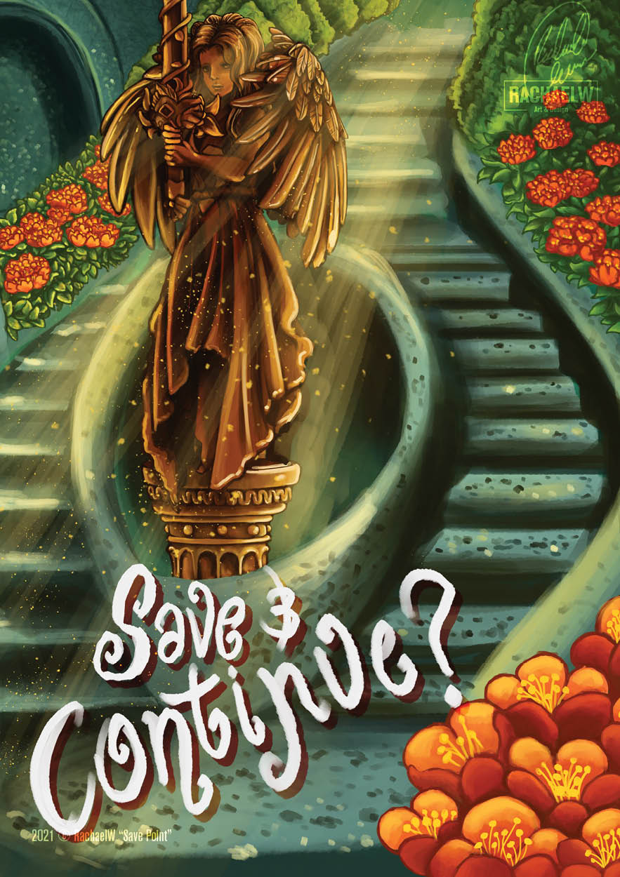
Save Point (2021)
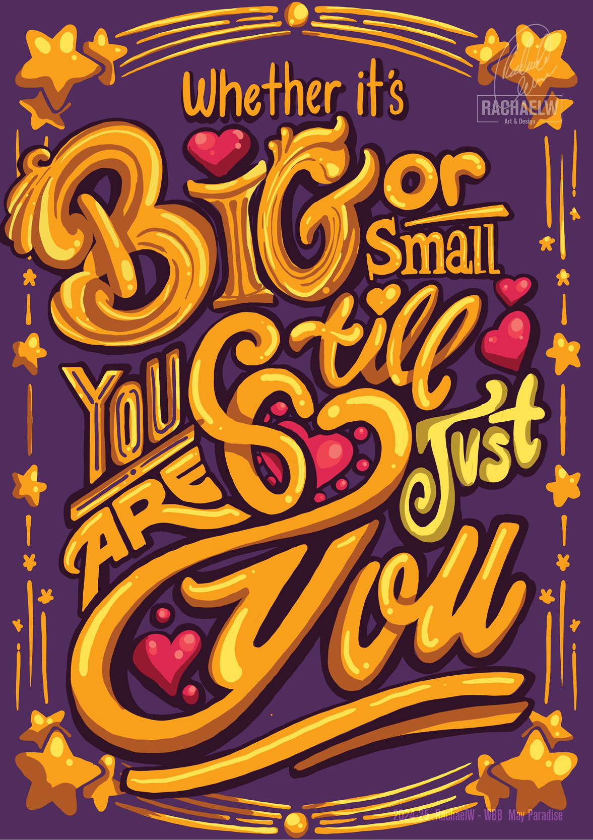
WBB – You’re Still You (2024)
Sketchy Veggies (2018-2022)
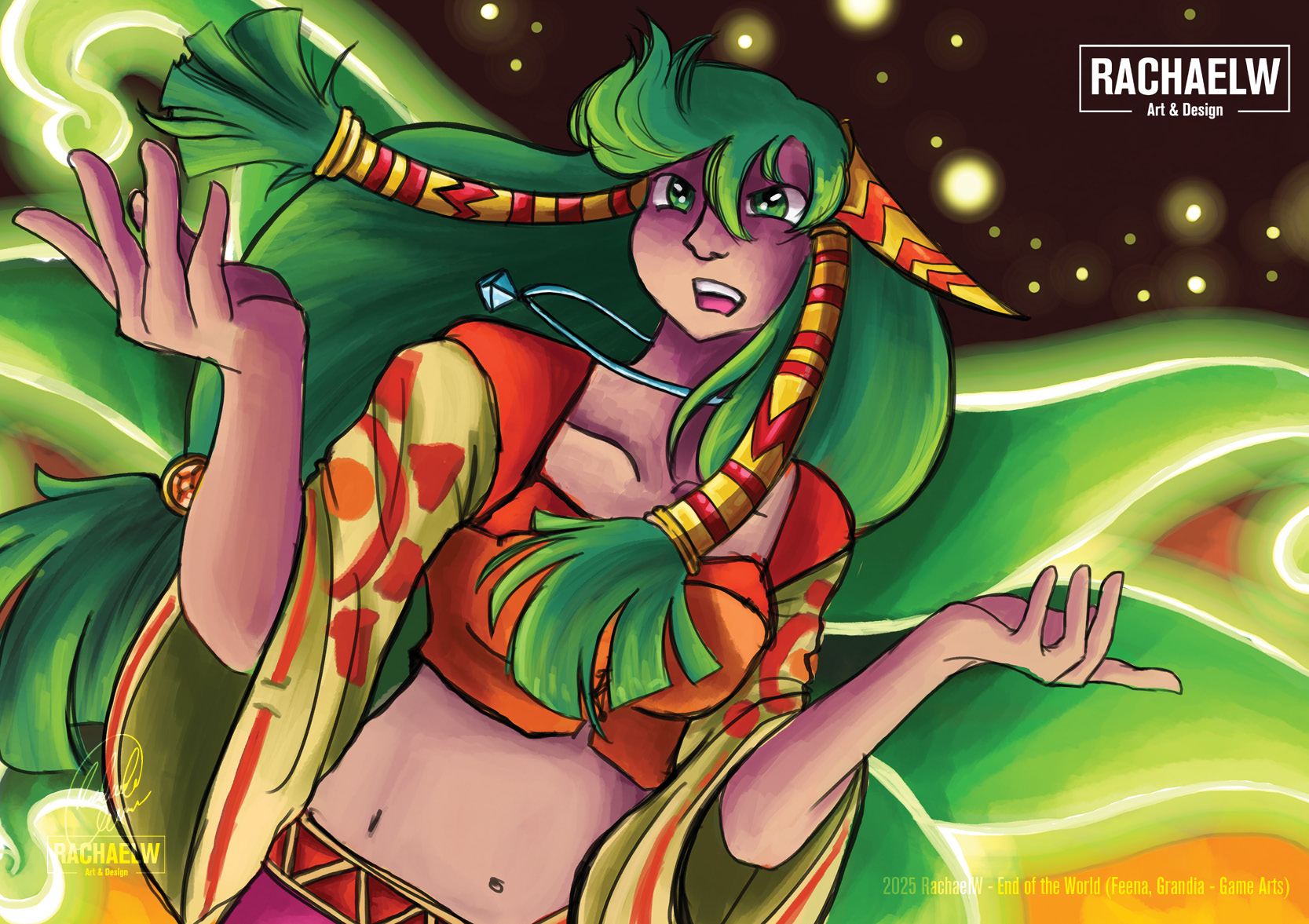
FANART: Feena – Grandia (2025)