
Colour Theory (2024)
Colour theory was one of those things where I had picked up bits and pieces from books as a kid, learned through trial and error the difference of mixing warm paints with cool paints instead of like with like, but not something that any formal education properly covered. But in the middle of July 2024, I became aware of a Colour Confidence course at the local art supply store. It seemed very different from most of the other courses being run as they were usually specifically aimed at one medium or another – such as watercolours, acrylic, graphite pencil.
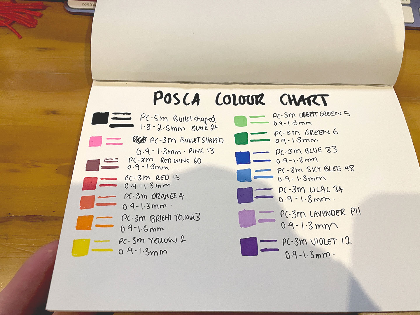
The course itself focused on colour theory applying it to acrylic paints – but in anticipation of the course, and with several years’ worth of Art Hoard Guilt™ I jumped the gun and started experimenting with colour ranges and trying to make use of the POSCA markers (2020) that I had accumulated, but largely had sat unused.

Original POSCA pallet
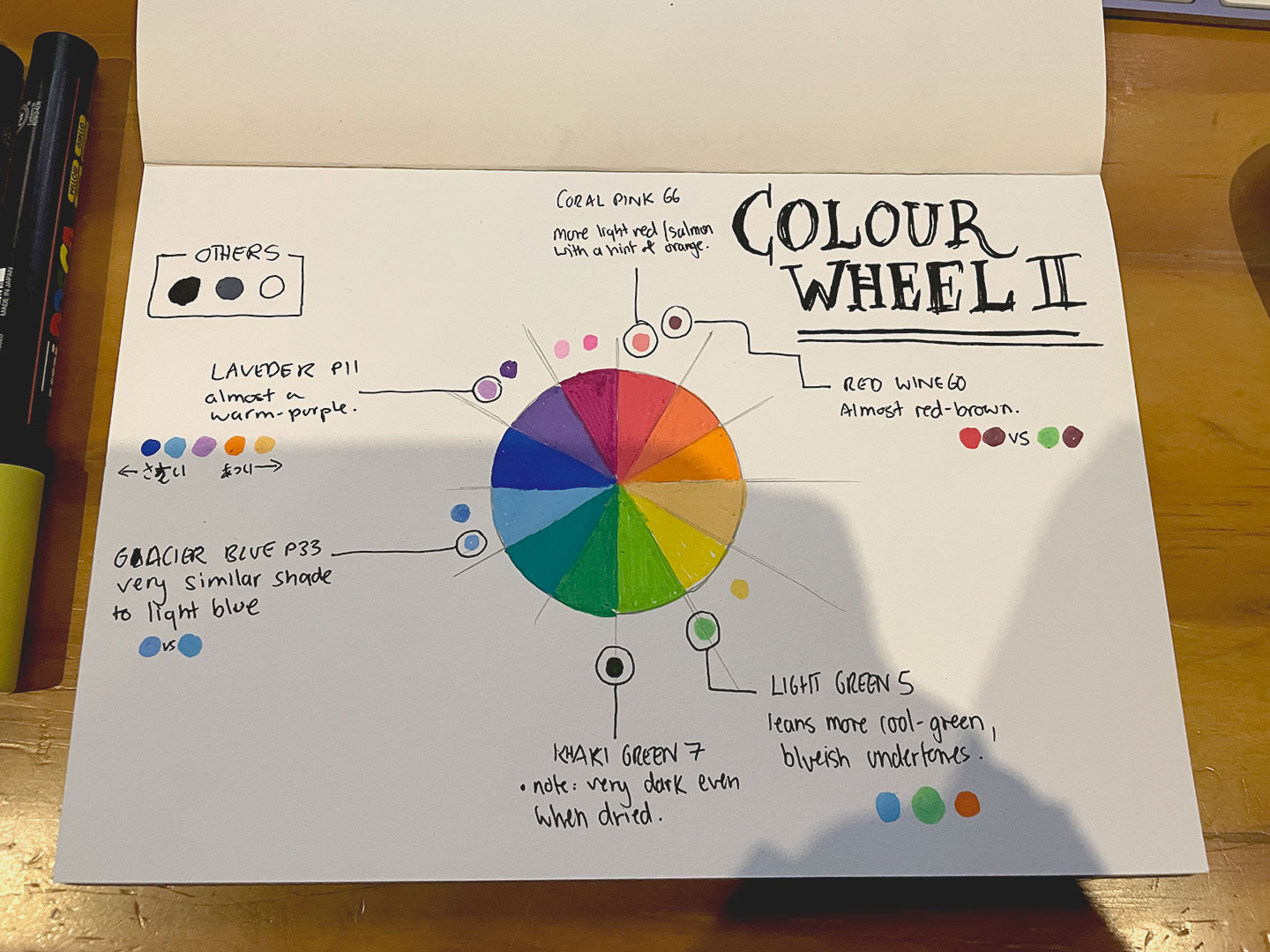
Colour Wheel V1
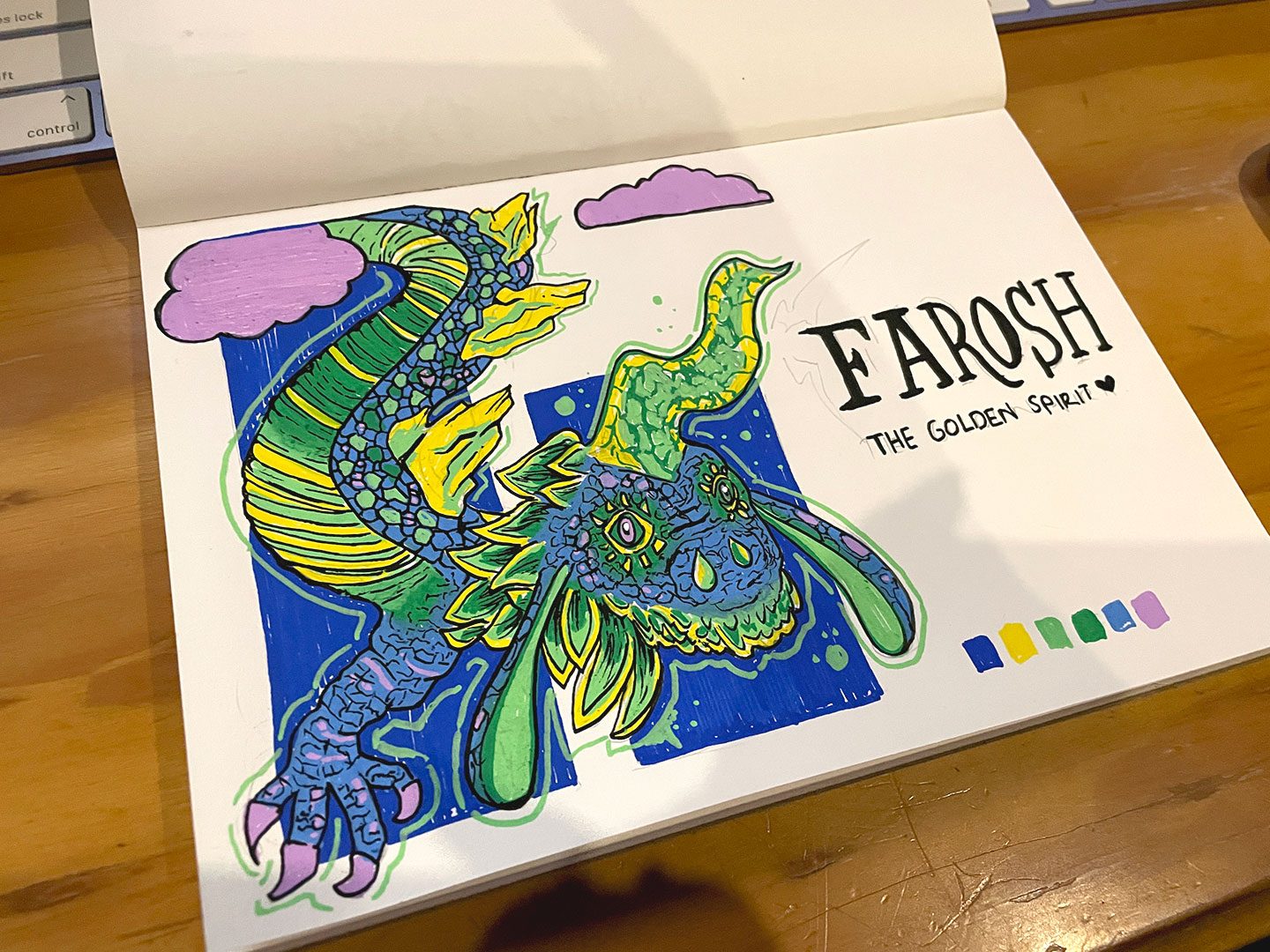
Farosh – Legend of Zelda, Breath of the Wild (POSCA Pens)
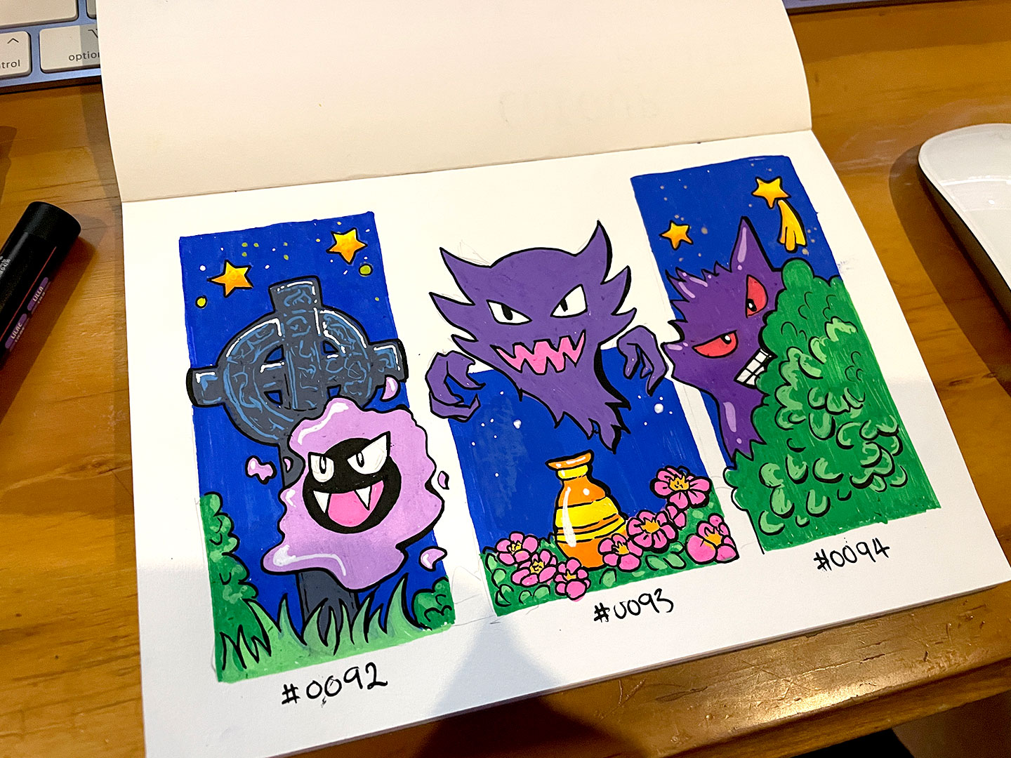
Ghost Pokemon (POSCA Pens)
I can’t find the specific origin of the colour wheel idea – I’m sure I saw something like it in passing from another artist process video or studio photos – but the urge to just do a basic colour pallet to see what POSCA colours I had was something that my brain had been dangling as a dopamine carrot at me to do for a while. (And yes, it was right. It was very satisfying)
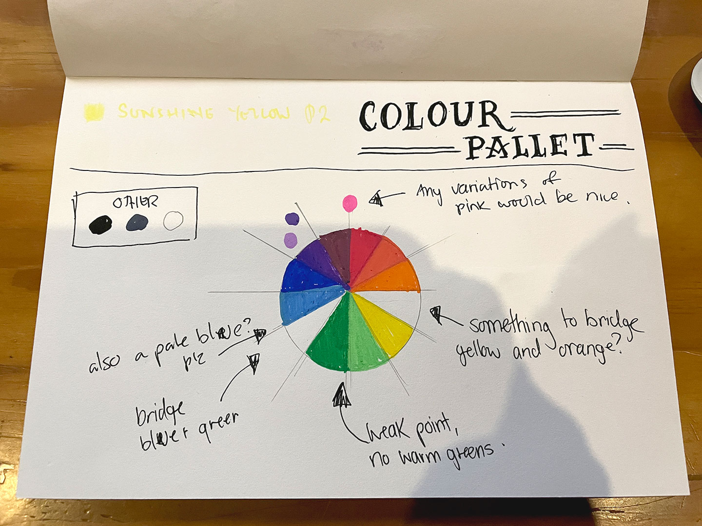
Of course the original colour spectrum tests proved that there were some missing colours. So after consulting the POSCA colour range and the local stationery store, with an updated collection the colour pallets were redone and revised.
Colour Pallet 2.0
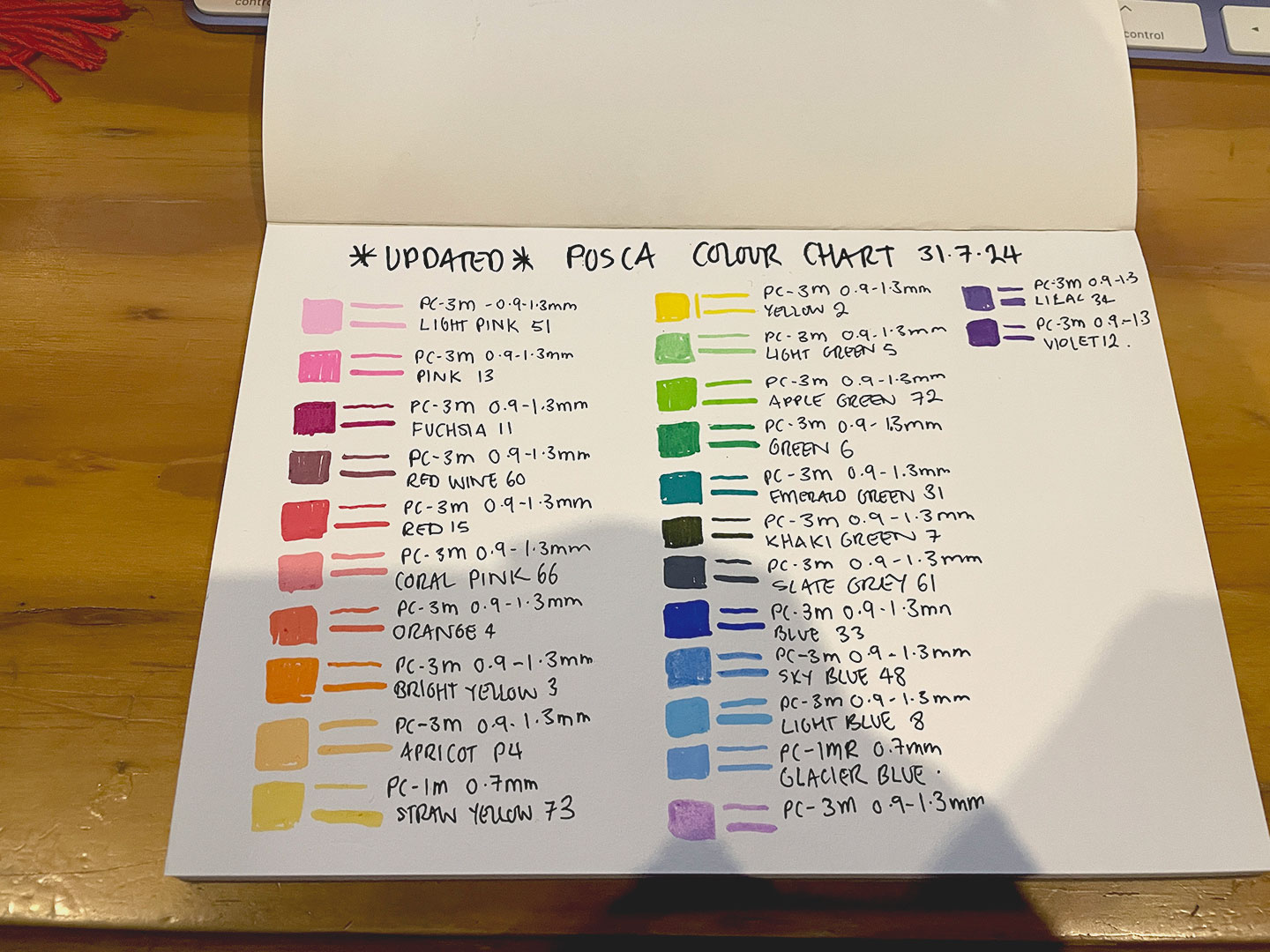
Colour Pallet 2.0
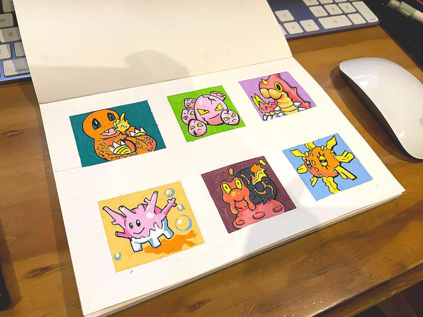
Various Pokemon test pieces
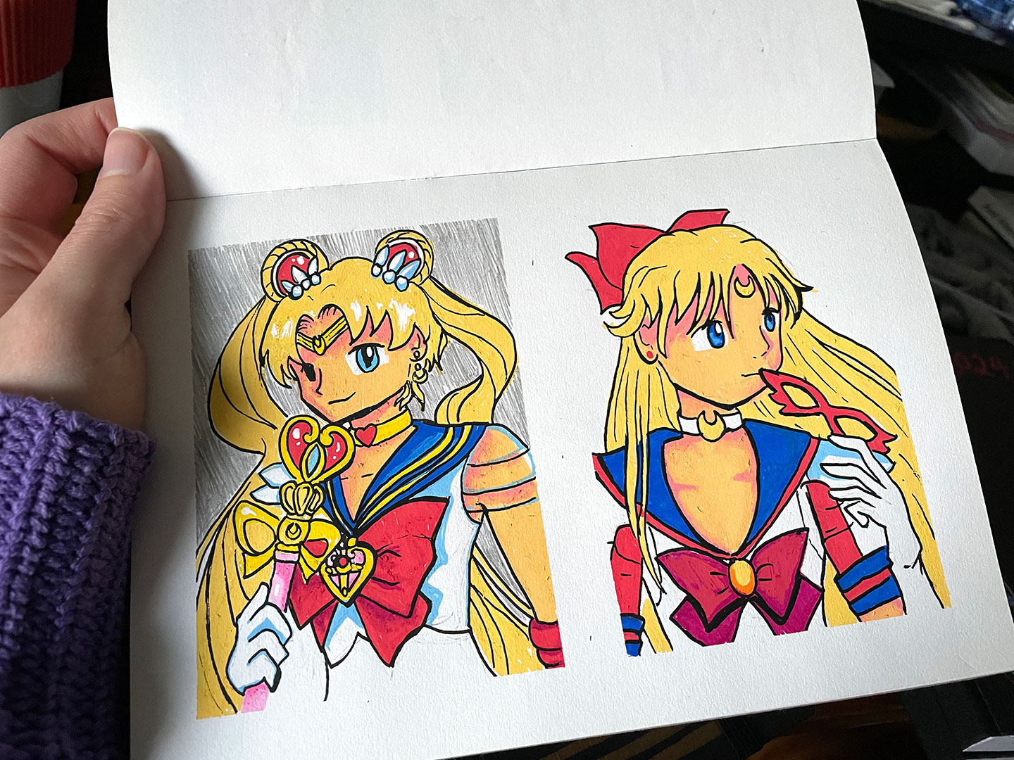
Sailor Moon & Sailor V
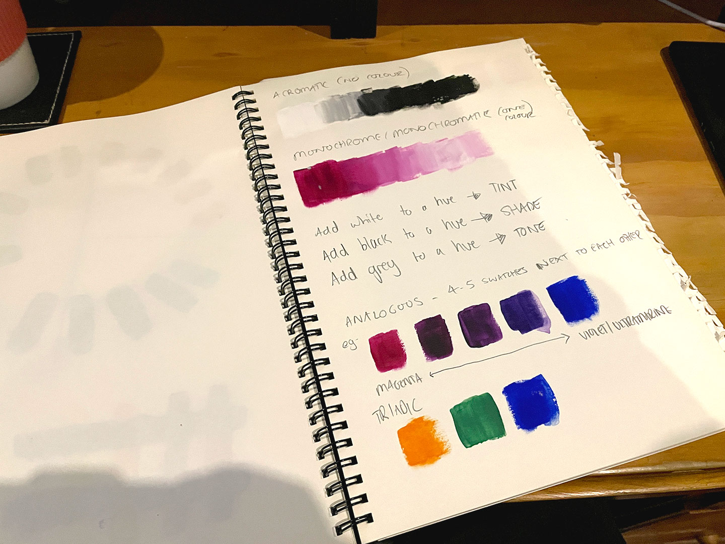
The Colour Confidence workshop went on to cover mixing colours with acrylics, the differences between warm-shades and cool-shades (and how they interact – or, in some cases, don’t). Taking a 8 colour pallet – Magenta, Cadmium Red, Ultramarine Blue, Primary Blue, Light Yellow, Deep Yellow, Mars Black, and Titanium White and expanding it by mixing colours. Further exercises included:
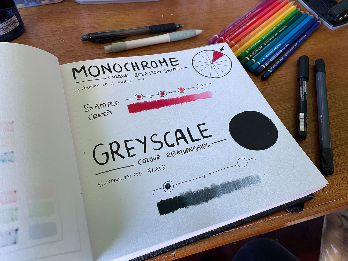
- Achromatic Gradient (No colour, black and white)
- Monochrome (Single colour)
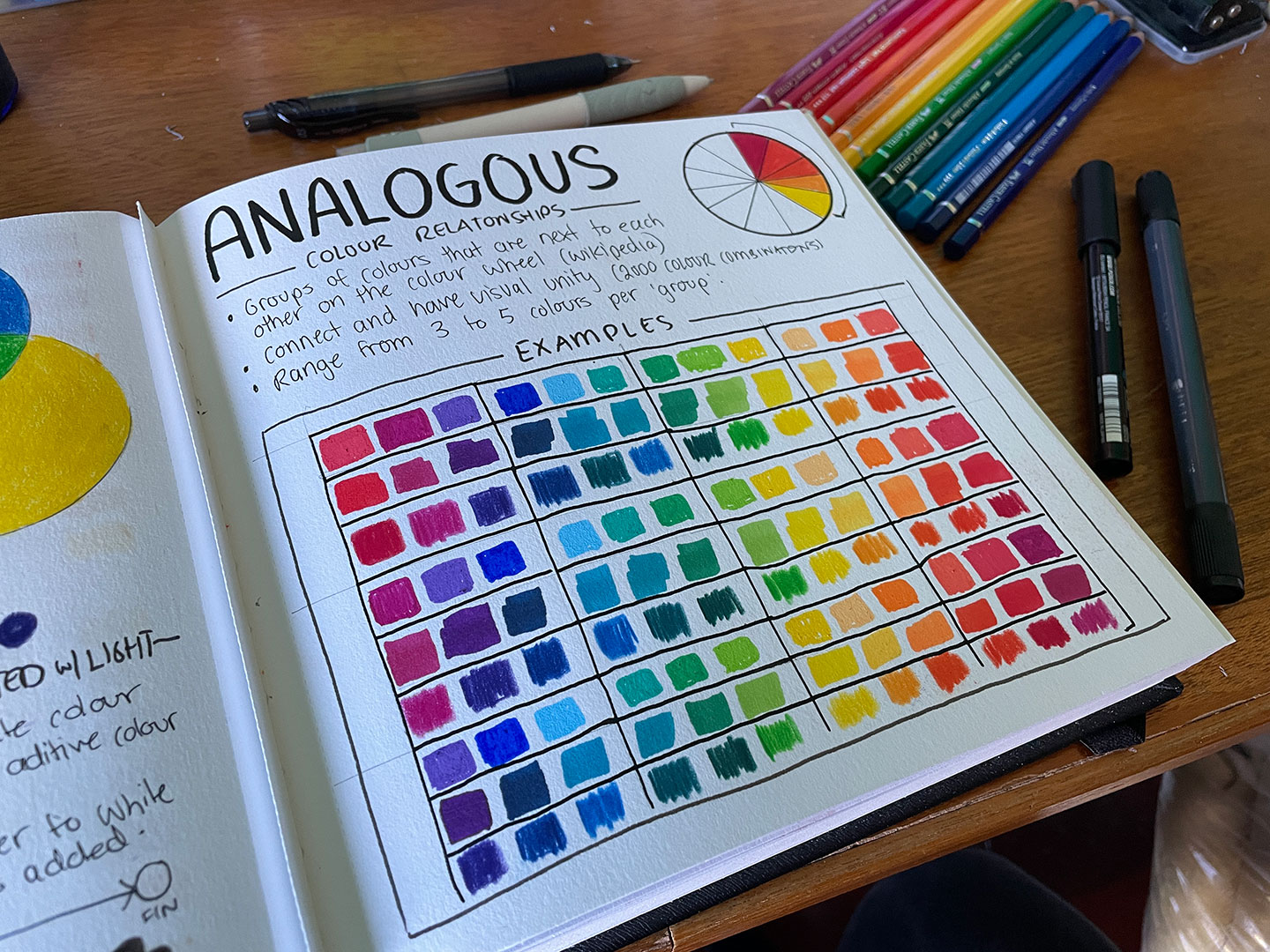
- Analogous Pallets (4-5 colours next to each other in the colour wheel)
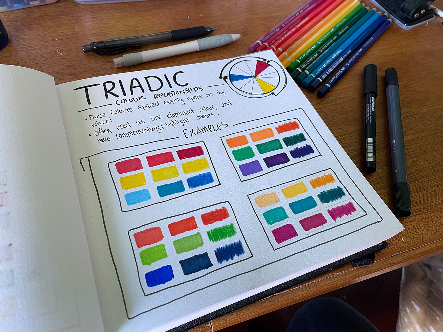
- Triadic Pallets (3 colours evenly spaced across the colour wheel)
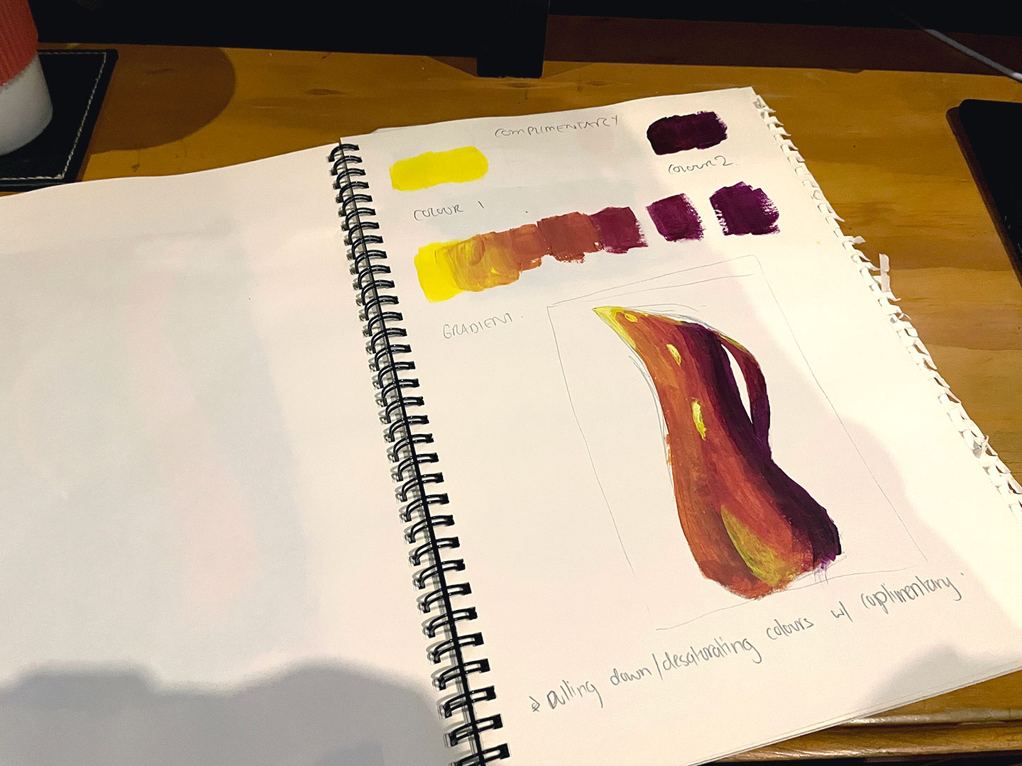
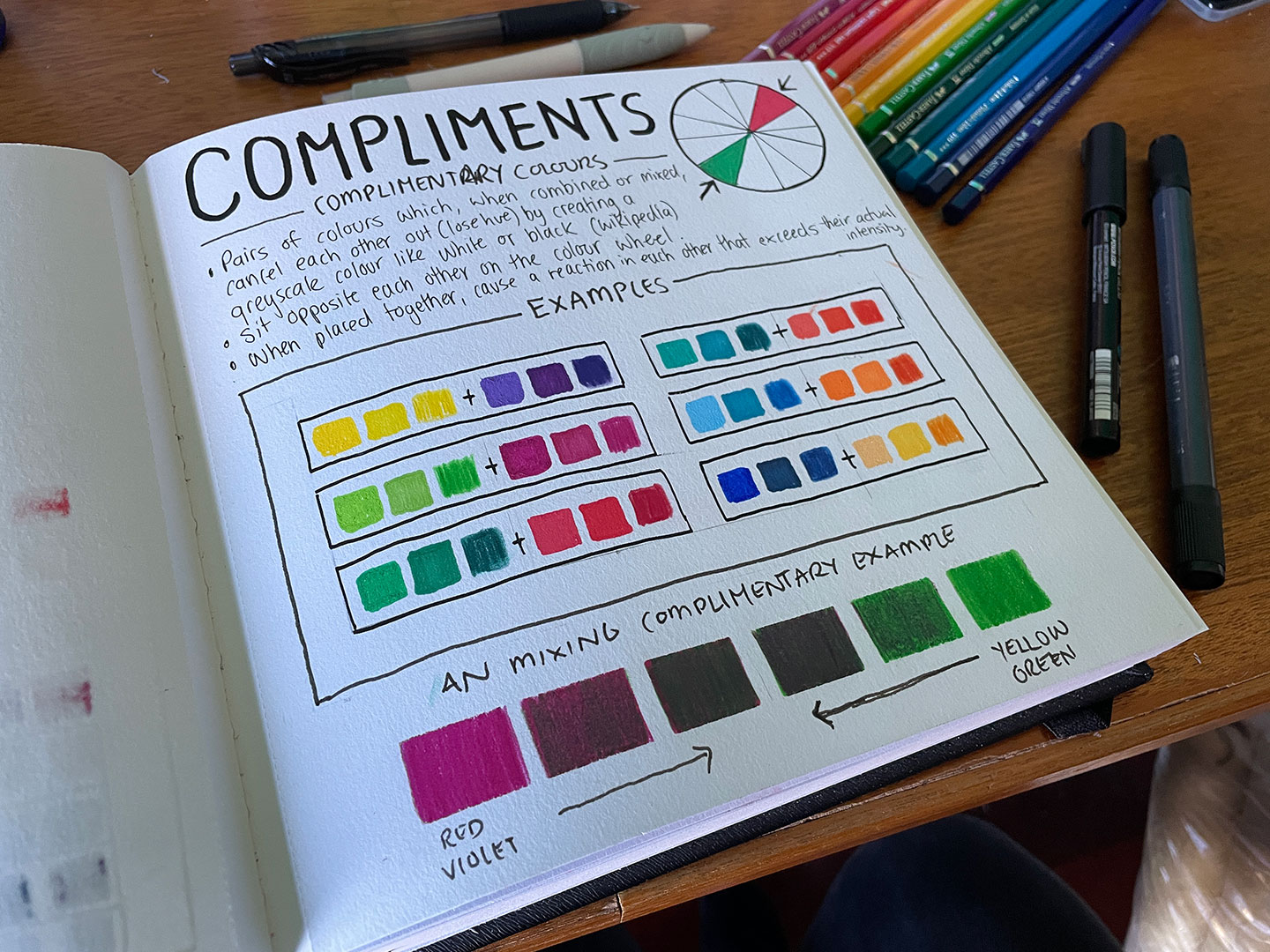
- Complimentary Pallets (Colours opposite each other on the colour wheel, such as blue and orange)
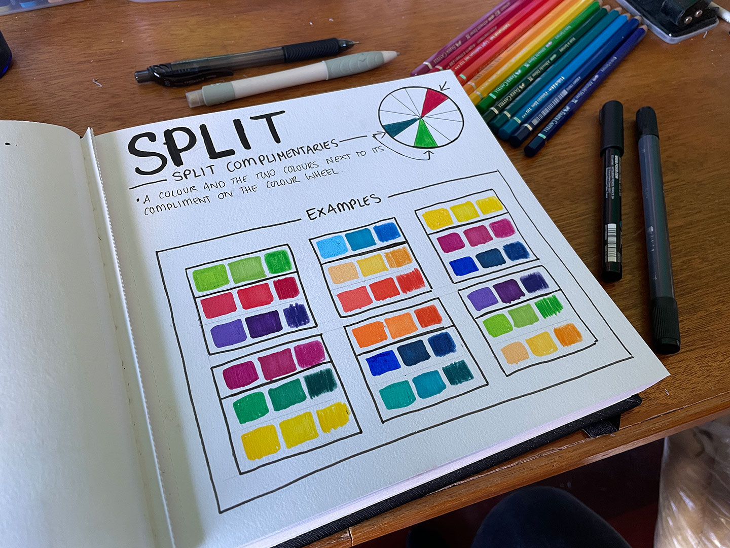
- Split Complementary Pallets (Similar to complimentary, but instead of the colour opposite it takes the two colours either side of it. So if we started with blue, the split complimentary would take red and yellow instead of orange)
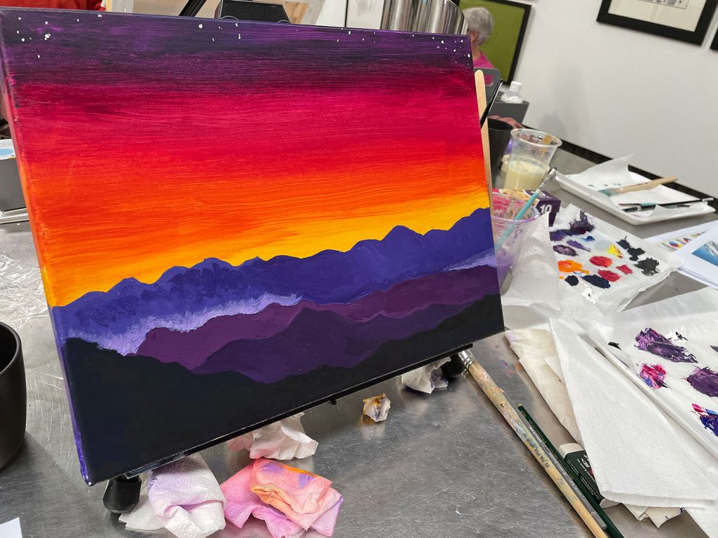
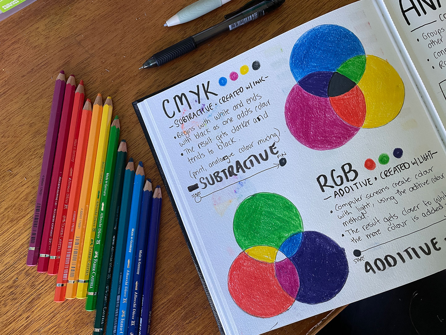
The majority of the course revolved around a 12-colour Colour Wheel model, and we briefly touched on the difference between additive colour (what your computer monitor or phone screen uses, by generating light – additive) and subtractive colour models (most traditional media, subtracting from the light being reflected off the paper/canvas/substrate). The day closed out with a painting on canvas based on photos supplied.
Notes (mixing colours)
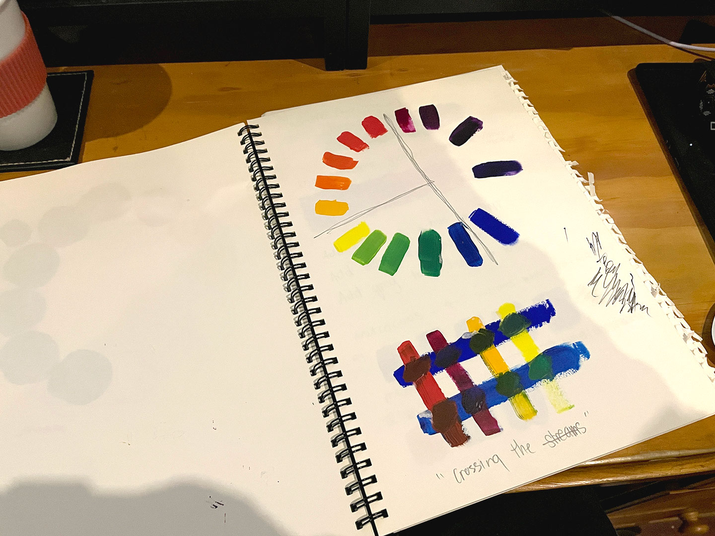
Workshop Notes
Practice Exercise (Complimentary Colours)
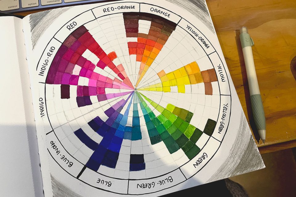
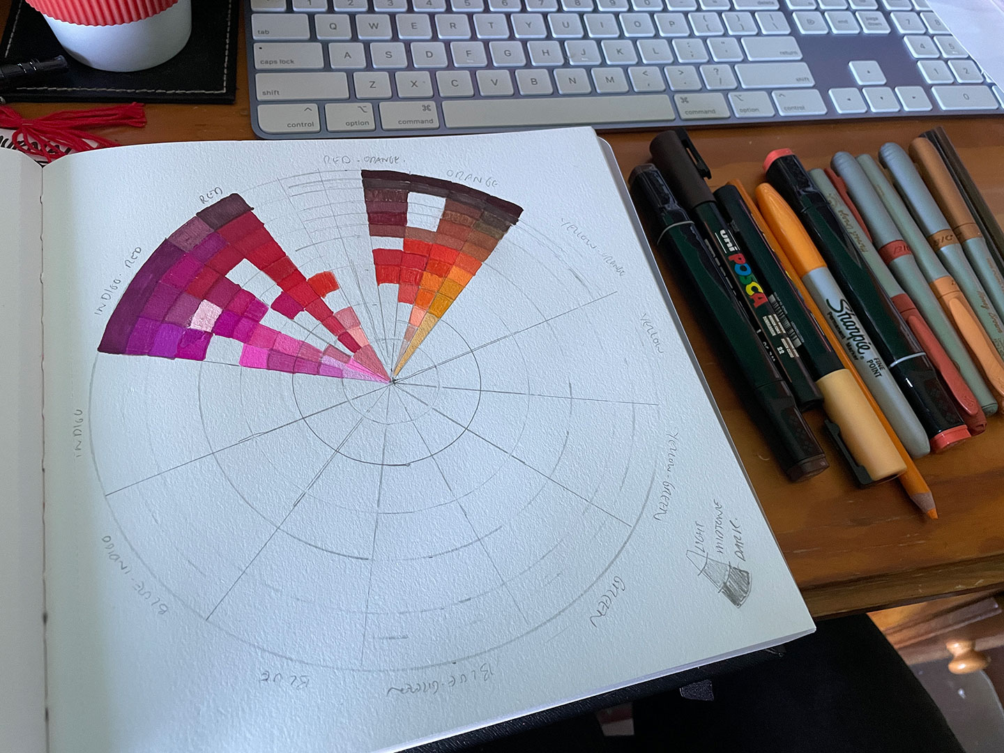
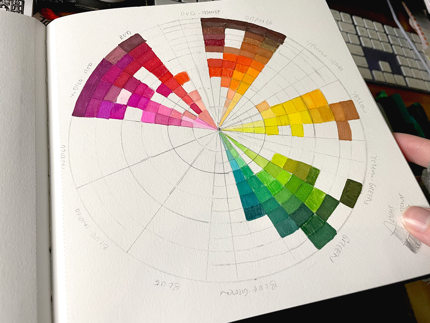
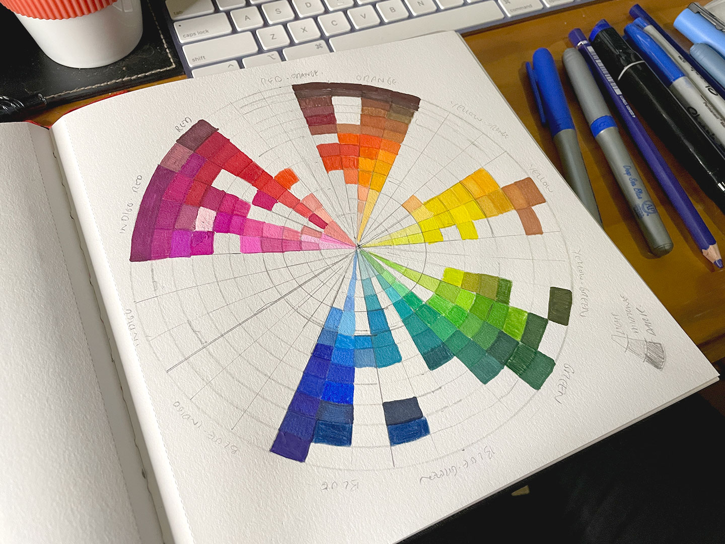
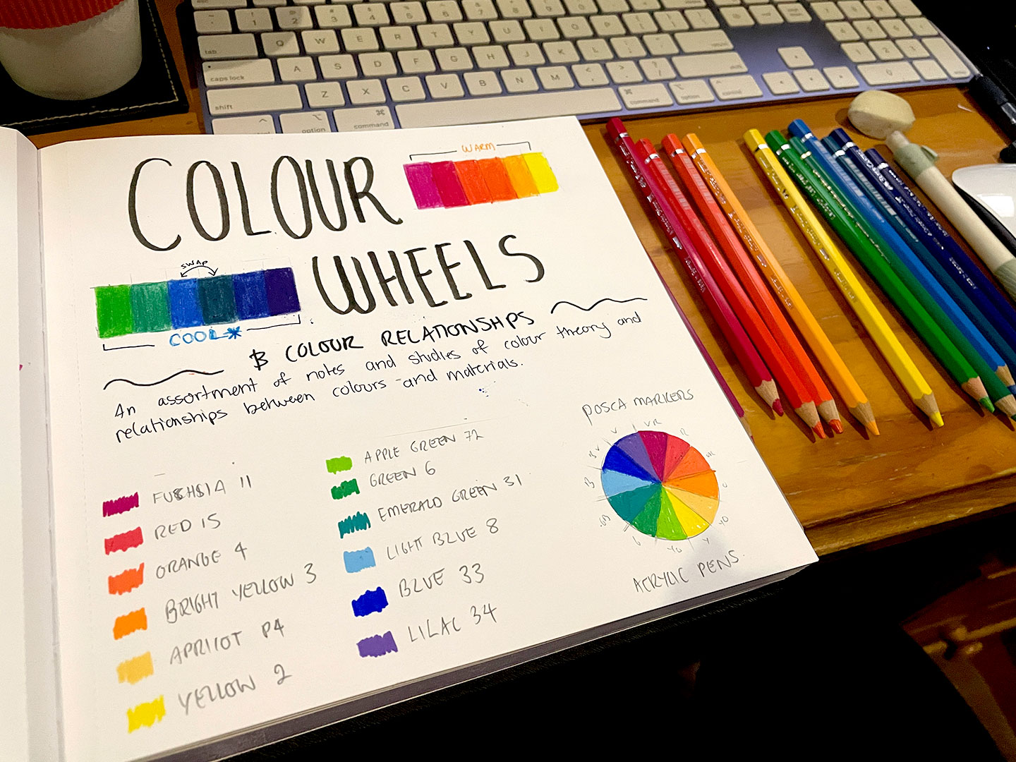
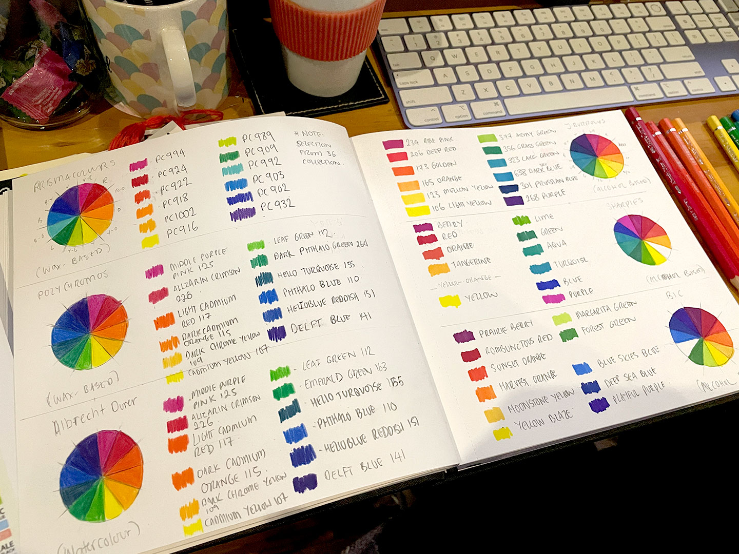
About two days prior to Colour Confidence, I started to expand on the investigation into POSCA colours and started to look at the other traditional materials in the Art Hoard™ including a set of J Burrows Graphic Markers (circa 2018), Sharpies (also circa 2018), old Copic markers (circa 2008), several ShinHan Touch Markers (circa 2012), Prismacolour pencils (circa 2017), an assortment of Faber Castel Albrect Dürer watercolour pencils (2024) and inherited sets of BIC Markers. Something had struck me as a good idea to see visually what traditional media colour spectrum I was dealing with, especially since I was so familiar working with a digital colour wheel. It also would make it easier to see where I had gaps in the spectrums, in theory.
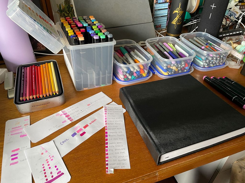
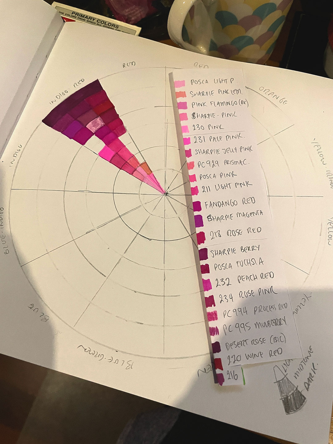
This project was a good exercise in Colour Temperature, trying to establish whether shades were warm or cool compared to one another. Each slice of colour was split into three sections on the horizontal axis: warm-colour, core-colour, and cool-colour. Vertically the slices were also broken into light, mid-tones and shadows.
Sorting colours
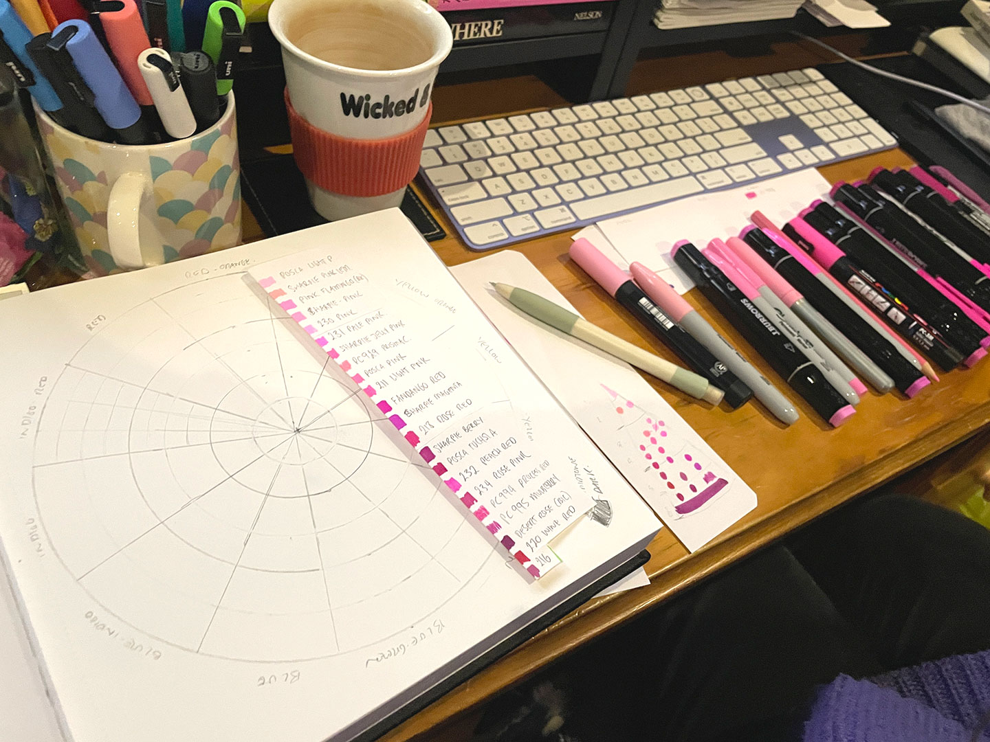
Colour Wheel – Pink
Progress – Orange
Progress – Greens
Progress – Blues
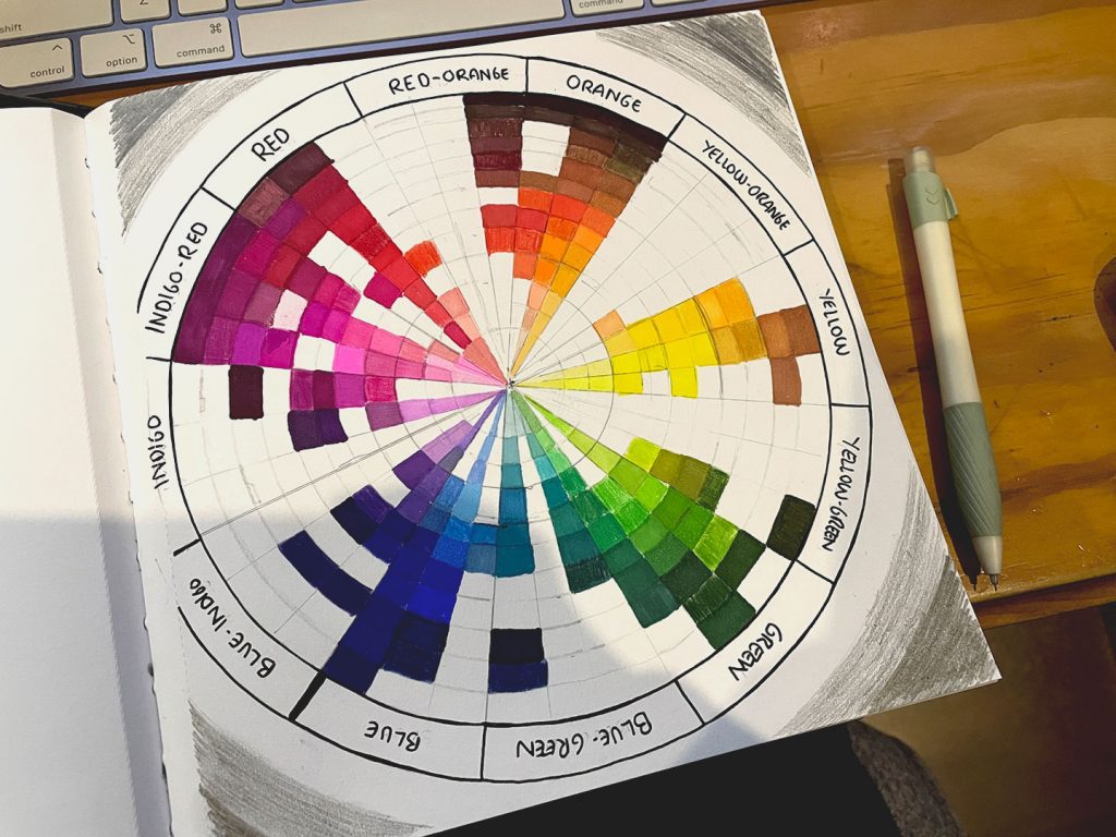
One of the things I was particularly interested in was seeing how similar colours across different mediums were – Prismacolours compared to Polycrome, different brands of alcohol markers (J Burrows vs Sharpies vs BIC), and where the POSCAs fell in the spectrum. If I was going to try and use the traditional mediums more, I wanted to try and get a better handle on how colour worked across what I had available to me.
Base Colours – POSCA
Base Colours – Pencils vs Alcohol Markers
Subtractive vs Additive notes
Analogous Colour Groups
Complimentary Colours
Split Complimentary Colours
Triad Colour Groups
Monochrome, Greyscale examples
Most of the blog posts at this point would finish with some kind of Big Bad final project but it appears I’ve let that fall to the wayside – perhaps because it spawned further investigation into techniques for Copic (and other) markers, different pencil techniques and finally playing with the Gauche from the Art Hoard™ (2020, this time).