
Daily Logo Challenge & Branding Identity studies
The most common thing I keep seeing in portfolio advice has been “only put up work you WANT to do”. Which makes this a bit of a strange project to write up and post. Because even after all this time, I still don’t like (making) logos. This study proved to myself that I can make them, but I don’t like them. But it’s a good example of identifying a weakness, in this case branding identity and logo design, and zooming in to try and reinforce fundamentals so it’s less of an intimidating prospect.
I still don’t like making them though.
Too much pressure, too many opportunities to overthink a dozen “what if”s.
So now that we’re clear on where I stand about logos… what was this “study”? And how did we get here?
As you may have picked up from other projects at the time (Inktober 2017, Dinovember 2017), the writing was on the wall. The design team’s days were numbered. And while I managed to just squeeze my three years of industry experience out of it, when I started to dust of my resume and update my portfolio I was increasingly concerned about other areas that were not as strong as they could or should have been.
One of those areas was Branding. I’d had exposure to utilising branding across multiple brands and dozens if not hundreds of products of course, but that was for packaging. Boxes and cans and pouches and bags and bottle labels. That told me how to use it, but it wasn’t going to help me make a logo if required, wherever I wound up next.
The Daily Logo Challenge (by Harris Roberts)
Running into 2018 on the right foot, or at least trying to, in early January I signed up for the Daily Logo Challenge run by Harris Roberts. Prompts were sent out by email every day, for a total of 50 prompts. My archives suggest I got about 9 prompts into the challenge, before stopping for whatever reason.

01. Rocketship
02. HotAirBalloon
03. Panda Logo
05. Coffee Shop
06. Driverless Car
07. Fashion Wordmark
08. Ski Mountain
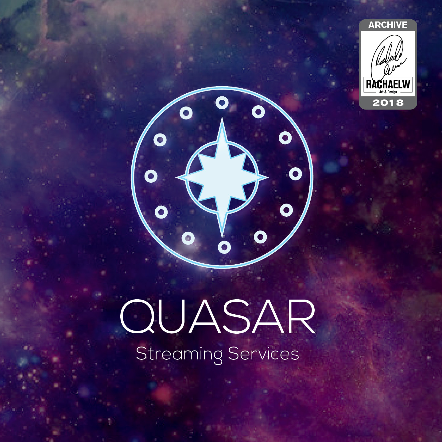
09. Streaming Service
10. Flame Logo
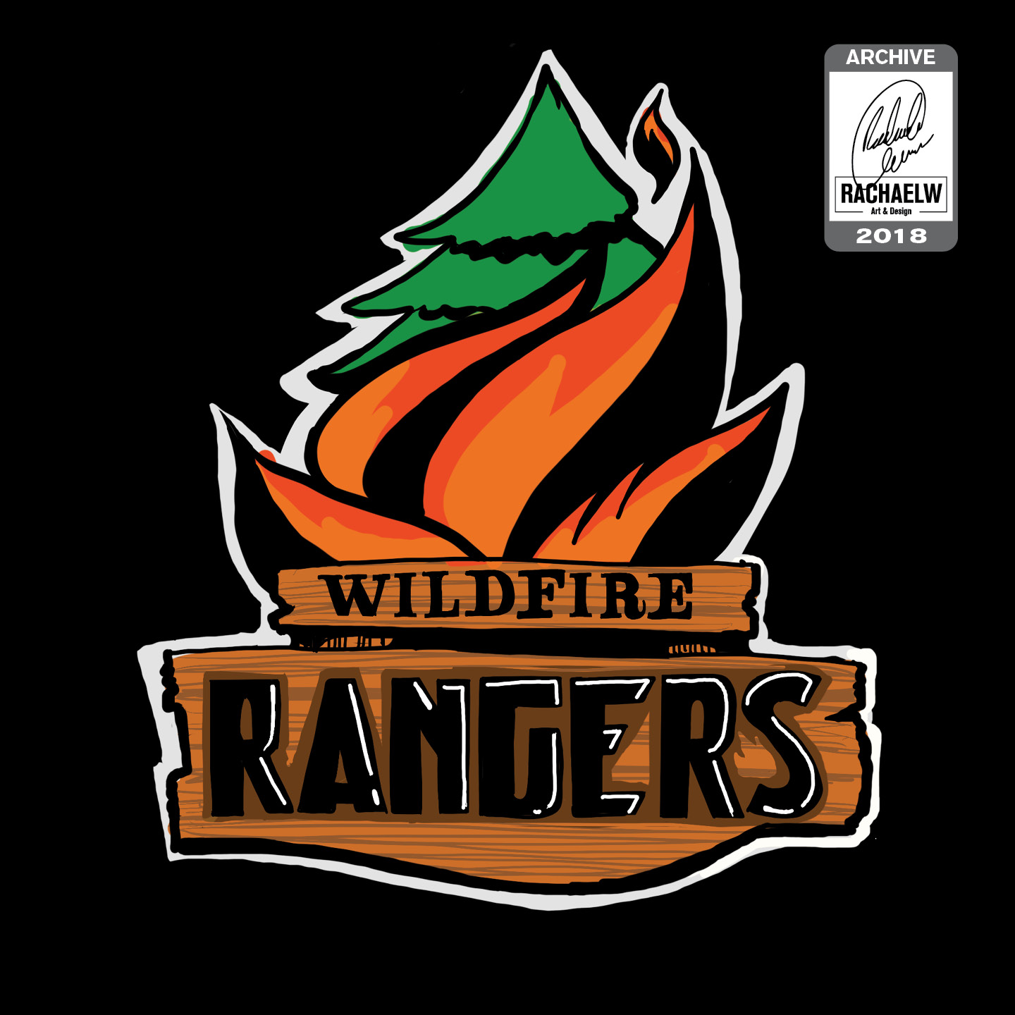
Some of them worked, some of them didn’t, and some have aged surprisingly well. (And yes, number 4 is missing. You’re not going mad. It looks like I just didn’t do that prompt [Logo from a single letter])
Daily Logo Challenge Extensions
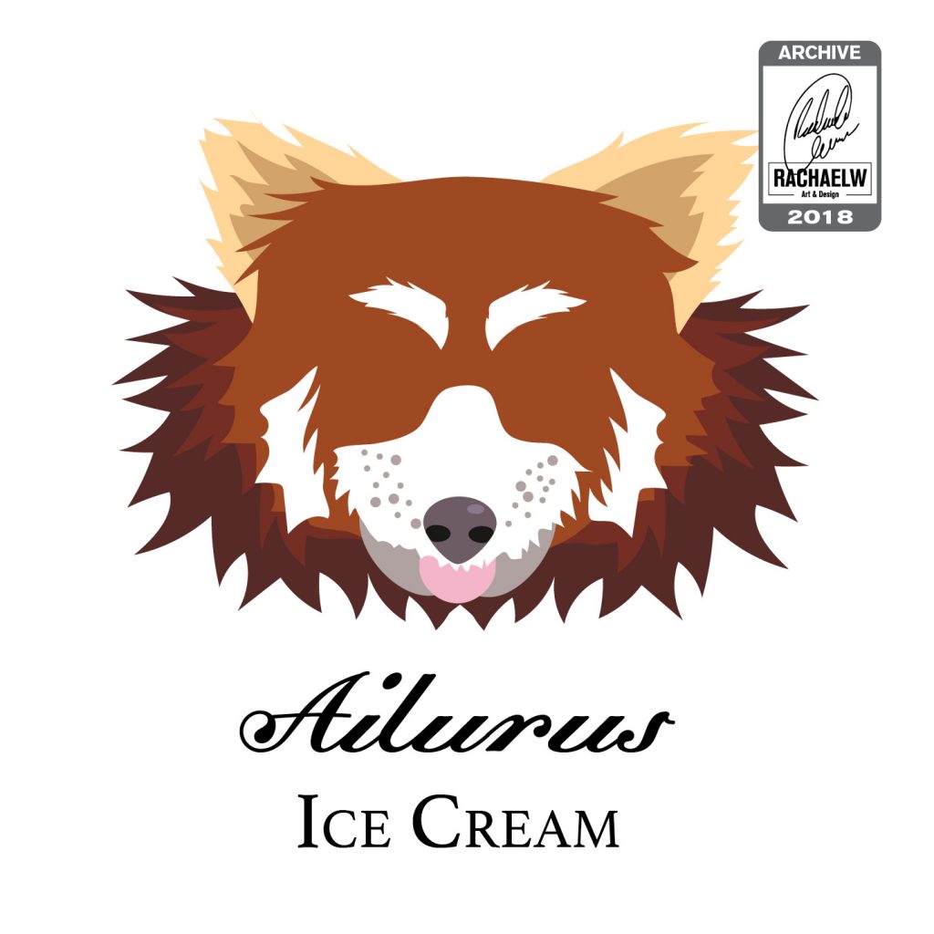
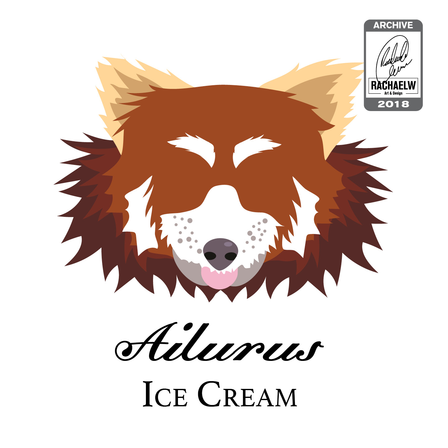
Prompt 03: Panda Logo
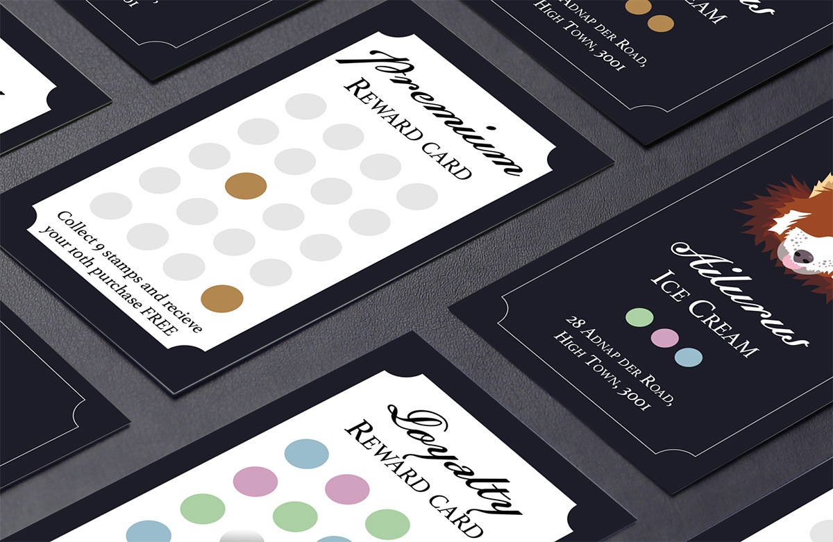
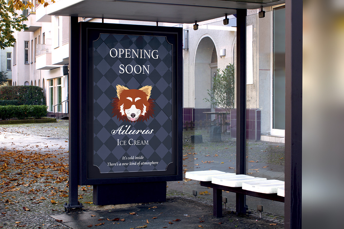
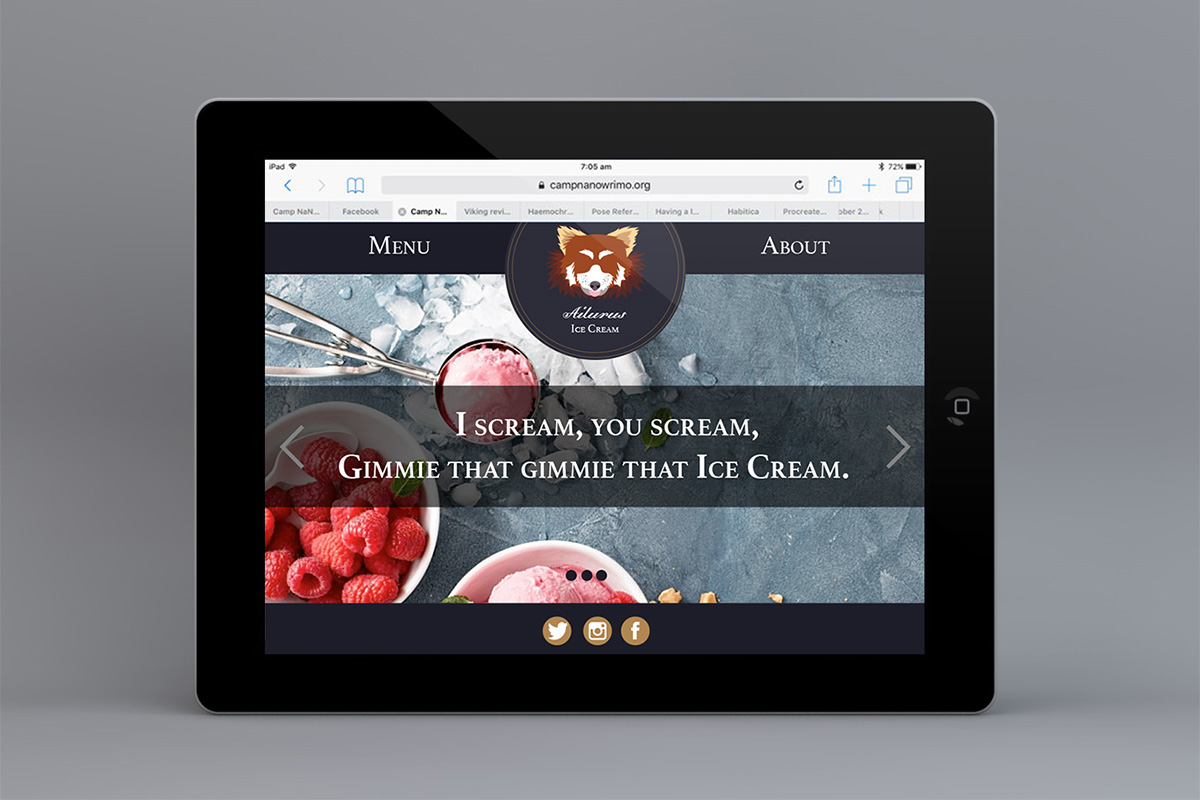
The faceless, vector Red Panda head icon lent itself well to a branding concept for a high-end ice creamery. Complete with little nods to pop culture (Red Dwarf, Red Velvet)
2018-RachaelW-Aliurus-3Fold-Menu-1200px
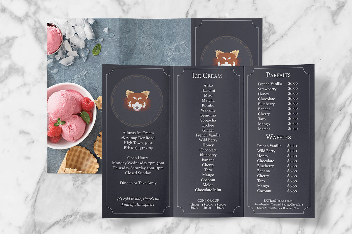
2018-RachaelW-Aliurus-Loyalty-Cards-BOTH-1200px
2018-RachaelW-Aliurus-Signage-Coming-Soon-1200px
2018-RachaelW-Aliurus-Website-Homepage1-fix-1200px
Prompt 05: Driverless Car.
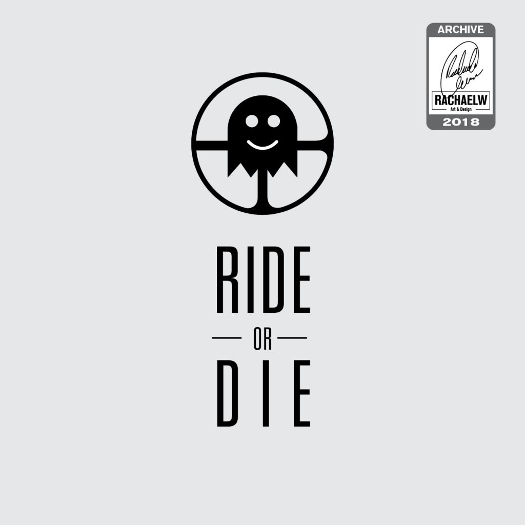
Looking back at the concepts for “Ride or Die” both the Alien-eyed Pacman ghost version and the ghost with a smile versions stand up surprisingly well after all this time.
Even if it does feel a little bit like a low-budget horror series waiting to happen.
2018-RachaelW-Ride-or-Die-01
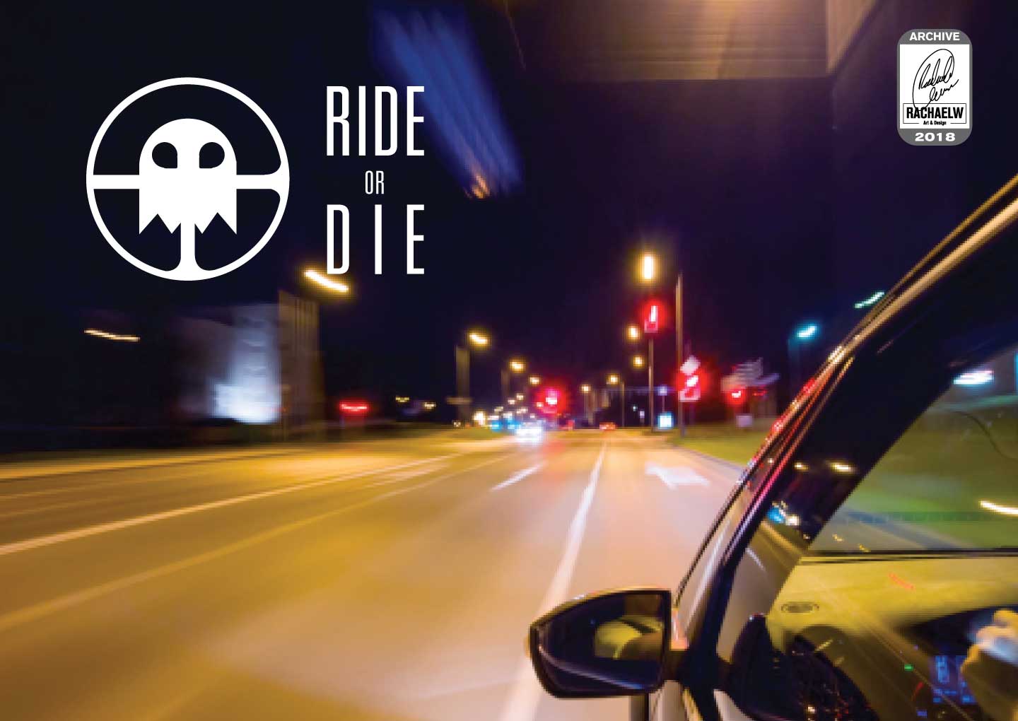
2018-RachaelW-Ride-or-Die-04
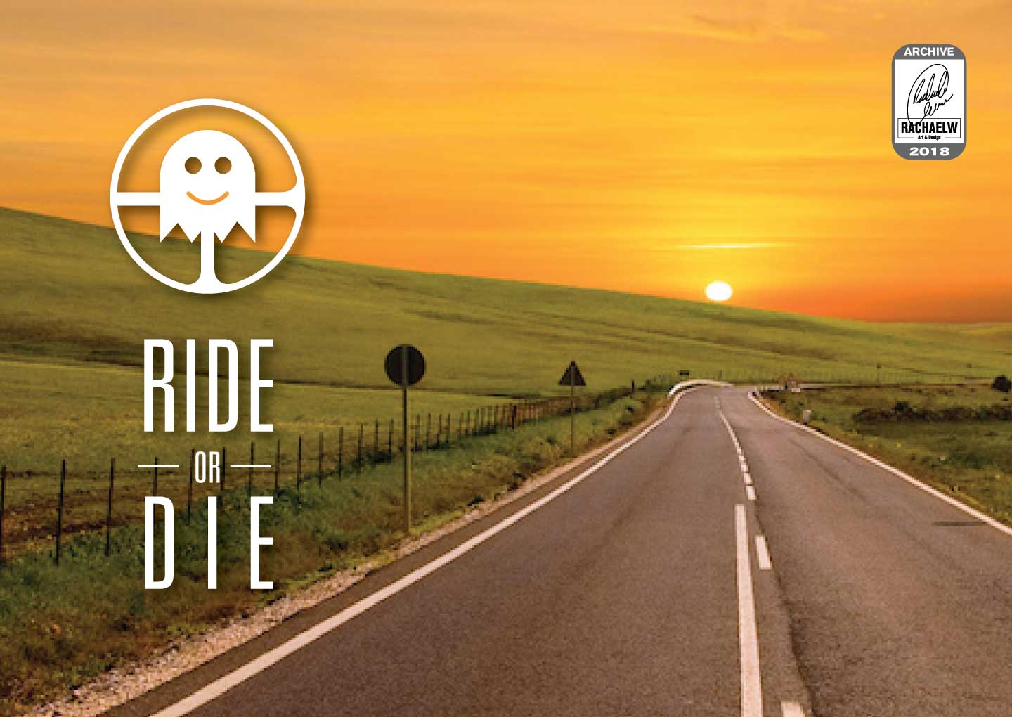
2018-RachaelW-Ride-or-Die-02
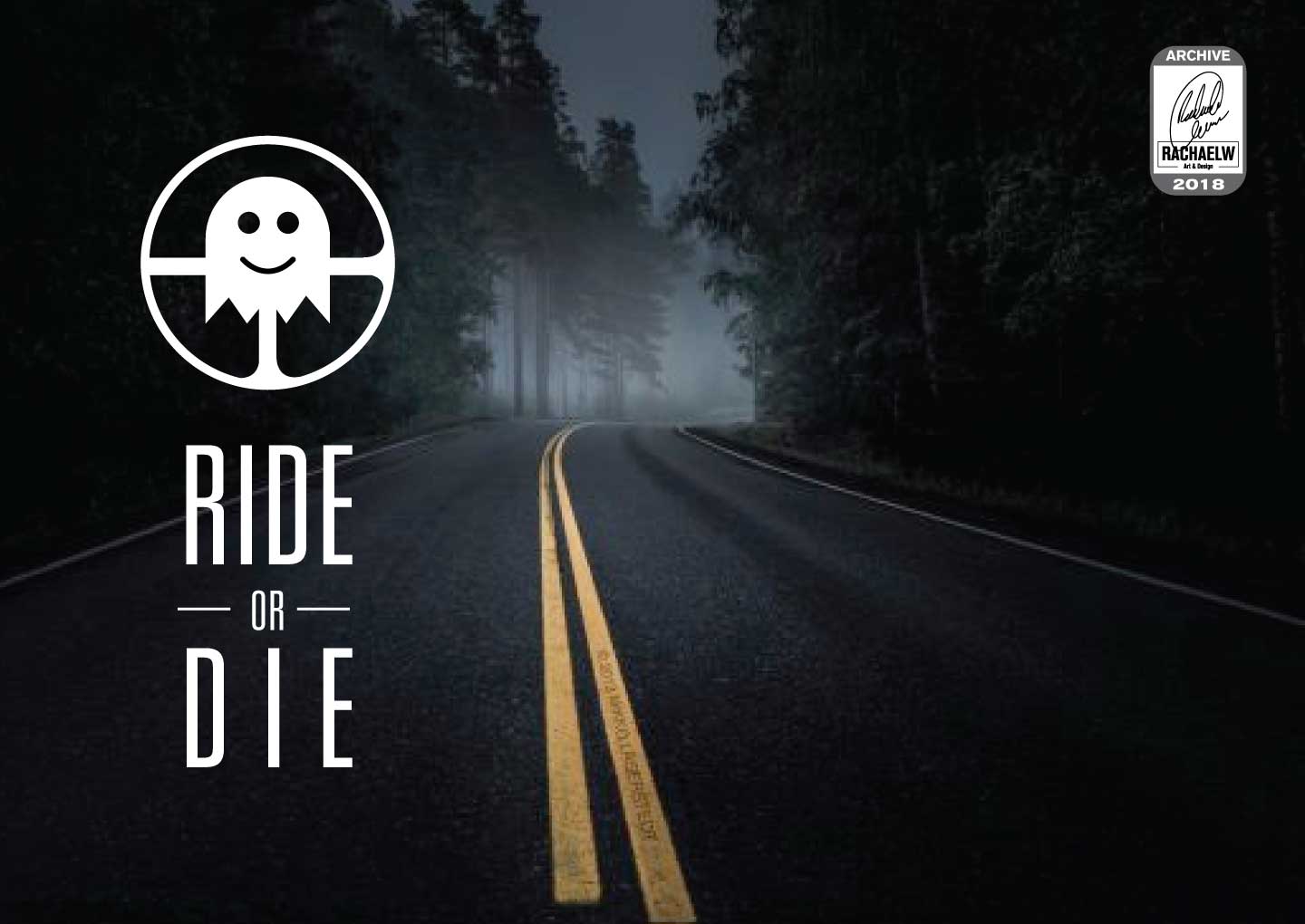
2018-RachaelW-Ride-or-Die-03
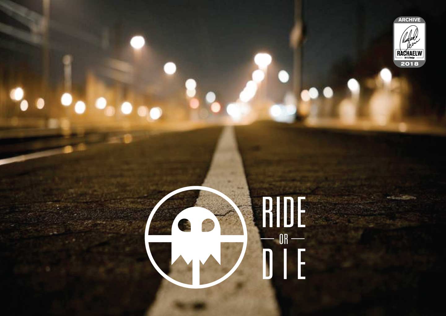
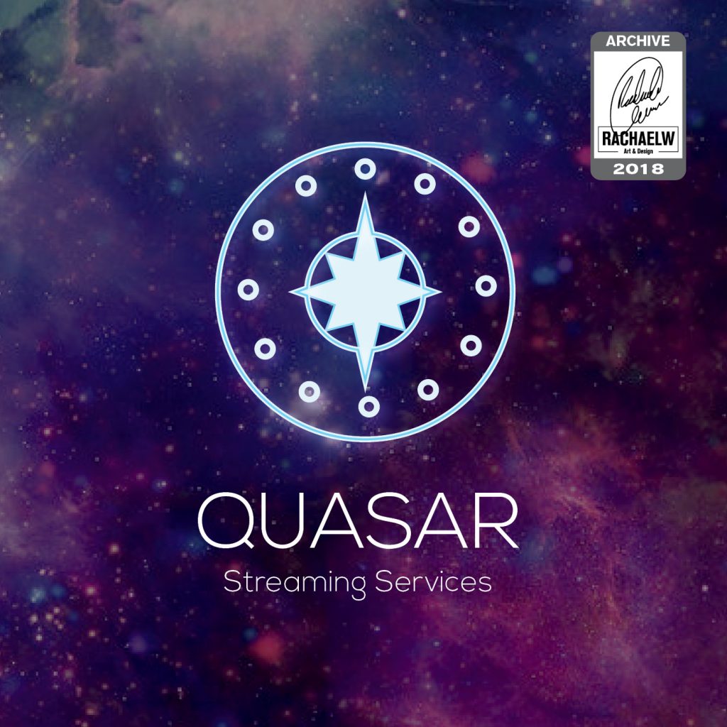
Prompt: Streaming Service
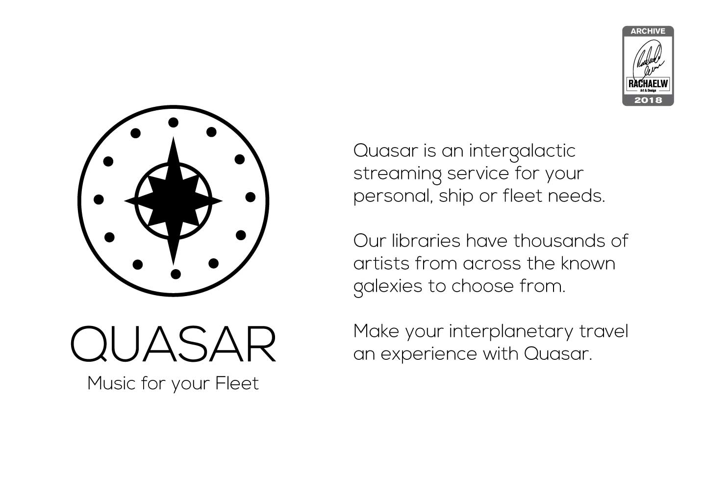
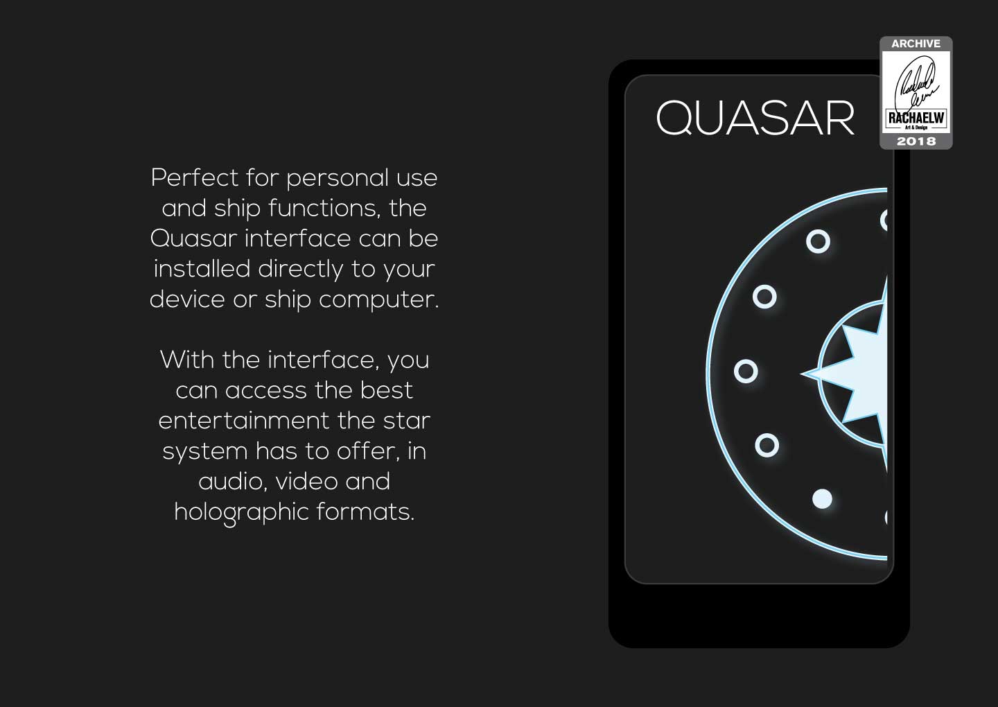
Some of these logos very clearly had little stories built around them, and Quasar is no different. A futuristic intergalactic streaming service, complete with visual references back to the old ipod control panel and dual purpose star icon that serves as a compass too.
2018-RachaelW-Quasar-01
2018-RachaelW-Quasar-02
2018-RachaelW-Quasar-03
Between one thing and another, efforts in the upskilling department fell off for a while until the design team had finished up their last days of work. With no excuses and all the reasons to pursue additional skills or reinforcing older ones, I didn’t exactly need to have my arm twisted to add to my reference library.
Hitting the books
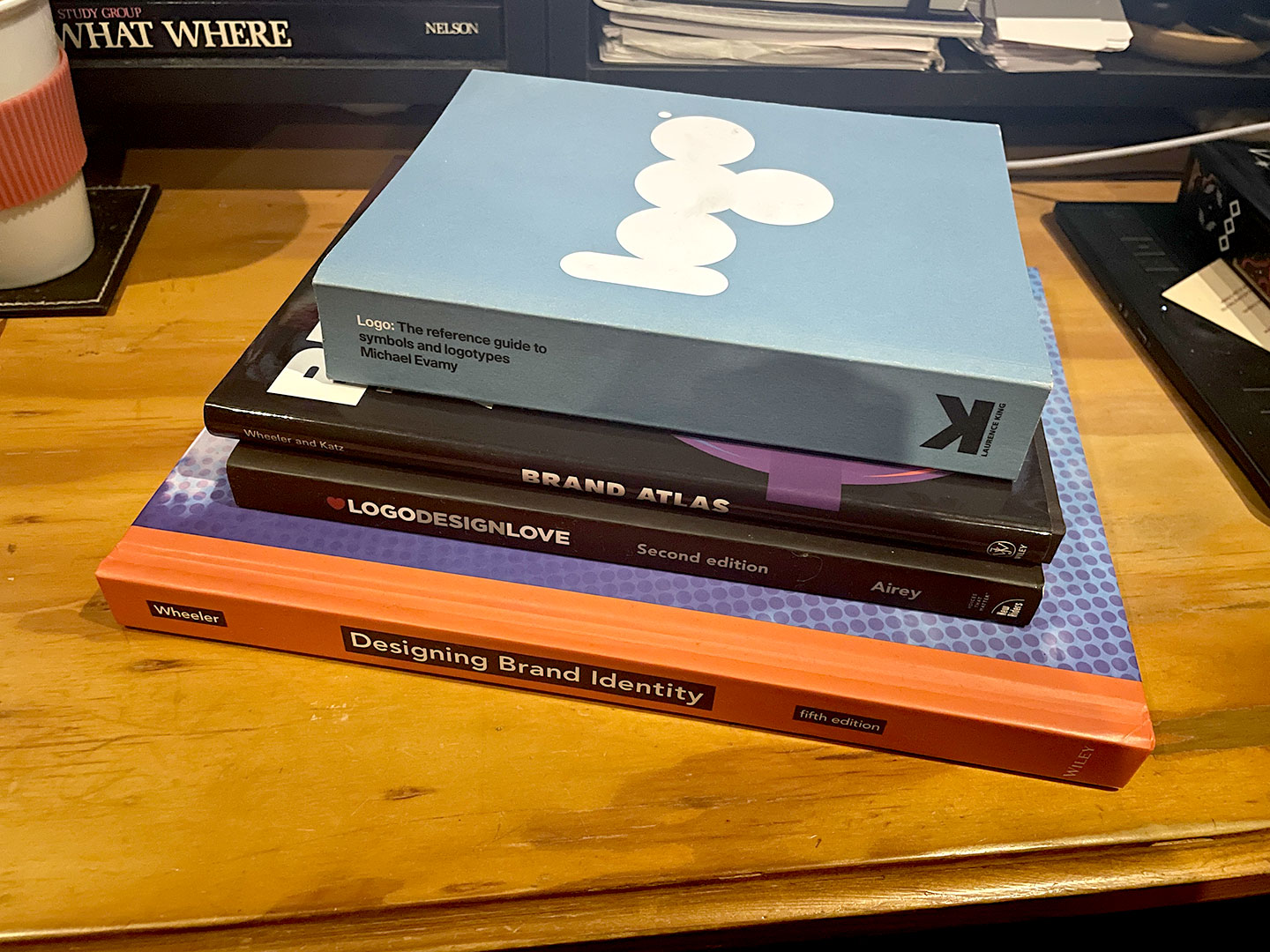
Designing Brand Identity (by Alina Wheeler), Brand Atlas (Alina Wheeler and Joel Katz), LogoDesignLove (by David Airey), Logo: The reference guide to symbols and logotypes (by Michael Evamy)
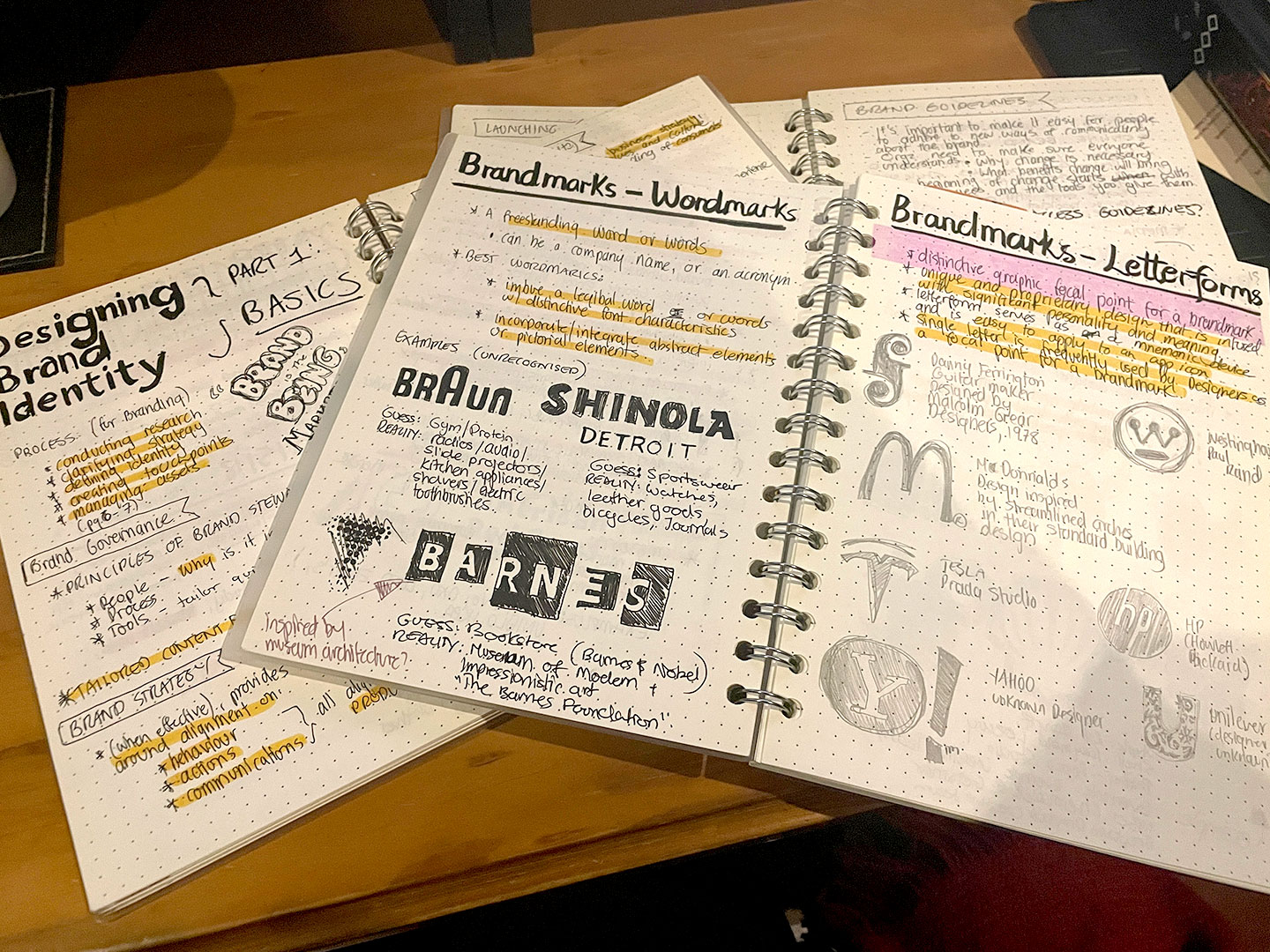
As is probably no surprise at this point, worth doing — worth overdoing. I dedicated hours to working my way through Designing Brand Identity, compounded by dozens of pages of notes. Written and highlighted. In hindsight it was a fascinating read in the context of having all the brands from the packaging job to reference and see the patterns and points being made, both good and bad.
Partway through of course, the guilt from reading and making notes with nothing to really show for it started to hit. Two birds, one stone; There were still plenty of logo prompts left incomplete from the Daily Logo Challenge. And at the time I had just worked through section all about different kinds of brandmarks. The perfect opportunity to put some of this theory, to potential use.
Reference Books
Study notes
Return to the Daily Logo Challenge
By mid June I had pulled together a shortlist of prompts, drawn up a tracker, and designated time to be spent on the challenge. The thought of doing all 50 still seemed daunting, and far too many to be able to use in a portfolio later, so it became a selection of 15. Some of the new 15 had already been done in the original 9 prompts, choosing to revisit them with a fresh set of eyes.
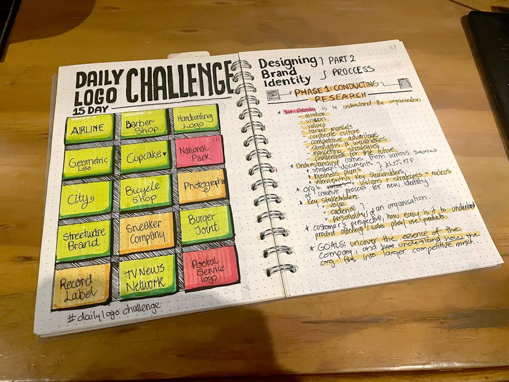
Starting the challenge after having completed the section about different types of brandmarks gave me the tools to categorise the logos I was doing and ensure that something had been attempted across all the styles mentioned in Designing Brand Identity’s breakdown of types of brandmarks.
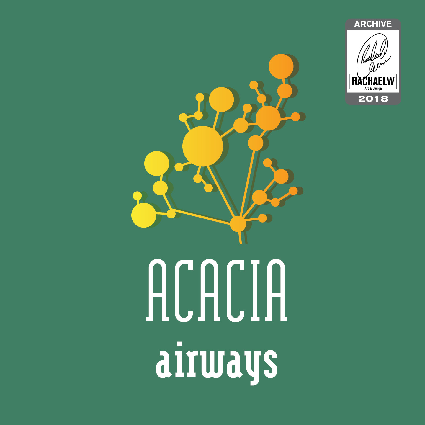
12. Airline
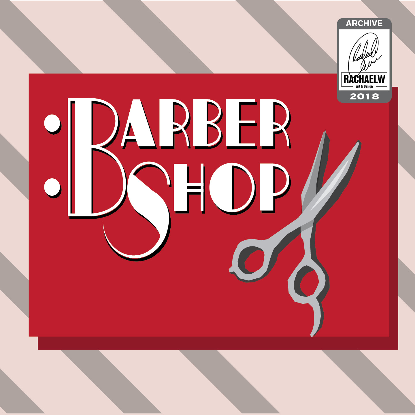
13. Barbershop
17. Geometric Logo
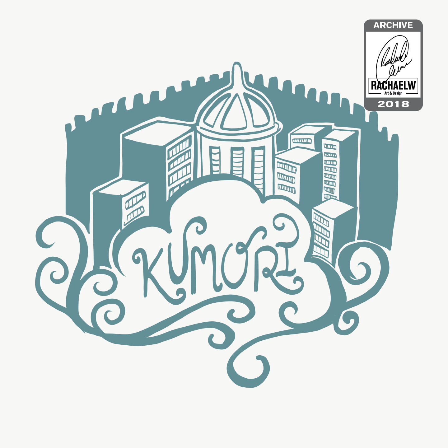
21. City
24. Bicycle Shop
28. Streetware Brand
33. Burger Joint
37. TV News Network
25. Photographer
30. Sneaker Company
36. Record Label
42. Postal Service
18. Cupcake
20. NationalPark
11. Daily Logo Challenge
This is also, however, where it seems that all seriousness starts to go out the window. The logos are full of jokes, commentary or parodies.
Daily Logo Challenge Extensions – Round 2
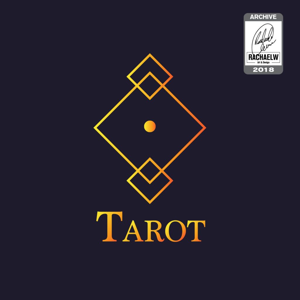
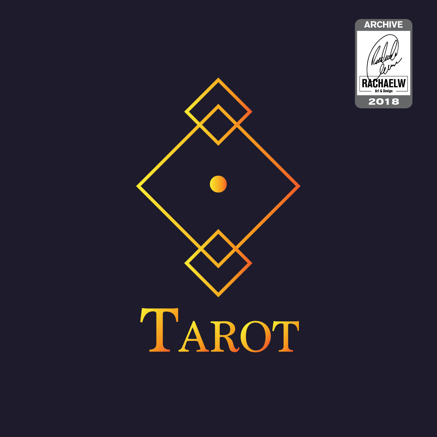
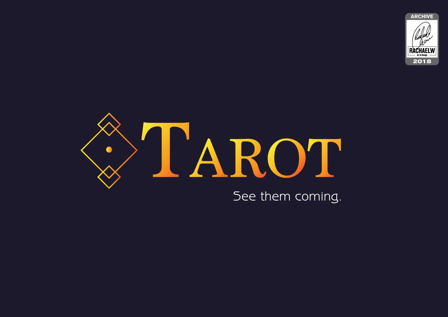
Prompt 17: Geometric Logo
What was a rather generic prompt somehow turned into a concept for a chain-store fortune store offering a variety of services, charms and talismans. Tarot readings, good luck charms, etc etc.
2018-RachaelW-Tarot-01
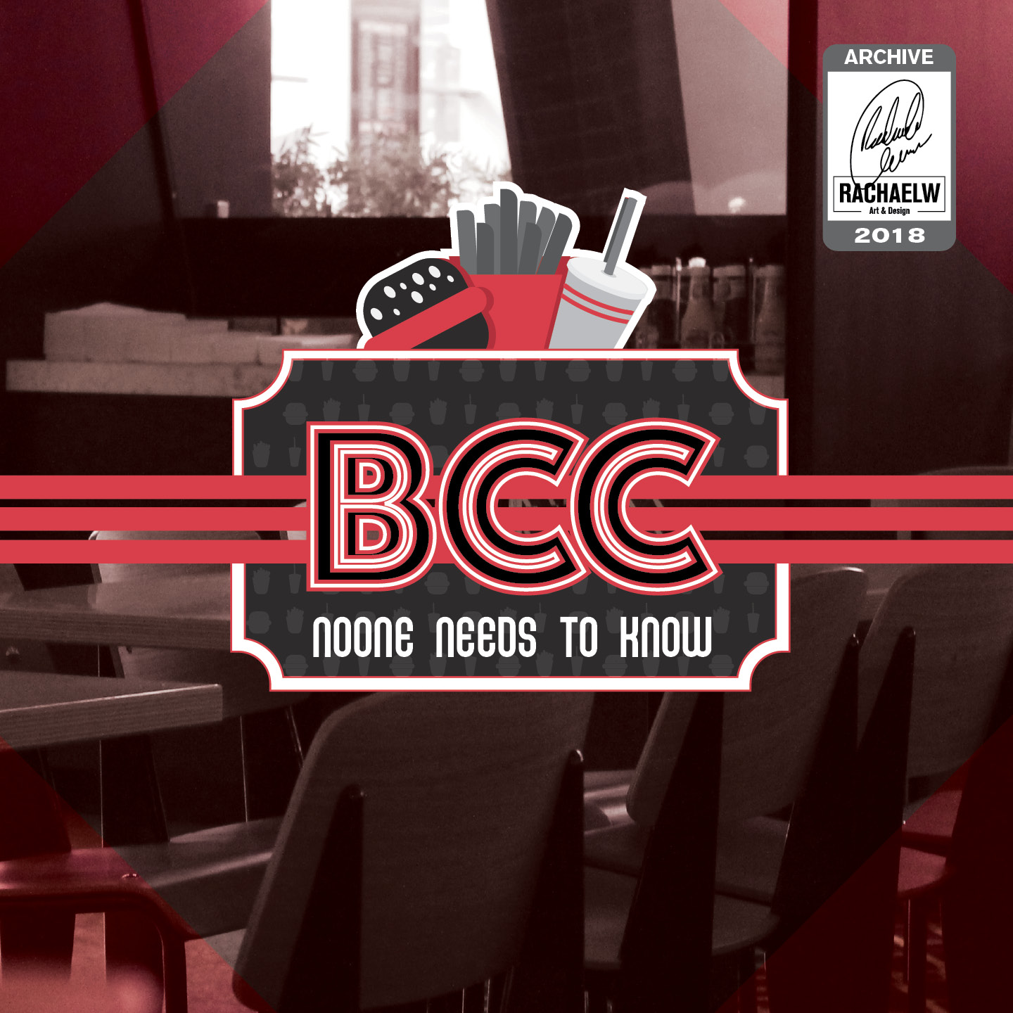
Prompt 33: Burger Bar
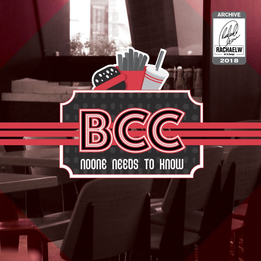
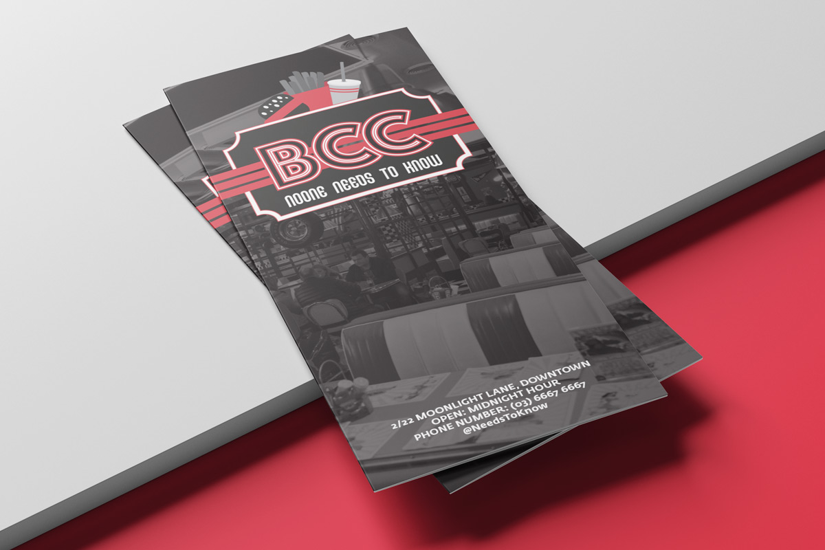
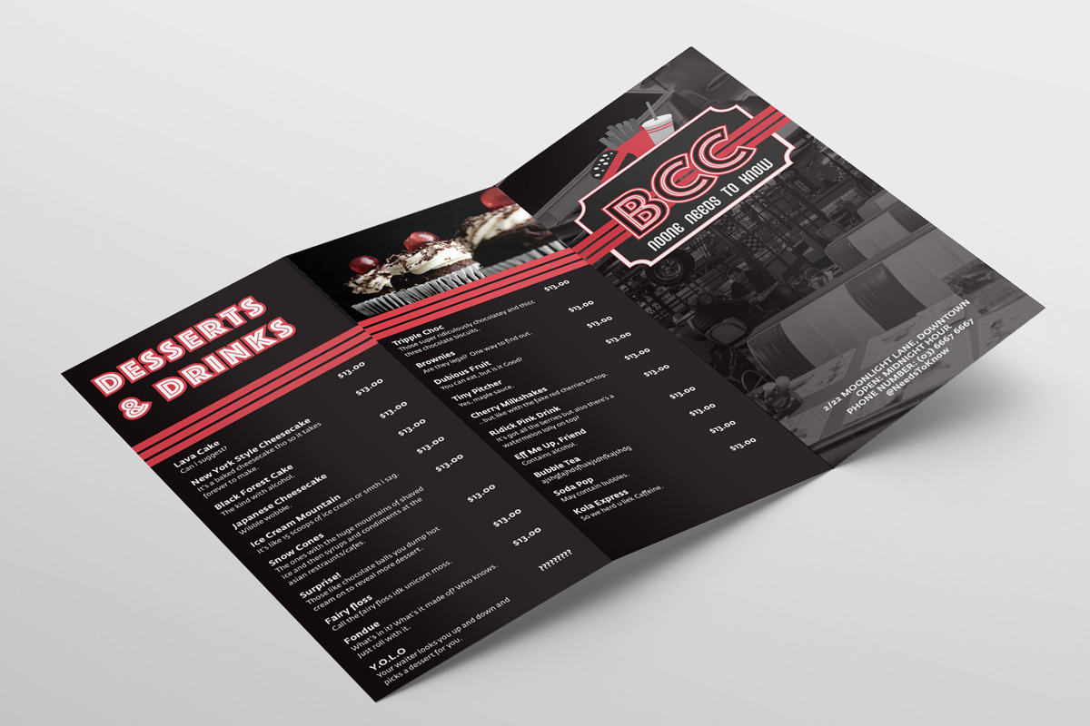
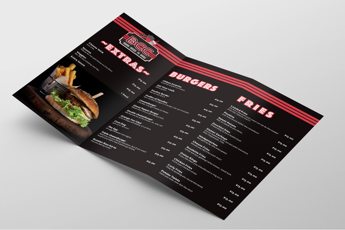
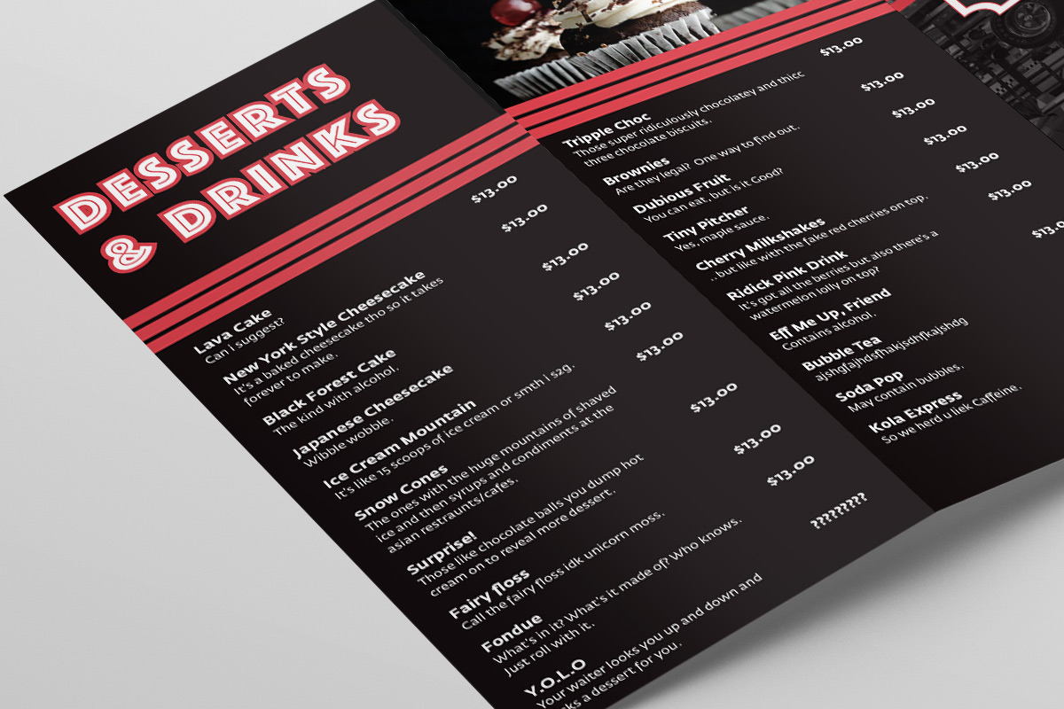
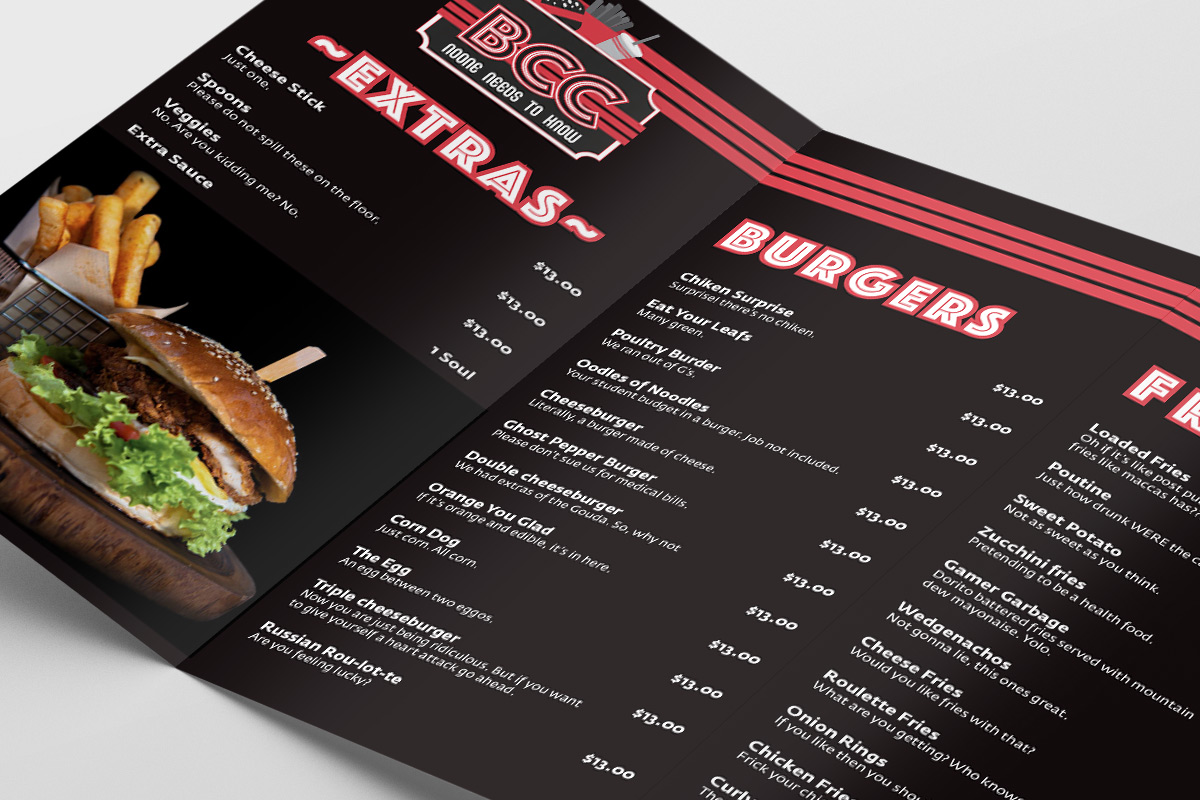
A play on acronyms, both “Blind Carbon Copy” (the practice of sending a copy of a message to an additional recipient, while omitting their details from the other recipients) and for “Burger, Chips and Coke” (typical components in a fast-food meal combo). This one always evokes the idea of a secret, hidden restaurant that operates at bizarre hours and is the perfect place for a sneaky midnight snack, or a post-night-out feed
RachaelW-BCC-Front-2020-04-10
RachaelW-BBC-Outside-2020-04-10
RachaelW-BBC-Inside-2020-04-10
RachaelW-BBC-Closeup-02-2020-04-10
RachaelW-BBC-Closeup-01-2020-04-10
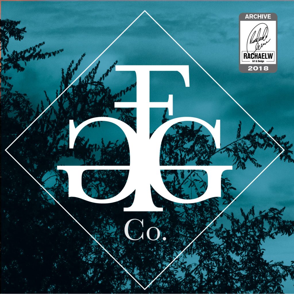
Prompt 30: Sneaker Company
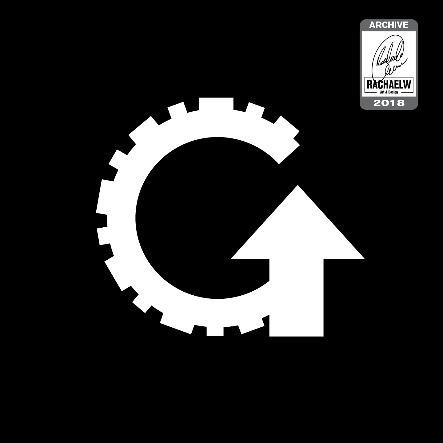
I’m glad I named the file the way I did, because otherwise I would have been lost. “Gotta Go Fast.png” gives this monograph a whole new layer of meaning, and once again leans heavily into the juxtaposition of silly names with serious-looking visuals.
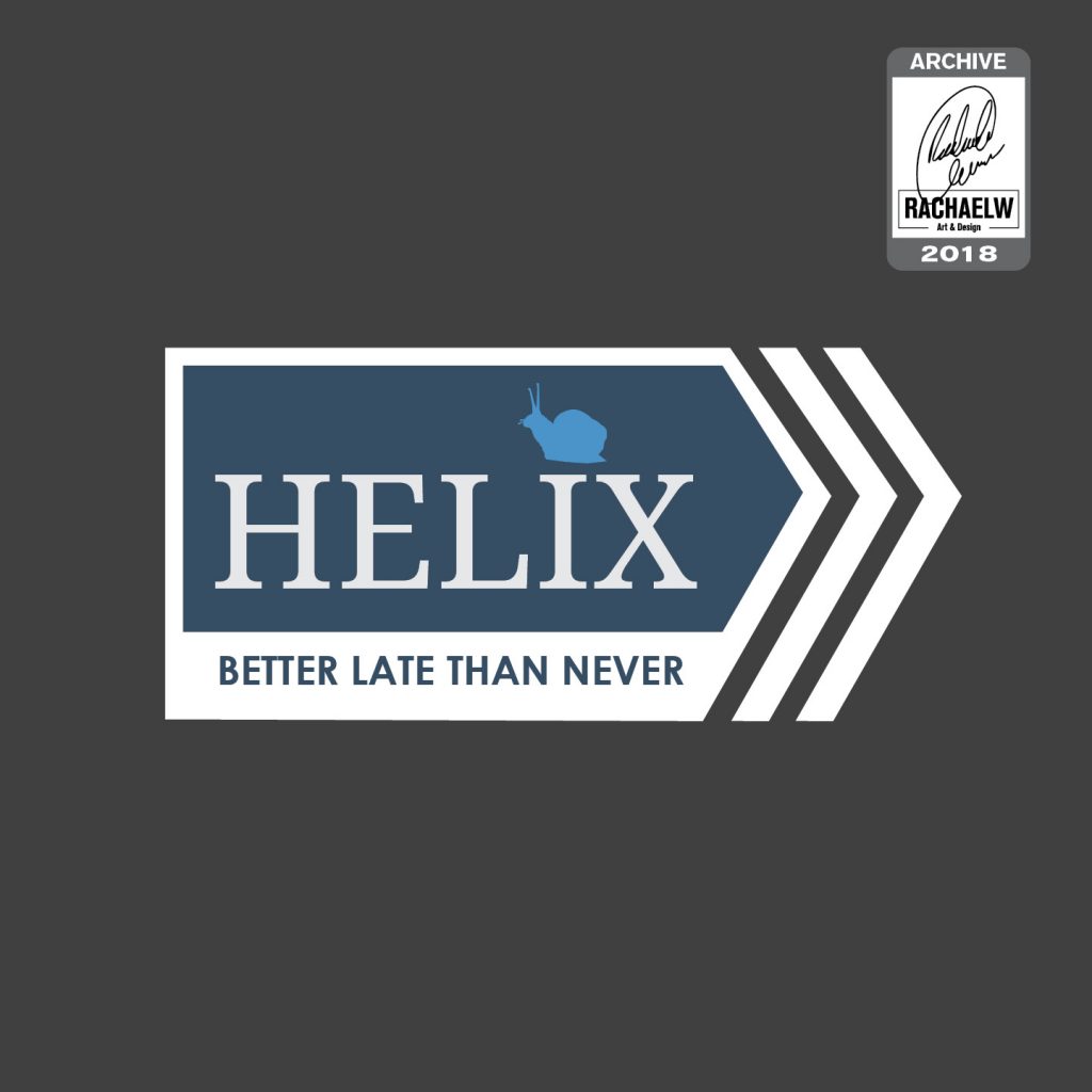
Prompt 42: Postal Service
Playing around with the idea of “snail mail” (affectionately – or not affectionately – referring to the physical postal), heavily influenced by the wait times experienced outside of the Australian capitals.
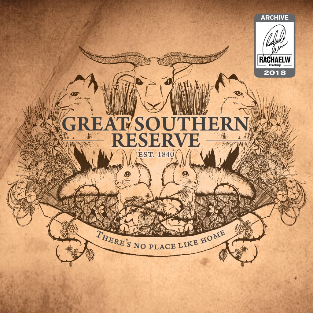
Prompt 20: National Park
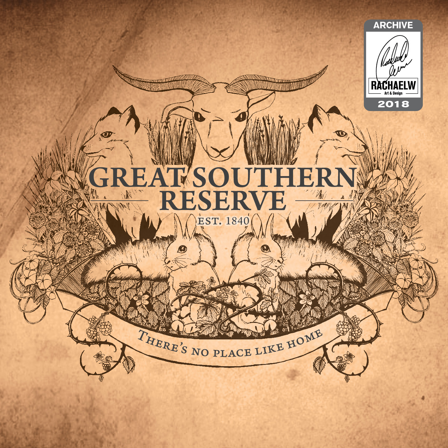
“Great Southern Reserve” incorporates a collection of flora and fauna considered to be Invasive Species to Australia – such as foxes, rabbits, morning glory, and blackberry. United with a tagline of “There’s no place like home” as a bit of tongue-in-cheek pointed commentary at the impact on local native environments.
Conclusion
While this study was born out of a series of unpleasant events, and the further away from it I get the more I find could be improved within my old work, it’s one of those projects that had to happen for me to get to where I am now. Whether I like it or not, each of these logos and their extensions were stepping stones on the way to identifying what I liked and what I did, what I could do vs what I couldn’t. And that’s nothing to be embarassed by or ashamed of.
(… though I’ll admit, it’s tempting to try the 50 day challenge again. Just, you know, for comparison’s sake. Progress, or something like that.)
Ironically from flipping back through the notes, I think this was where I first encountered the phrasing “font psychology”, which gave me something to look for later around the time of 36 Days of Type, finally coming across an article by Nick Kolenda (https://www.kolenda.io/guides/fonts ) that finally went into detail about font associations, which I found extremely helpful for getting better and faster at picking fonts for things. Not perfect by a long shot, but there’s also a lot of fonts out there.