
Lettering sketchbook 2023
In the middle of 2022, I was gifted a Domestika Course – “Typography Sketchbook: Drawing Letters with Style” by Joanna Muñoz”. Of course I signed up, logged in, and then things happened and it fell to the wayside for a while. Quite a while. Eventually in September 2023, I dug up my log in details, grabbed an old dot-grid notebook, and started to make my way through the first few introductory videos.
An Introduction to Lettering

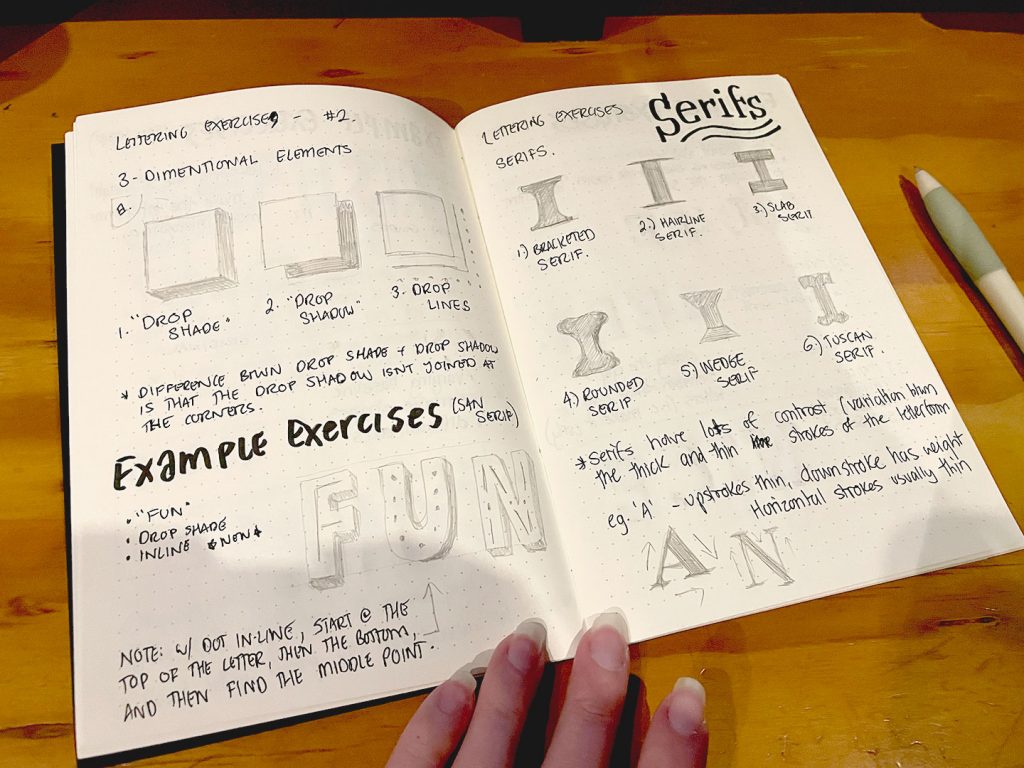
Going through the motions of following the course was a personally bizarre experience; I’d been dabbling in and out of lettering for decades, done at least one university-level introduction class to Typography and heard far too many coursemates telling tales of woe during their time taking the later electives. I had been able to see several prominent lettering artists present at Semi-Permanent in 2014 (such as Jessica Hische and Seb Lester), and had the chance to add some of their own books to my reference library in the years that followed. I knew all too well what things like descenders and ascenders were, I’d spent weeks studying the differences between different types of serifs and san-serif fonts for 36 Days of Type. It felt, in some ways, like I was rehashing things I already knew. That I already should be fine with.
But at the same time that frustration became a strange kind of super power. I could identify more easily what I didn’t know from what I did, things that I agreed with vs things that I didn’t (Even in the “old days” of 2023 I was still skeptical about leaning on pintrest for reference material, after personal experiences that showed it could be extremely difficult to track down original sources).
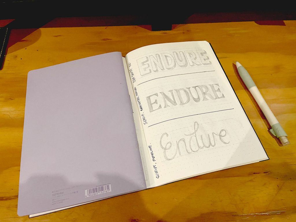
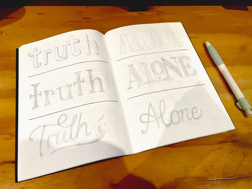
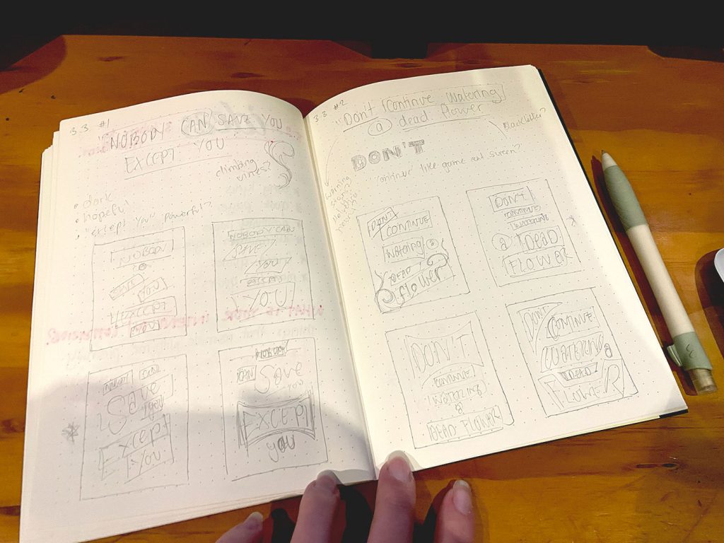
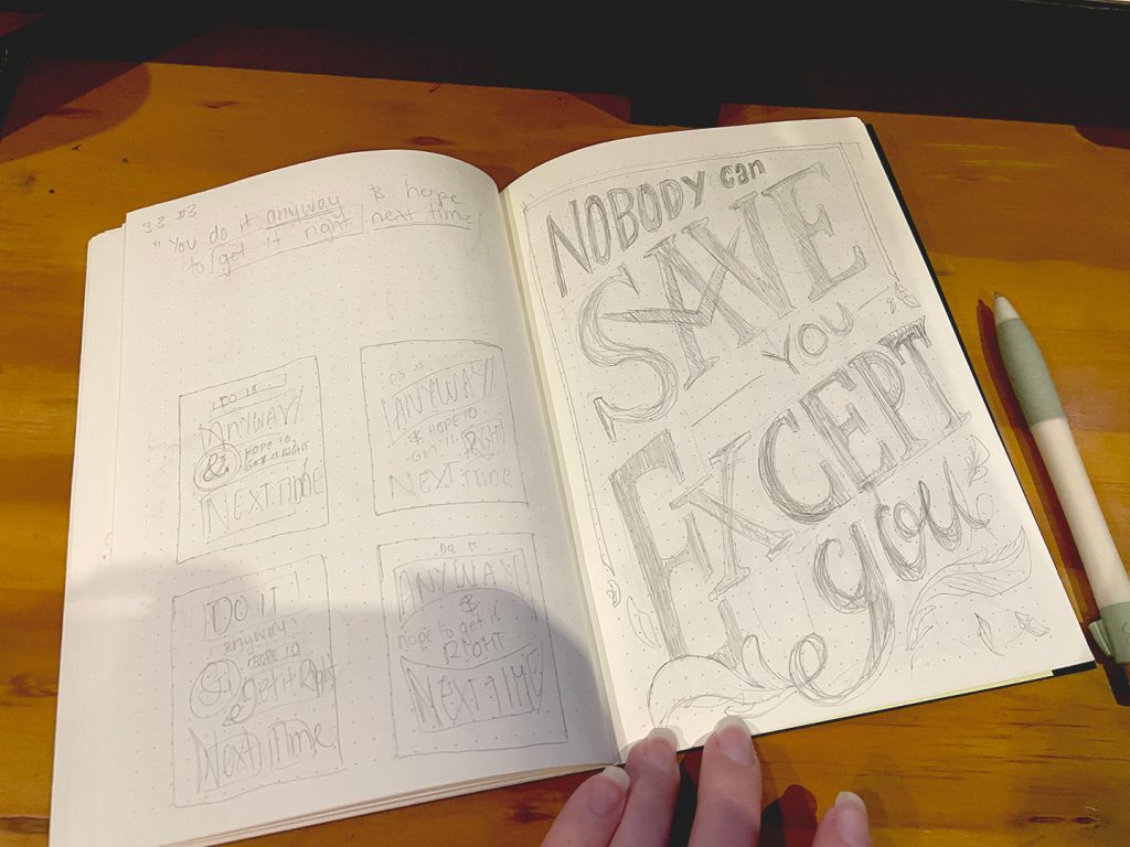
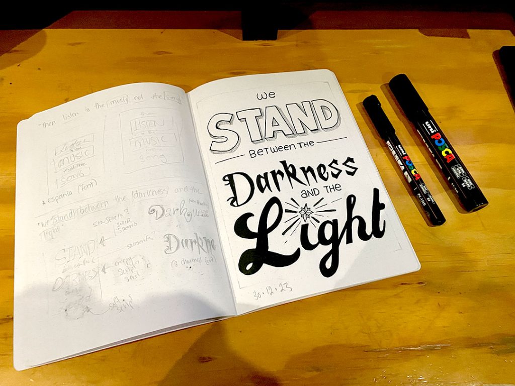
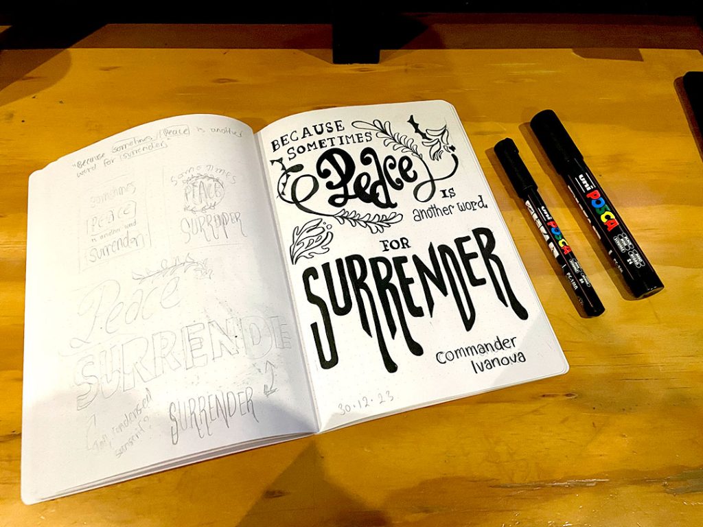
Of course, if you’ve been around the blog this should come as no surprise, as once again “worth doing, worth overdoing” kicked in; Tasks within the course, each done in triplicate.
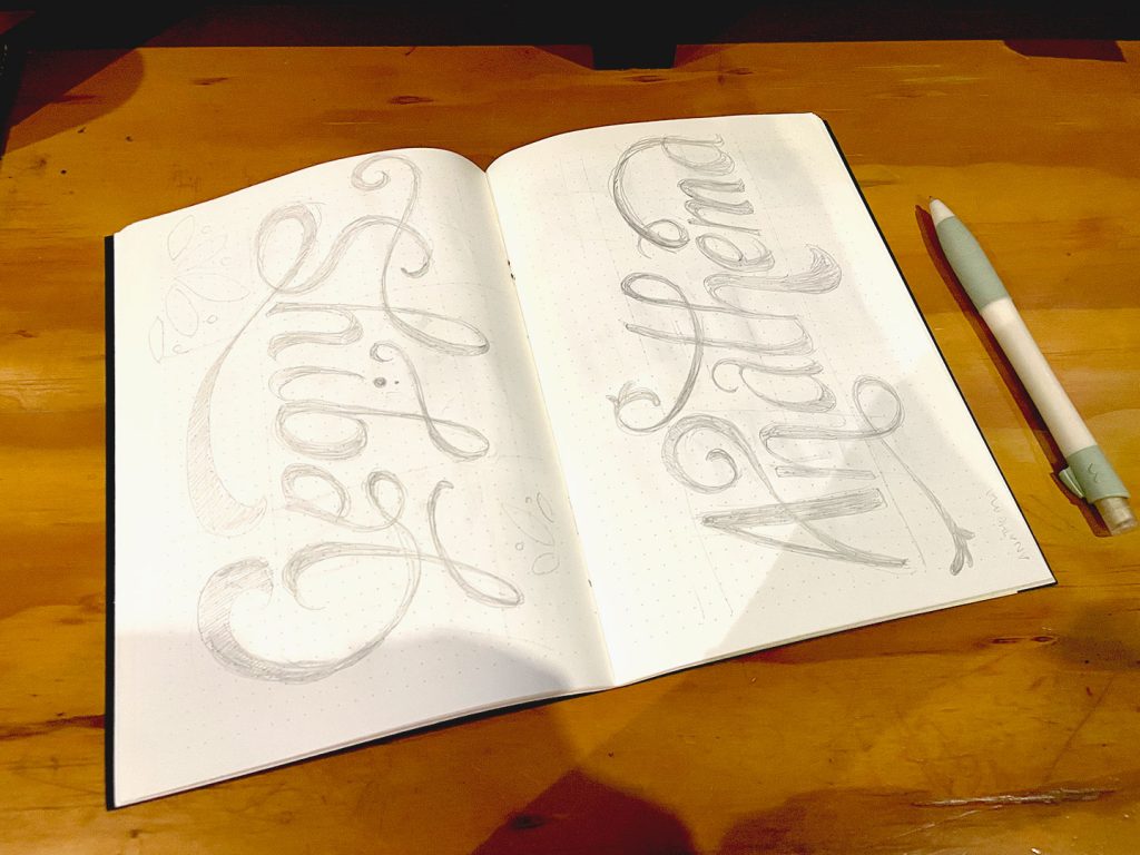
- Same Words, Three Ways (san-serif with a 3D effect, high contrast bracketed serif, and monoline script)
- Flourishes and Swashes (script styles)
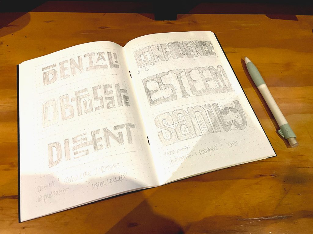
- Interlocking Forms (blockwork styles)
- Carved Out (more blockwork forms)
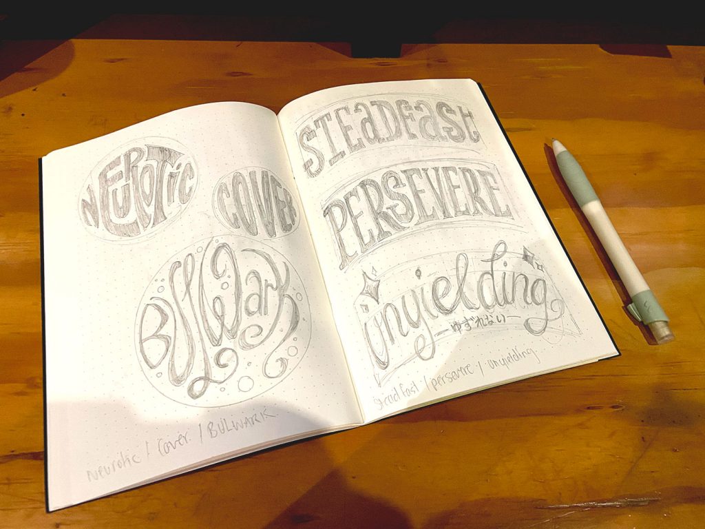
- Circles (letttering in a form)
- Arches (using guidelines)
- Arcs (guidelines and rotation)
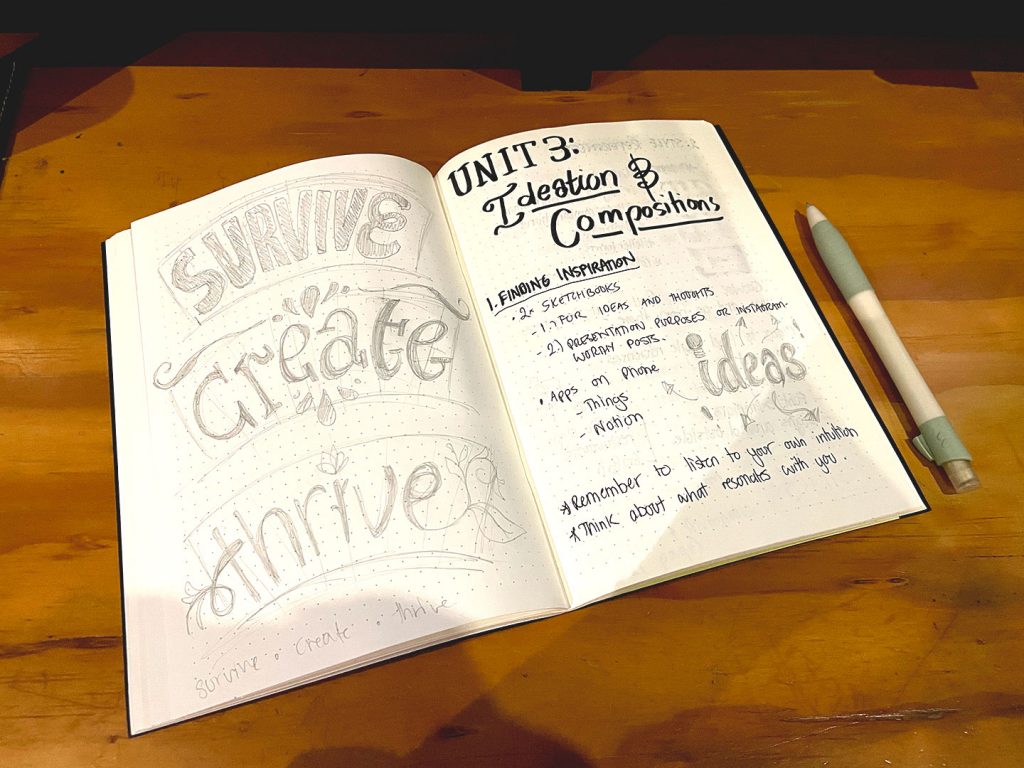
Moving from reinforcing new and old fundamentals, we started to get into the meat of the course. The stuff I was truly in it for.
Creating Compositions
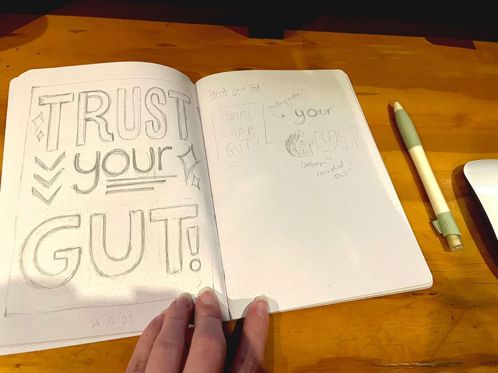
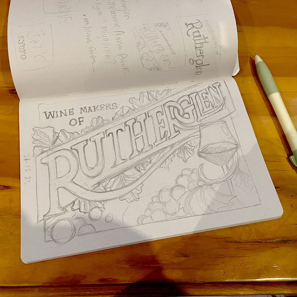
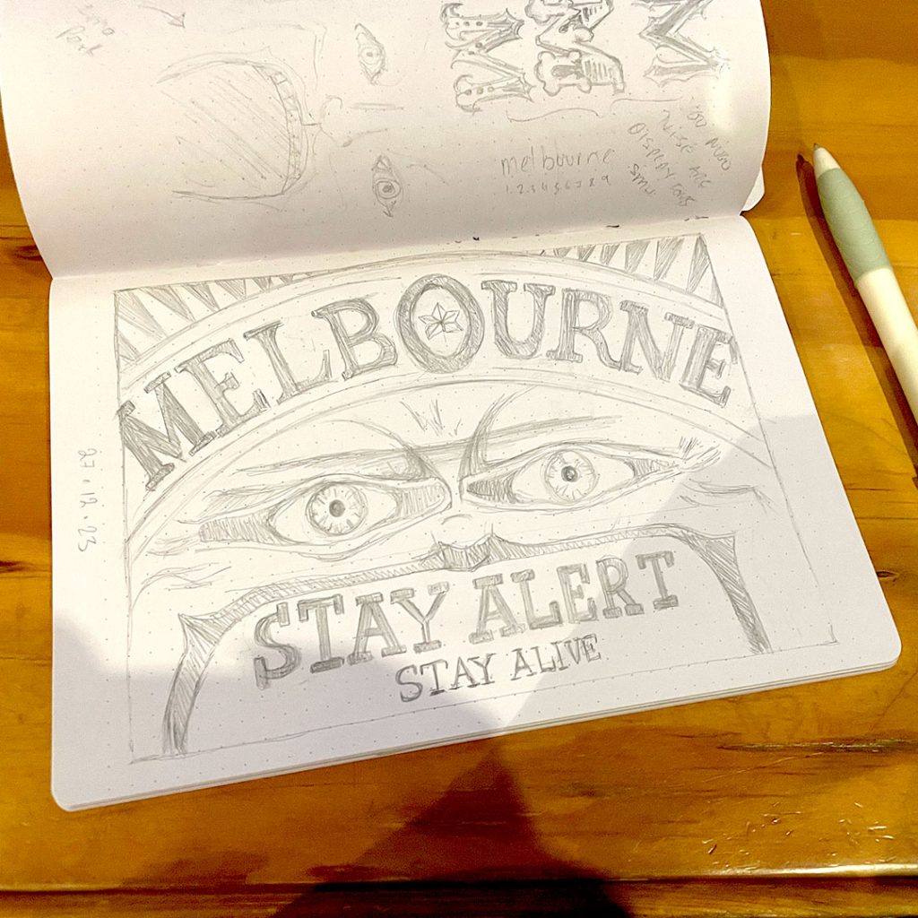
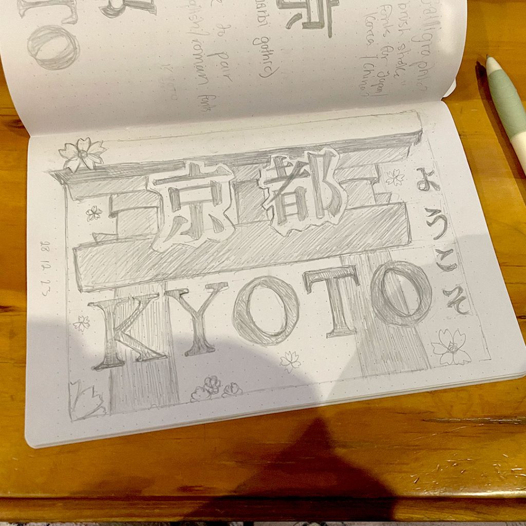
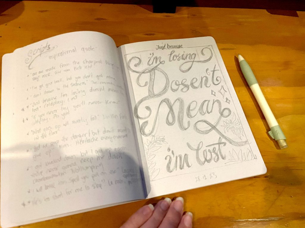
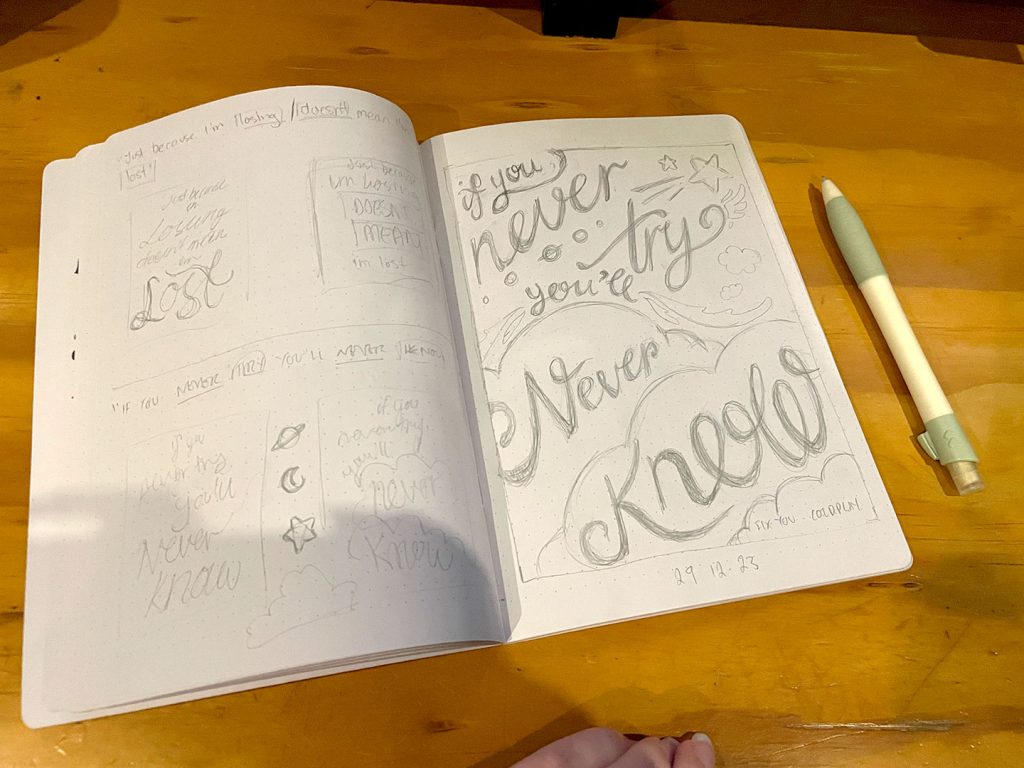
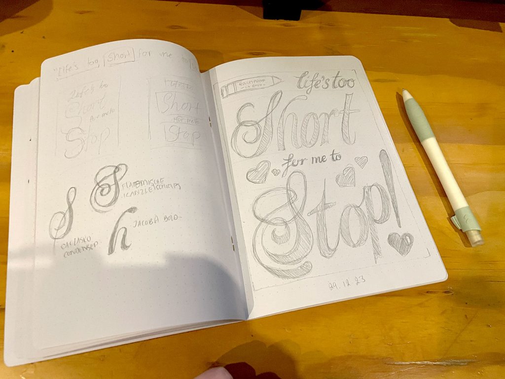
The next task called for students to pair a single phrase with one of the references gathered during the ideas phase – where we looked at where we get our ideas and inspiration from, and whom. And yet in spite of following the assigned task to the letter, something felt missing.
Worth doing, worth overdoing.
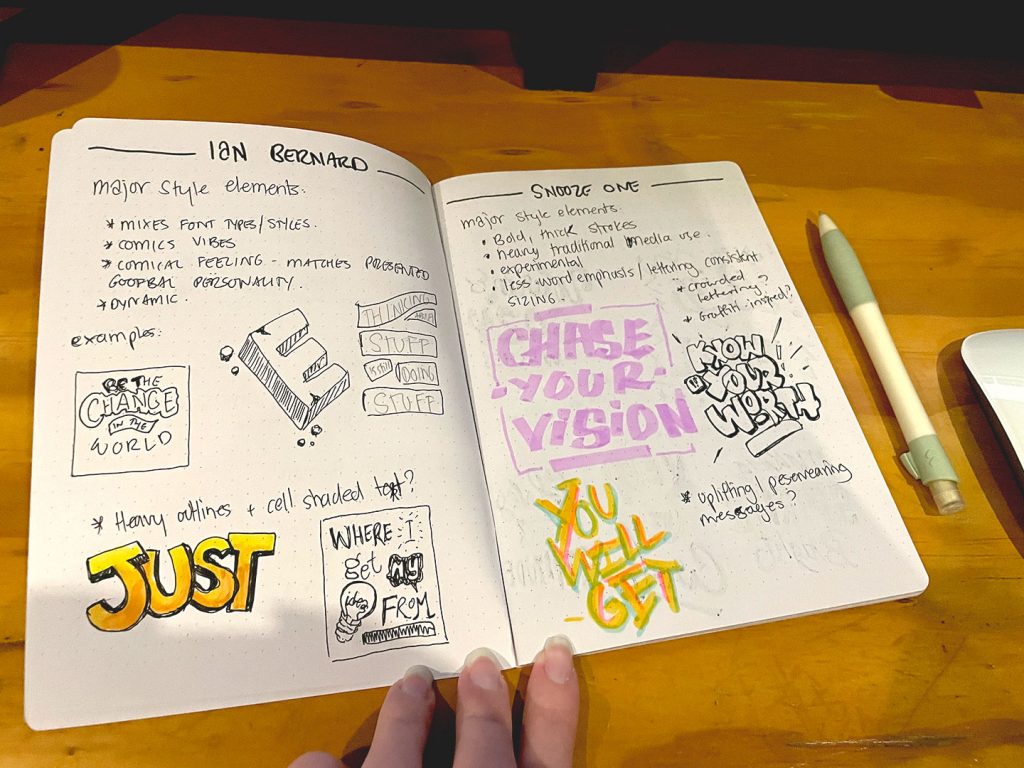
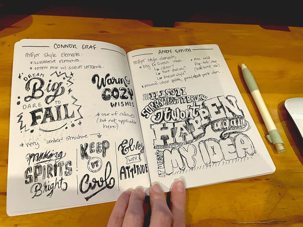
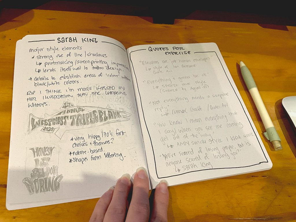
I set about making my own twist on the task – picking 5 specific artists whose styles I liked and/or wanted to emulate, looking at examples of their work and identifying what made it feel like their work (to me, at least). Choosing artists with a range of styles and looking at how and what still made each piece feel very obviously “them” was something that appealed in the wake of the annual “style” discourse that flooded the internet so often and the push for creatives to be their own “brand”.
Putting It All Together
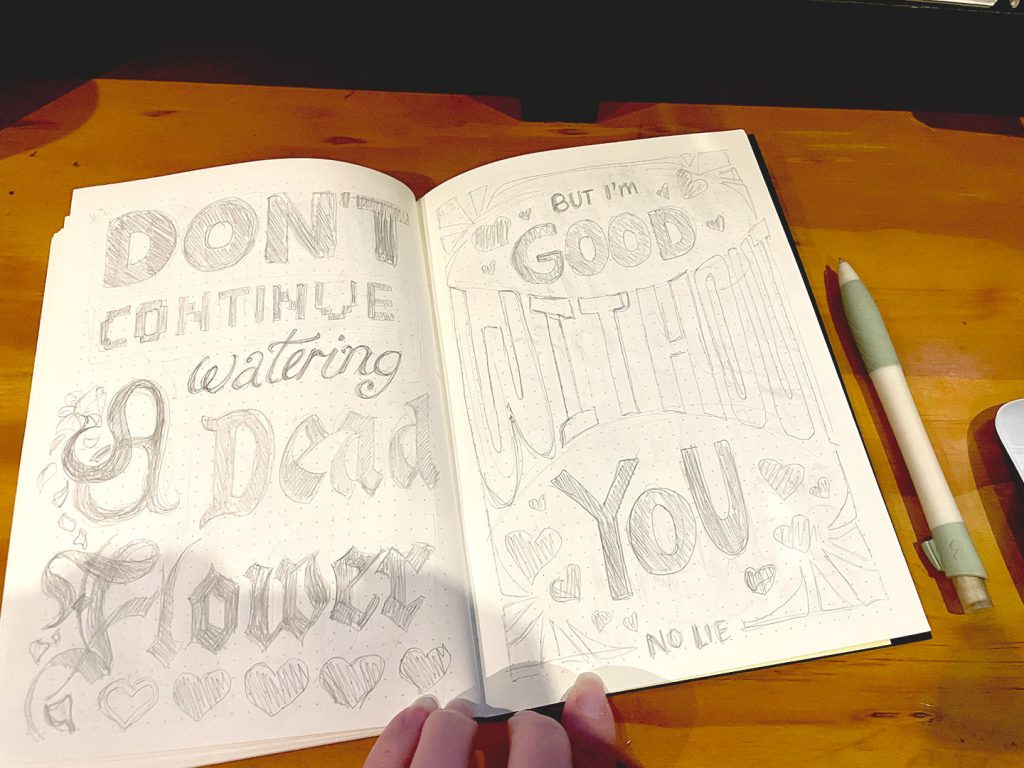
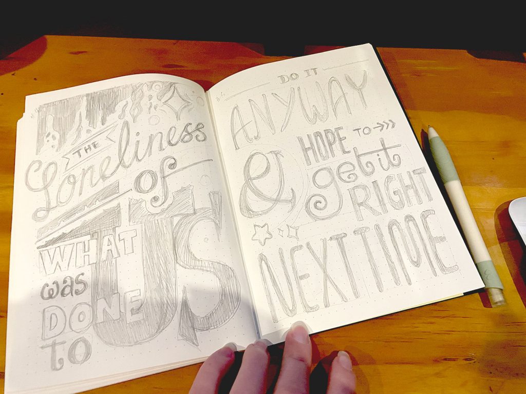
The course followed this with a set of exercises – a serif piece, a san-serif piece, a script piece, and a mixed lettering piece. (4 pieces total)
You know the drill by now, don’t you? Worth doing, worth overdoing.
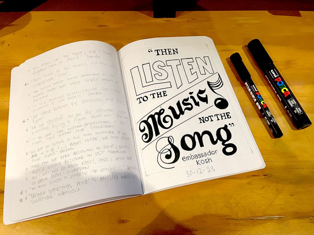
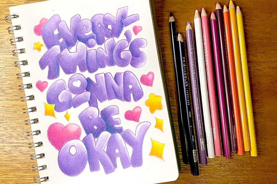
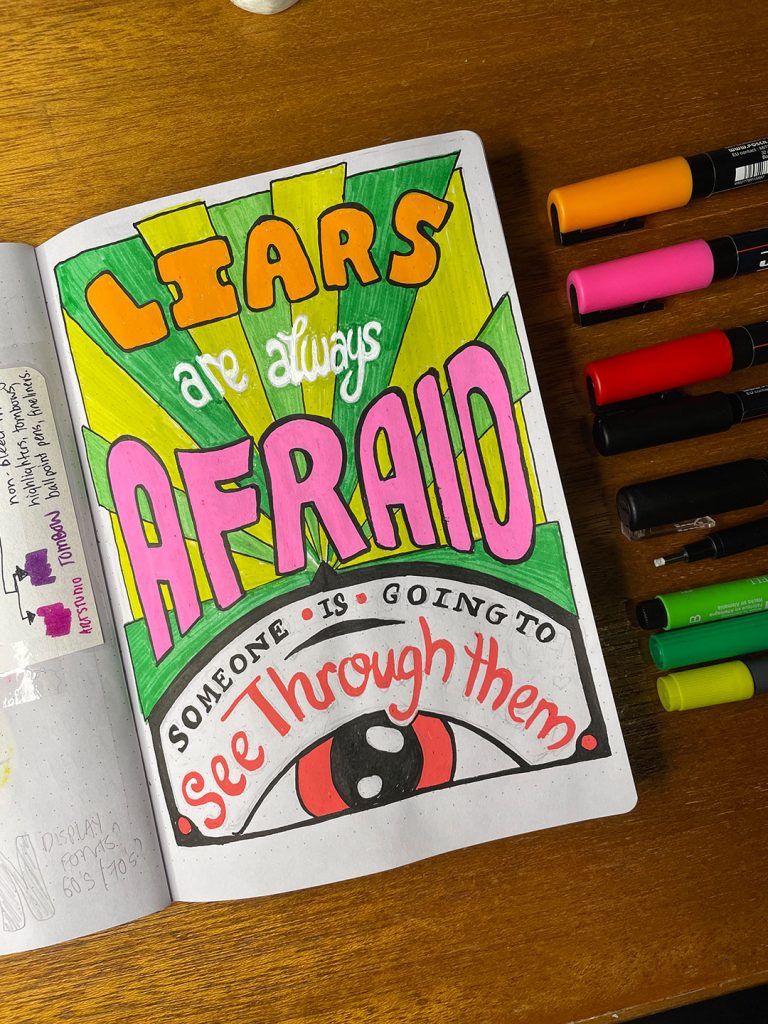
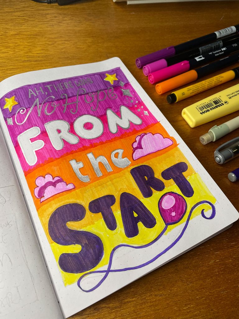
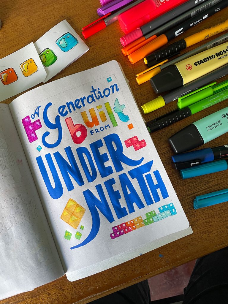
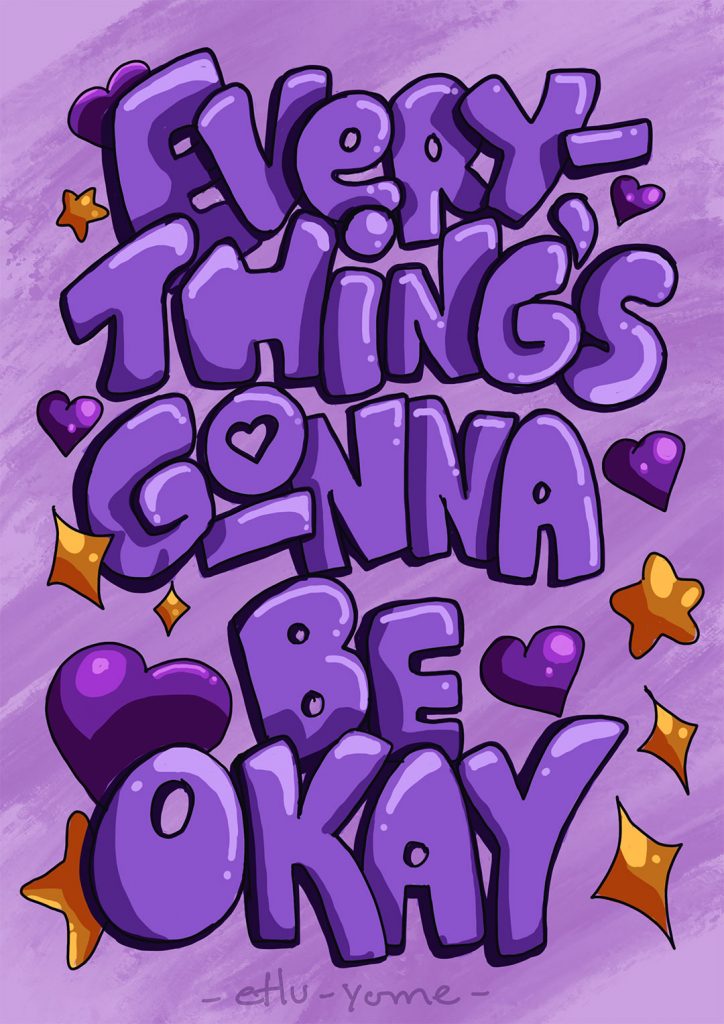
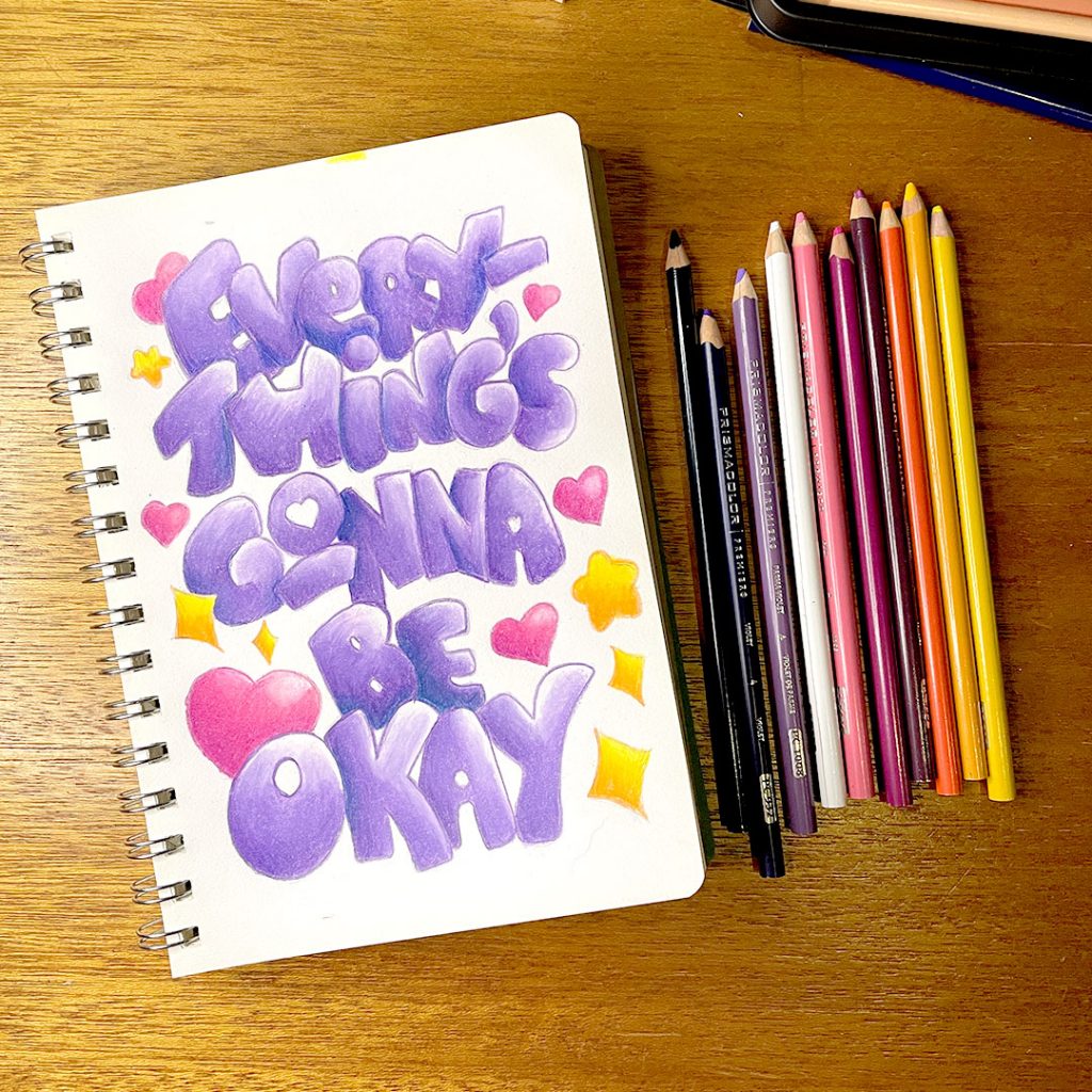
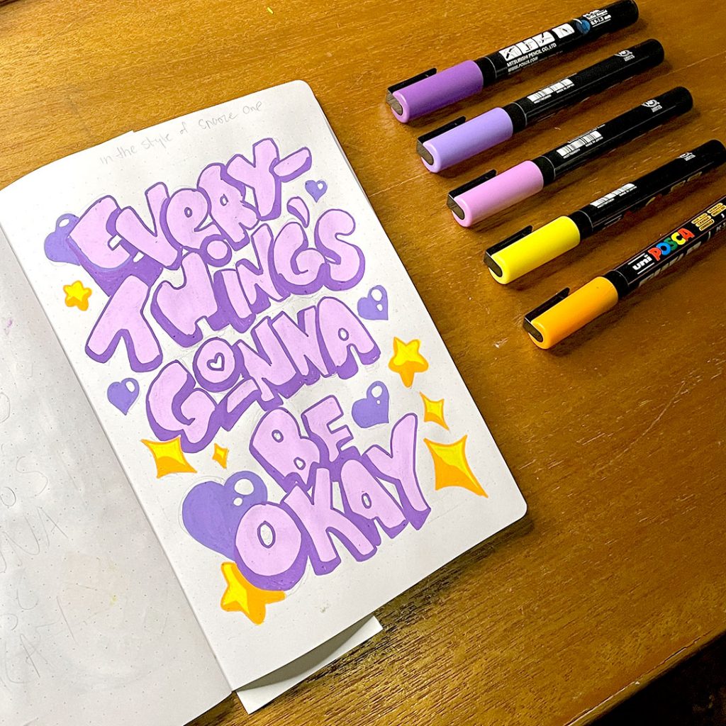
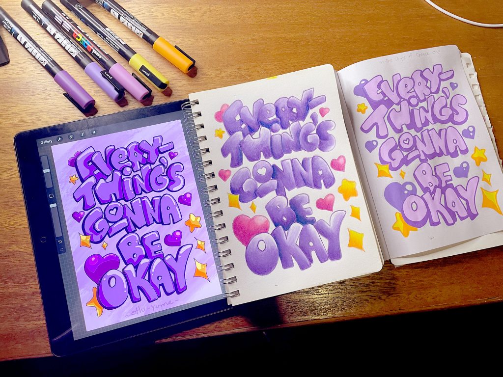
And of course now that we’ve got a basic grasp of composition in pencil and black/white, the next task was to start adding colour to pieces and documenting them for social media.
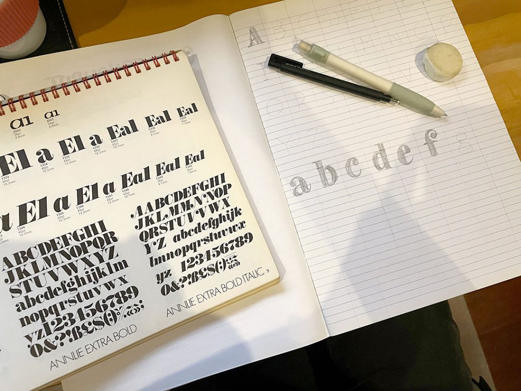
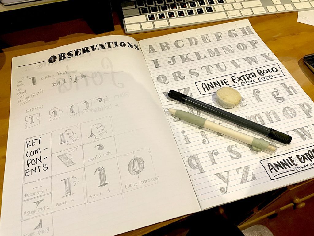
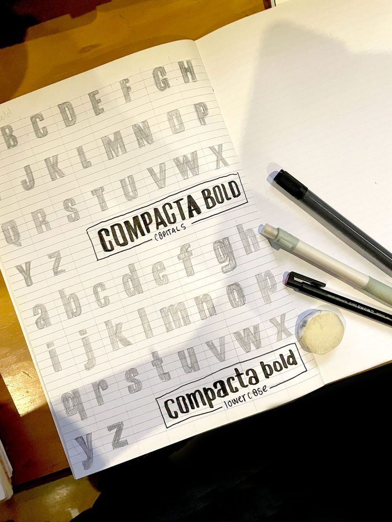
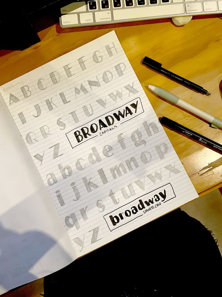
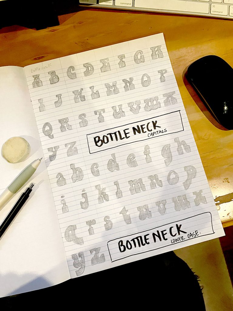
SIDEQUEST: Font Studies in Letraset
Somewhere along the line I also paused the colour project to do an abrupt crash course in different font families from ye old trustworthy font friend, Letraset.
Final Project(s)
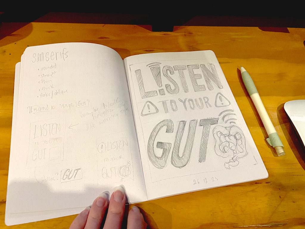
At this point you know I couldn’t just do one final project, of course I did three – and added an extra layer of complexity! In unit 4 we started with sketching compositions and adding black ink to them. Unit 5 saw us adding colour to our compositions. So it only felt fitting for Unit 6’s grand finale, to finally translate the skills across to the digital front and complete them on the iPad with Procreate. The final missing piece in this lettering journey.
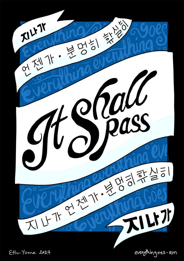
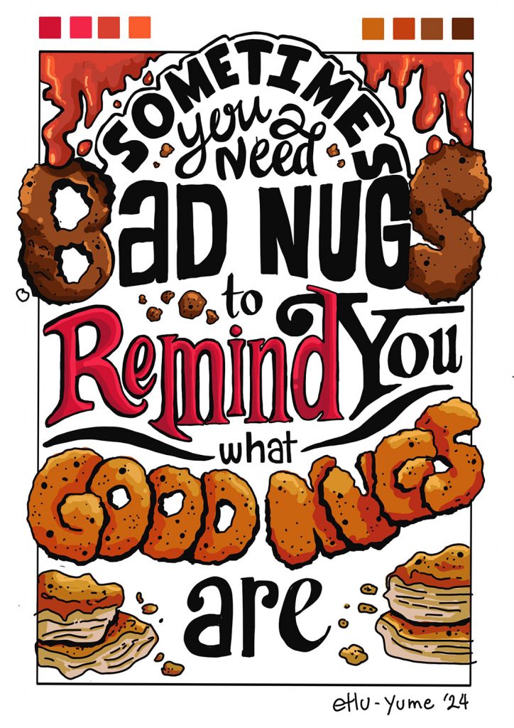
from the exercises in Creating Compositions for my final submission.